
Introduction
In my last post on October 21st, looking at the potential for an exit from the epidemic, I described a cyclical version of the modelling of the epidemic in the UK, reflecting outputs from Imperial College and Harvard earlier this year, which postulated a continuing cycle of partial lockdowns, easing of restrictions and upsurges in the epidemic, a cycle only broken by the development of a pharmaceutical solution.
I will illustrate that again with the application of my model to the USA (where I haven’t reflected, as I have in the UK, any continuing measures to control the epidemic apart from an initial intervention on March 23rd); the absence of later interventions allows the effect of periodic ones to show up, and to be compared to the do-nothing situation.
Apart from that initial March 23rd set of measures, it was hard to identify a consistent set of federal measures in the US (much of what they do is State-driven, and is very variable), and in any case my focus was (and is) more on the UK.
I will then revert, therefore, to the UK, with an adjustment to my model output, which reflects the lower effectiveness of the UK Government’s measures taken in the last couple of weeks, in the face of increasing individual and population informal relaxations of compliance with requested measures.
This has resulted in the UK Government being forced to introduce new “tiers” of measures across England, paralleled in Scotland, Wales and Northern Ireland with arguably more severe measures; it is mooted that England might also introduce, for example, a fourth tier of interventions, as an alternative to the ‘circuit-breaker” or “fire-break” approaches taken elsewhere.
Inspiration for cyclical modelling
I embarked on a cyclical version of my model to replicate a version of the Imperial College and Harvard models for this kind of epidemic management, through adaptively triggered NPIs (Non Pharmaceutical Interventions), referenced in several of my blog posts (including my most recent on October 21st) and which I first saw at the April 17th Cambridge Conversation webinar, which I reported in my April 17th blog post, and also in my April 22nd blog post on model refinement.
The Imperial College version of the chart is here, first presented in their pivotal and influential March 16th Report 9 on the subject of Non Pharmaceutical Interventions for the epidemic.
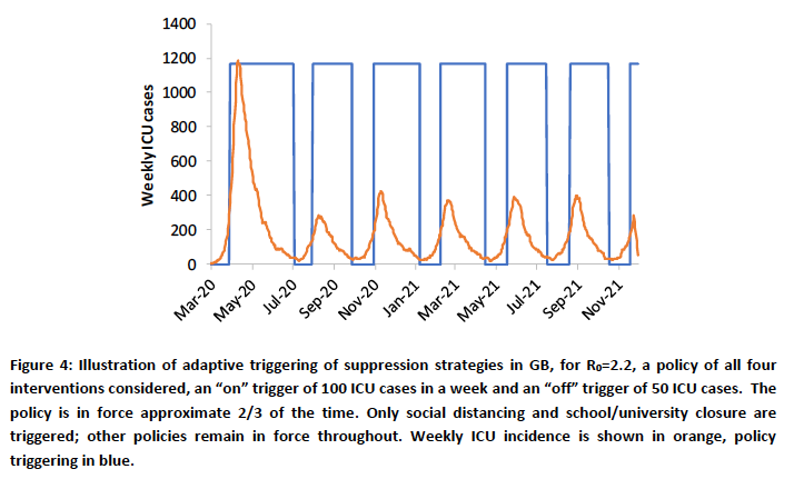
This presents a model that adaptively applies interventions, triggered by, and thereby controlling the number of high technology beds required across the country. My model can cope with setting these numbers at a population level, and one might interpret “critically ill” in my model as 40% of the SS number – again, a proportion that could be chosen to reflect the real numbers of beds required at any time, although Imperial’s multi-disciplinary team, with its financial support from the Medical Research Council, has access to much more detailed and specific medical and population data.
Epidemic life-cycle model for the US
The scientific-political background in the USA
In the six months I have been developing ideas for Coronavirus modelling, I have been increasingly surprised at the political motivations that appear to be behind the work of some scientists in this area, be they epidemiologists, data scientists or from other backgrounds.
This recent article by Stephanie Lee on Buzzfeed was originally published a couple of months back on July 24th, when I first saw it; it states that Public Record Requests in the US (similar to requests made under our UK Freedom of Information Act) provided her with redacted transcripts of some scientists’ attempted communications with the White House, in an effort, it would seem, to deter lockdown measures. This was in late March. I was extremely disappointed to see a Nobel laureate cited in the article as a possible member of this group, which puts forward such opposing views on lockdown measures.
It might explain not only some curious White House decisions (one of which was to replace Dr Anthony Fauci (an experienced and qualified virologist/epidemiologist) as Presidential adviser with Scott Atlas (a senior Stanford staffer, not in those fields, but in radiology)), but also some of the scientific material that seems to have been published in a reverse “confirmation-bias” sense.
Evidence and methods to support a particular outcome seem to have been used selectively to support some academic papers and social media publications (Twitter being, it seems, a novel and popular way for some scientists to get their message out).
Authors can suffer from confirmation bias too, citing preferentially supportive evidence, just as some readers might only select material that supports their preconceptions.
I am glad to see, from Forbes magazine, that over 70 Stanford academics (no doubt appalled by the recent advice and messaging to the US Government) published a rebuttal of the Atlas appointment, with the full letter here. When Atlas threatened legal action, according to Forbes magazine, over 100 Stanford academics responded with a second letter, saying “We believe that his [Atlas’s] statements and the advice he has been giving fosters misunderstandings of established science and risks undermining critical public health efforts.“
The recent “Great Barrington Declaration” (GBD), initiated by Jay Bhattacharya, Martin Kulldorff and Sunetra Gupta of Stanford, Harvard and Oxford Universities respectively, supports a herd immunity approach to the epidemic.
It very surprising to see some otherwise established scientists as apparent signatories to this Declaration, (together with many imaginary ones, such as Dr Harold Shipmans, Dr Person Fakename, Dr Very Dodgy Doctor, and a Mr Banana Rama as The Independent reports), while, reassuringly, large number of others in the academic world oppose it.
There are too many views to list them all here, but The Independent newspaper in the UK quotes Devi Sridhar, Professor of Global Public Health at Edinburgh University and an adviser to the Scottish government, and Professor Martin McKee, from the London School of Hygiene and Tropical Medicine, in opposition to it.
Prof. Sridhar is reported as saying “If you look at the advice of the WHO, health leaders in the United States, what they come out and say is that it’s not necessarily possible to build herd immunity to this virus.”
“Many governments thought that immunity would at least last a year, and at that point, if we still haven’t built herd immunity, all we’re going to see is cycles, waves of infection.”
Prof. McKee said that it reminded him of “the messaging used to undermine public health policies on harmful substances, such as tobacco”.
“Leaving aside the powerful arguments against this declaration on grounds of science and feasibility, we have consistent evidence that a clear majority of the British public support necessary measures to reduce the spread of the virus or it would go even further,” he said.
“Yet the campaign behind this declaration promotes a completely different picture.”
Comments opposing the GBD also include that of Dr Fauci; one from The Director General of the WHO; and one published in the Lancet, from many scientists well qualified to comment, including Prof. Marc Lipsitch, Professor of Epidemiology and the Director of the Center for Communicable Disease Dynamics at Harvard University, whose work I have quoted before, where they say “This is a dangerous fallacy unsupported by scientific evidence“.
Misinformation (in my view) as represented by the GBD is very disappointing and concerning, particularly as science itself is being given a bad name. While some might know enough to separate scientific wheat from chaff, what is the general public to think?
It seems to me that it is simply “populist” to appeal to public concerns, worries and fears about the virus, the economy and their jobs with self-serving and politically inspired messages, cloaked in scientific terms.
Reassuring views about developing herd immunity naturally, quoting such (misguided and misled) scientific supporters are more likely to be welcomed, in relief, by those worried by the situation, rather than the more realistic (and less welcome) warnings to take even more care with social distancing, and to comply with other measures that are disrupting lives and livelihoods, until an effective treatment and some immunity, most desirably in the form of a vaccine, appears.
The unholy trinity of 1) poor science; 2) politically inspired resistance to reasonable Non Pharmaceutical Interventions such as face-coverings and some other measures sometimes included in the broad term “lockdown”; and 3) the broader and increasing public tendency towards giving anti-vaxxers (and other pseudo-scientific nonsense and conspiracy theorists) credibility is very dangerous. One informed commentator, Prof. Lior Pachter, of CalTech, uses the term “lethal nonsense” about some of this science. His blog is somewhat more outspoken than mine.
USA cyclical modelling – a test case
The intervention status of my model for the US was essentially a “green field”, apart from an initial 74% effective intervention, and can therefore show the impact of any subsequent modelling methods and interventions clearly.
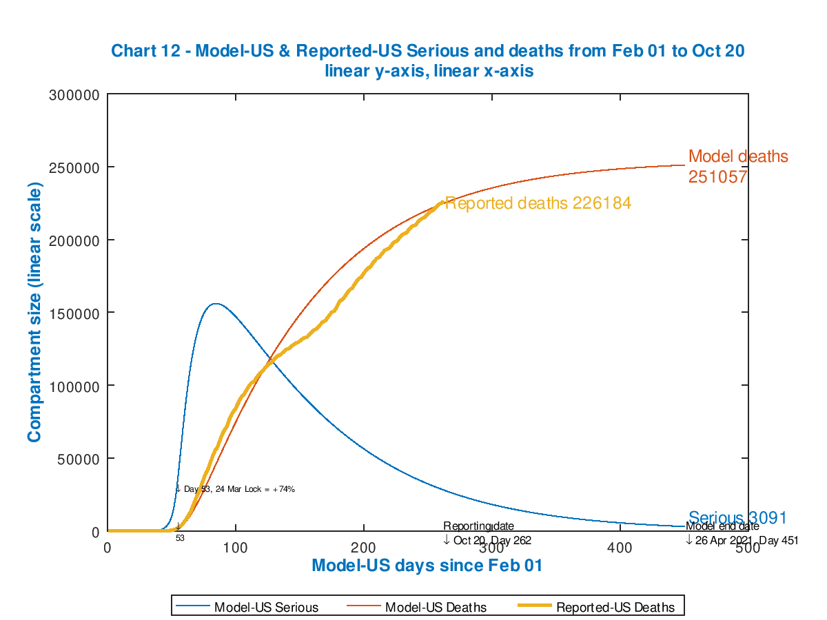
In my previous post on October 21st, I compared the base case and a cyclical (adaptive intervention triggering) case for the US, with these two charts. The initial intervention of 74% effectiveness on the left was followed, in the version on the right, by additional 10% adjustments up and down, in response to Seriously Sick numbers crossing upper and lower thresholds. The first 10% addition was on the same day as the original 74% intervention, and so in effect the first intervention was at 84% effectiveness (i.e. reducing the transmission rate of the virus to 16% of what it otherwise would have been at that point).

I have since revised the model coding to handle (and to annotate) this more effectively, with a similar aggregate introductory partial lockdown (parametrised in several steps in the slideshow charts below). This is followed by cycles of Intervention reduction and re-reinstatement, triggered on and off as the number of Seriously Sick (SS) patients crosses upper and lower thresholds.
The upper threshold, when extra measures take effect, remains at c. 17,000 SS cases, and the lower threshold for removing them is c. 7,500 SS cases as in my previous blog post, but I have increased the respective intervention effectiveness increments and decrements to +30% and -30% to show the impact more clearly.
I have run the model for several options for the intervention effectiveness percentages at the start, and present these in slideshow form so that you can run through them quickly, to see the sensitivity of the outcome to the intervention patterns. The reported number of deaths on each chart (the same for all, for comparison) are up to date, from Worldometers, as at October 24th.
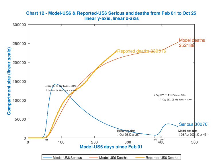
Chart 12 showing US modelled and reported cumulative deaths, with modelled Seriously Sick patient driven interventions. Reported data to October 24th. Initial lockdown 74% 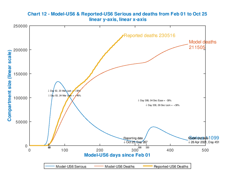
Chart 12 showing US modelled and reported cumulative deaths, with modelled Seriously Sick patient driven interventions. Reported data to October 24th. Initial lockdown 75% 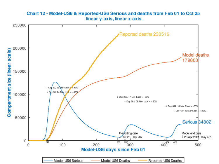
Chart 12 showing US modelled and reported cumulative deaths, with modelled Seriously Sick patient driven interventions. Reported data to October 24th. Initial lockdown 76% 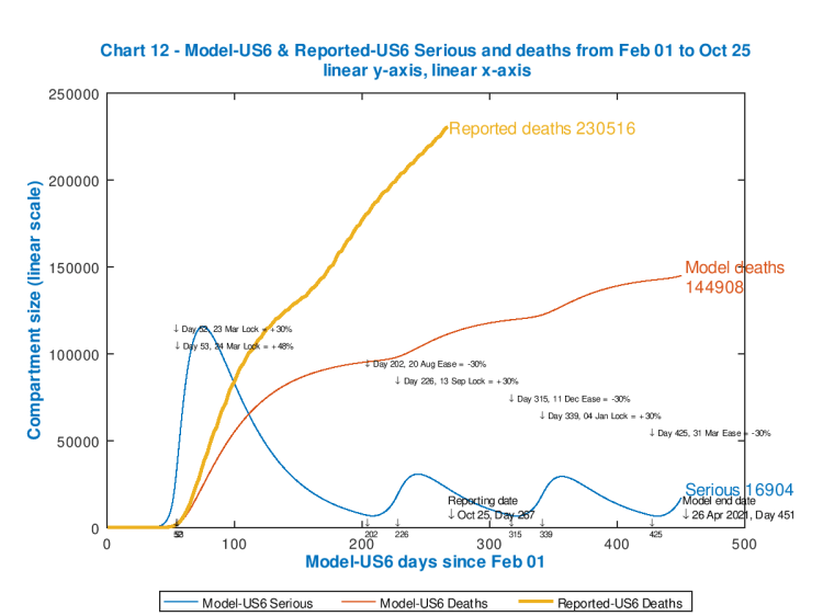
Chart 12 showing US modelled and reported cumulative deaths, with modelled Seriously Sick patient driven interventions. Reported data to October 24th. Initial lockdown 78% 
Chart 12 showing US modelled and reported cumulative deaths, with modelled Seriously Sick patient driven interventions. Reported data to October 24th. Initial lockdown 80% 
Chart 12 showing US modelled and reported cumulative deaths, with modelled Seriously Sick patient driven interventions. Reported data to October 24th. Initial lockdown 82% 
Chart 12 showing US modelled and reported cumulative deaths, with modelled Seriously Sick patient driven interventions. Reported data to October 24th. Initial lockdown 84%
Each chart shows the effectiveness of the starting and subsequent interventions, with their dates of application, in the body of the chart. Notice how each peak in Seriously Sick has a fast ramp-up but slower decline (as per typical infectious disease outbreaks).
As the starting intervention becomes more severe, followed by cyclical relaxations and re-impositions of the 30% increments/decrements in intervention effectiveness, the death rate is controlled though the control of the Seriously Sick cases at the thresholds, but the overall quantum of outcome is driven by (the effectiveness and timing of) that initial lockdown event.
As we see, the only model case that approaches the reported outcome for deaths is for the minimum postulated starting intervention effectiveness of 74% (because up to Day 400 that model chart reflects subsequent inaction). Clearly a more effective initial intervention (as the later charts show) would have been needed (in the real world) early on to make a difference to the currently reported outcome.
The most effective intervention pattern of those illustrated is for an initial 84% “lockdown” followed by cycles of 54% and then 84% as the SS number falls and rises (respectively) below and above the lower and upper thresholds. This reduces model deaths (by April 26th 2021) from 252,186 to 101,595.
It is indicative of the substantial loss of lives that late and inadequate action can cause, and no doubt these are the kind of outcomes that Government scientific advisers will have been presenting.
No relaxations of interventions at all (i.e. staying at 84% throughout) would be more effective in the narrow epidemiological sense, of course, but as we have seen, that is very difficult to countenance in broader health and economic terms.
We will see the University of Washington’s UK and US current projections, each with three sensitivities, later on, via the Worldometers website. They are sobering.
The impact of the timing of interventions
I showed in my blog post on May 14th what might have happened in the UK if lockdown had been two weeks earlier (March 9th), using the same % effectiveness as used in the model for the actual UK lockdown date, March 23rd.
It indicated that the timing of any interventions is indeed crucial. Other groups (e.g. that of Prof Kao’s team at Edinburgh University, that I reported on June 22nd, and whose paper can be seen in draft here, and where I also reported Neil Ferguson’s evidence in that regard to the UK Parliamentary Science & Technology Select Committee) also confirmed that many lives could have been saved with earlier action.
As I have said many times, in the UK context, early and decisive action is best in purely epidemiological terms. The negative impact on the economy (and on many other facets of people’s lives, including other aspects of their health, both now and later) certainly increases as the interventions become more severe; these factors of broader population and economic health are what Governments have to weigh when making their judgements.
The model can be adjusted in many ways, of course, but these charts show how any such notional intervention strategies can be evaluated using such models.
It is easy to see how forecasts made on the basis of “curve-fitting” have been confounded (as I have reported before, for example in my blog post on September 2nd) by the changes in the intervention environment (NPIs) and public responses. It isn’t possible to forecast on the basis of steering by the wake (as curve-fitting does) when underlying conditions are changing.
The current UK position
Because I have already introduced many interventions into my UK model, from March 23rd until the present day, the effect of any cyclical, adaptive interventions based on Seriously Sick numbers is not so obvious. I present the UK current situation below, in the same format as for the US, having matched the model to reported deaths up to October 27th.
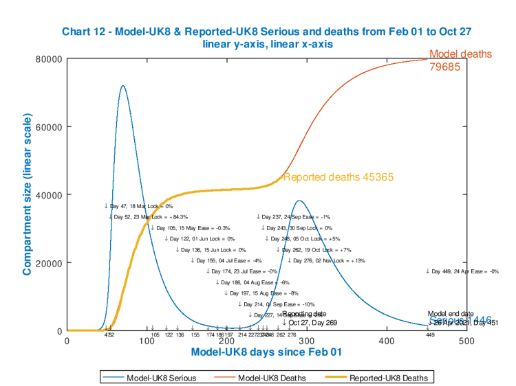
I have adjusted the existing model interventions, between 24th September and 19th October, to reflect what is, in effect, the failure of the UK interventions so far to control the case rate (and, to some extent, the death rate) up until the current reporting date (27th October), in the face of individual and population responses to the situation, after more than six months of social and economic disruption.
The match is so close that the chart lines for reported deaths to date (in orange), and for the modelled deaths (in red) to that point (October 27th, Day 269) are virtually coincident.
My original remaining planned intervention (so far) for the UK, on 2nd November, Day 276 has been upgraded to a 13% increase in effectiveness, to reflect UK Government plans and actions, which are to impose and potentially increase the intervention “tier” levels to cope with many local, and increasingly regional outbreaks.
The upper and lower thresholds for Seriously Sick are set at 7,500 and 3,500 respectively, the same proportions of the overall UK population as for the USA model above.
As far as those Seriously Sick patients are concerned, I have set additional interventions (both up and down) at 0% in this version, to show the accuracy of the unamended base model fit to the current situation. Those “zero” adjustments, as those thresholds are encountered, can be seen at days 47, 136, 243 and 443, as the number of Seriously Sick cross those respective thresholds each time.
As I write this blog post, however, on 27th October, I see that on the UK Government Coronavirus reporting website, daily cases are reported at 22,885 and daily deaths at a very high 367. I am sure that will include deaths not included in last weekend’s figures, as usual in the early weekdays; but nevertheless the trend is very much upwards, I’m afraid.
The full chart analysis is presented next, on Chart 11 as usual, where we can see the model tracking the actual data quite well, apart from case numbers, where, as usual, because of the under-reporting of cases, as discussed in previous blog posts (e.g. in my September 2nd blog post), the modelled numbers for cases are nearer to reality (in my view) and far higher than the reported numbers.
Imperial College runs a number of continuing epidemic data research projects under the “REal Time Assessment of Community Transmission” (REACT) banner. The earlier REACT 2 study, mentioned in my September 2nd blog post, reported 6% of 100,000 people testing with antibodies, which multiplies up to 3.5 million people (if reflective of the UK as a whole) with antibodies. In my charts, this would be modelled as cumulative cases in the UK, while less than 1/2 million cumulative cases were being reported in UK Government figures.
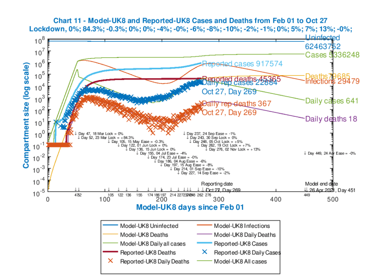
All of the interventions and their dates are tabulated in the body of the chart as usual (and successive intervention % effectiveness measures are in the sub-title line for the chart, where “+” is for uplifts and “-” represents easing of restrictions).
Reported numbers are annotated towards the centre of the chart, and modelled outcomes, for April 26th 2021, are on the right.
Modelled Uninfected, Cases and Deaths outcomes shown at the right are cumulative; the numbers for modelled Infections, Daily Cases and Daily deaths are as counted on that April 26th 2021 model end date (day 451).
Current Infections in the UK
Another study in the REACT series, REACT-1, has just reported that current infections are on the increase, with infection prevalence in England averaging at 1.8% of the population. If this were representative of the UK as a whole, this would be c. 850,000 people currently infected. Describing the outcome of this report, Professor Paul Elliott, director of the REACT programme at Imperial, said:
“These interim findings paint a concerning picture of the situation in England, where we’re seeing a nation-wide increase in infection prevalence, which we know will lead to more hospitalisations and loss of life. We’re also detecting early signs that areas which previously had low rates of infection are following trends observed in the country’s worst-affected areas. Now more than ever we must all work together to curb further spread of the virus and avoid subsequent overwhelming of the health service.”
Antibodies, immunity and vaccine
As I said above, Covid-19 antibody prevalence has fallen recently in England, according to the latest Imperial College REACT 2 study, one of the series of such studies they have published.
I reported their earlier REACT-2 findings in my blog post on September 2nd, when their study had indicated that 6% of the UK population are likely to have been infected by Covid-19 before (hence my statement above on the under-reporting of cases).
This latest instance of the REACT-2 work is reported thus: “Led by Imperial College London, analysis of finger-prick tests carried out at home between 20 June and 28 September found that the number of people testing positive dropped by 26.5% across the study period, from almost 6% to 4.4%.
As they say “These findings suggest that there may be a decline in the level of immunity in the population in the months following the first wave of the epidemic.”
I said in my most recent post that “herd-immunity” was unlikely to be reached through natural Covid-19 transmission (despite announcements such as the “Great Barrington Declaration” (GBD), discussed above), and that a vaccine is probably the only exit from the current epidemic, and then only through a regular vaccination programme, as for the several components of the UK annual winter flu vaccine that some of us get.
I covered the age-dependency issues in my blog post on September 22nd, partly by reference to Adam Kucharski’s work, which indicates the difficulty of insulating or segregating the older, more vulnerable population from the younger (more socialising and working) part of the population, where most of the cases have been recently.
More recently, on October 22nd, another SPI-M adviser to the UK Government (like Adam Kucharski, also at the London School of Hygiene and Tropical Medicine), Prof. Graham Medley, has published a short narrative piece in The Lancet, on this topic, where he says:
“The epidemic is ongoing, and it remains the case that although most people remain susceptible to infection, control of transmission has to be through non-pharmaceutical interventions. Isolation and quarantine, physical distancing, and contact tracing will be required until transmission is reduced by immunity. Ideally, this immunity will be vaccine induced rather than through transmission of the disease.”
“There have been increasing suggestions that one option is to simply protect everyone who is at risk of infection and allow the epidemic to spread in those at low risk…I noted that this approach is conceptually appealing but impossible in practice. It is not a strategy I endorse.“
I summarised the herd immunity and vaccination arguments in my last post on October 21st, which has additional references, including to my detailed calculations for the required herd immunity in my June 28th blog post, so I won’t repeat the arguments here.
But suffice to say that the latest REACT-2 paper very much confirms (as far as is possible from such on-the-fly papers, published, of necessity, without time for peer review) that herd immunity almost certainly requires a vaccine approach, to get anywhere near the required 70%, rather than 20% which seems to be the maximum achievable otherwise.
Author Professor Paul Elliott says “Our study shows that over time there is a reduction in the proportion of people testing positive for antibodies. Testing positive for antibodies does not mean you are immune to COVID-19. It remains unclear what level of immunity antibodies provide, or for how long this immunity lasts. If someone tests positive for antibodies, they still need to follow national guidelines including social distancing measures, getting a swab test if they have symptoms and wearing face coverings where required.”
Discussion
We are experiencing an upswing in cases and deaths in the UK (and elsewhere) at the moment. Depending on how long a safe, universal and effective vaccine will take to develop, we may be in for more ups and downs in the epidemic life-cycle, as Government and the population try to balance health and safety against negative economic and social impact.
In such a scenario, where there is a high dependency and sensitivity of outcomes on the timeliness and decisiveness of our actions, modelling and forecasting is particularly difficult, but does present a way to evaluate our options.
Worldometers & University of Washington projections
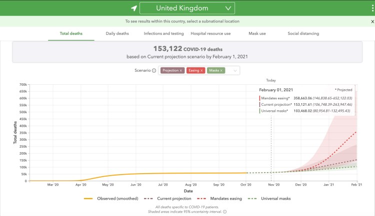
The Worldometers website for the UK (and here for the US), where I source my day-to-day cases and deaths data, links to the University of Washington’s forecasting site, which shows projected outcomes, ranging from dire to disastrous, depending on policies such as universal mask-wearing, projections based on current data, or relaxation of interventions (mandates easing). The forecast for the UK is here and is currently (October 29th) showing the following:
and here for the USA, currently (October 29th) as below:

which are truly staggering numbers. My own model’s forecast looks very conservative by comparison (although its outputs in this post are trial ones for the new cyclical modelling approach).
From the wrong end of the telescope, my perceptions of what is happening in the USA are hard to differentiate from my views about their political leadership. My points above refer.
Here in the UK, with which I am more familiar, and which has been my focus for the last six months, I don’t see the same level of political interference in the scientific outputs, or, indeed, as much politicisation of the science itself, although one leading UK scientist is implicated in the GBD announcement.
But we should learn the lessons from the timing of measures that were taken in March, and from a strictly epidemiological perspective I would like to see faster and more decisive action – commensurate with managing the economic, social and collateral health impacts.
Easy for me to say when I’m not running the country. But, in any case, I’d rather be in the UK than the US.
Concluding comment
I am pleased that my model, originally authored by Prof. Alex de Visscher at Concordia University in Montreal, and available in its original form at https://arxiv.org/ftp/arxiv/papers/2003/2003.08824.pdf, is flexible and capable of development to handle specific interventions and dates as well as the case-driven adaptive intervention management.
Having updated my model algorithm and code now, I will spend a little more time on the data inputs; the Imperial College model which is available, with its data, on their website at https://www.imperial.ac.uk/mrc-global-infectious-disease-analysis/covid-19/ should lead to some further lessons for my own work.

10 thoughts on “Adaptive triggering and the Coronavirus epidemic life-cycle”