
Summary
We have reached an apparently stable phase in the development of the SARS-Cov-2 pandemic in the UK, with recently flat active case rates. We can see that vaccination, instead of purely Non-Pharmaceutical Interventions (NPIs), is able to control many aspects of the development of the Covid-19 disease. This is in contrast to the situation in the EU, where some countries, despite quite high vaccination rates, are suffering what looks like the start of a fourth wave, according to some reports, which I report later in this posting.
Here in the UK, however, many professional modellers have issues with what could be more like a saddle point in the infection’s growth pattern, rather than full stability. At this point, it seems it could go either way; the virus could either decline, in response to vaccination, or grow, by taking advantage of mass festive season socialising. I compare and contrast the UK with the EU, and discuss Scotland’s situation.
Firstly, I want to explore the nature of the model I have been developing, from its original roots in a development by Prof Alex de Visscher at Concordia University, Montreal, that I reported in my 14th April 2020 blog post, up until now, and showing the current UK projections.
I summarise the many capabilities that I have found necessary and useful to add for modelling the behaviour of the pandemic:- multiple variants, different population age-groups, the effect of Government NPIs and public behaviour, and vaccination.
The current situation in the UK
Vaccination has allowed Non-Pharmaceutical Interventions (NPIs) to be reduced in the UK, culminating in the UK Government’s “Freedom Day” on July 19th, so that as long as a new variant doesn’t develop with more damaging transmission rate, virulence or mortality, social and working lives are returning gradually towards pre-pandemic levels.
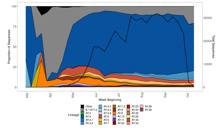
So far, despite representing 10-15% of Delta infections, the latest sub-variant of Delta, initially known as AY.4.2, later designated as VUI-21OCT-01, and described in detail in the UK Government Technical Briefing 26, is not thought likely to become significant, as I reported last time. This chart from the Briefing shows Delta sub-variant AY.4.2 in light blue.
In July, the average contacts per day per individual were reported by the BBC at about 4, compared with 10 pre-pandemic, which would be consistent with reduced infection transmission rates. Even so, most professional modellers in the UK have been surprised that infection rates have been fairly low so far, following the July 19th easing of lockdown, compared with their expectations. Some of their prior expectations of 100,000 cases per day seemed very high to me.
The following Chart 207 shows only Reported Cases, Active cases and Deaths, where a very slight flattening of the formerly slightly rising Reported Active cases can be discerned.
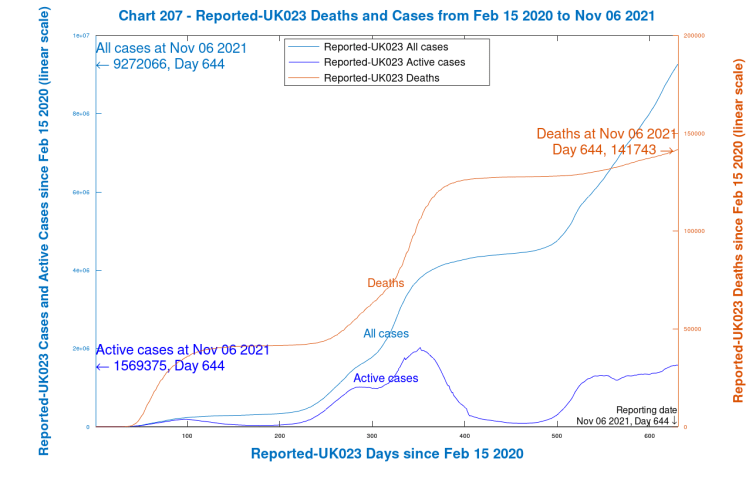
What does surprise me is that new Active cases have sustained a rate of 30k to 50k per day for several weeks, presumably just about matching the Recovery rate, keeping Active cases on quite a consistent plateau, along with a slowly increasing death rate, at about 150 deaths per day at present. My own model predicted (on a variety of parametric assumptions) that there should be a peak in active cases around now, followed by a decline.
There are worries that as winter approaches, and people spend more time indoors, with the festive season approaching, these rates might increase. There is parallel concern that winter ‘flu, having been absent last year, leading to a lack of immunity, may come back with greater severity this year.
The following chart 318 compares Reported and Modelled data, which shows my model’s outputs, run this week, compared with reported data, for a fairly conservative set of model assumptions. You can see the model’s predicted peak in Active cases (the thin red curve) in the next couple of weeks, along with a peak in Serious cases (the purple curve).
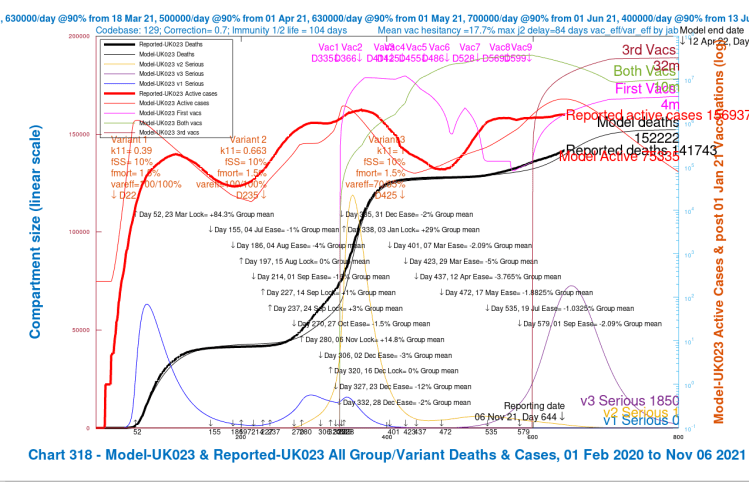
The previous peaks in Serious Cases are also shown in the model for the original variant (the light blue curve), with its further bounce in late 2020, before the steep climb in the Alpha variant (the yellow curve) after the Festive period, at the 2020 year end, and into 2021, supplanting the first variant.
Vaccination profiles are also shown on this chart, separately for first jabs only (magenta), for first plus second jabs (green), and for all three jabs (maroon). Thus the total vaccinations made (in the model) by day 800, April 12th 2022, would be 4m plus 2x10m plus 3x32m, a total of 120 million.
Note how the Reported active cases have plateaued, with cumulative deaths steadily increasing – their daily rate has been at 100+ for a while. The modelled Active cases peak during this period, and fall subsequently.
It is hard to escape the conclusion that reported and modelled cases and deaths, even though they temporarily diverge slightly, increase their rate of growth very soon after the Day 472, May 17th NPI relaxations, and through Day 579, July 19th, “Freedom Day”, as it was called by the UK Government.
The public seems to have responded to this bullish language, noting the reduction in vaccination rates about that time, although, thankfully, the rate seems to have recovered somewhat as, firstly, 16-17 year-olds were also offered vaccinations from August 23rd (Day 569), and, for older and vulnerable people, booster (third) vaccinations starting on September 22nd (Day 599), along with first vaccinations for 12-15 year-olds.
I haven’t added any further NPIs (either more severe ones, or relaxations) to my model beyond 1st September, although there will almost certainly be some downward adjustments (relaxations) to the model NPIs, reflecting more socialising during school vacations in the UK, with the subsequent Christmas and New Year festivities. If the UK Government comes off the fence regarding its Plan B NPIs, there would be increases in NPIs in the model to reflect that.
Without such NPI adjustments yet, the model shows Active cases declining soon, as you see, and although, as mentioned, there is some very slight indication of that in the reported data, reported (new) Active cases remain stubbornly pretty flat.
Most opinion supports the view that this sustained level of Reported active cases (the curve in heavy red) has something to do with immunity waning (which my model includes, as you see from the discussion below, at an average of 104 days) especially as the hospitalisation rates seem to be moving up the age range again (to those who had been the earliest to be vaccinated, the older and vulnerable) following an earlier period of growth in cases (and hospitalisations) in unvaccinated younger adults.
This is why the UK Government has set six months after second jabs as the booster jab eligibility interval (and have just announced that the advance online booking service will now start a month earlier, at the five-month point).
I have set the immunity half-life for unvaccinated people who have been previously infected at 150 days, but I set the corresponding half-lives for jabbed, but uninfected, people somewhat conservatively at 75, 100 and 125 days for single, double and triple jabbed people respectively, on the basis of the research mentioned in my latest October 19th blog post. This averages at 104 days, as the chart annotation shows.
Age related infection and death rates
I always run the model for four age/vulnerability groups, as follows.
| Group | Description | % of UK population |
|---|---|---|
| Group 1 | Younger adults, working and socialising | 33.5% |
| Group 2 | Mid-age adults, and carers | 30% |
| Group 3 | Older and/or vulnerable adults | 17.5% |
| Group 4 | School age children | 19% |
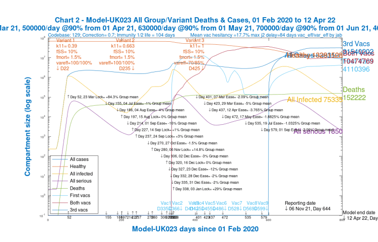
Whatever outputs are chosen for the model, it always calculates and solves the equations for the four groups and three variants separately, before aggregating them where necessary for charting and reporting. The overall model outputs, totalled over all groups and variants, are shown in the following Chart 2:
The outcomes, however, in the four age-group projections differ widely, especially as between children and old/vulnerable people, as we can see in the following group of four charts, one for each population group.
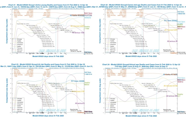
We see that for children (Chart 24) and younger adults (Chart 21), Active cases are high, but deaths are relatively low (and extremely low for children).
Although over the 2020-2021 course of the pandemic, cumulative deaths are highest for old/vulnerable people (Chart 23), by contrast, in 2021, after the beginning of vaccination in December 2020, the model shows, correctly, that deaths amongst older people are much lower (as are Active cases).
For younger and mid-age adults (Charts 21 and 22), however, they are increasing through 2021, vaccination having been later for these groups.
The following slideshow, comprising these same age-group charts 21-24, also including the aggregate chart 2 for all age groups, might enable visual comparison more easily.
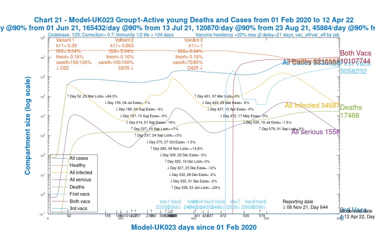
Chart 21 Group 1 Young active, for scenario UK023 with vaccinations. 17th May 1.8%, 19th July 1%, 1st Sep 2% NPI relaxations. v3 transmission k11 = 1, var_eff = 70/85%. v3 fss and fmort as v1 and v2. Model 800 day outcomes to April 12th 2022 – Healthy, All cases, All infected, Seriously Sick and deaths. 1st jabs from 1st June 2021, both jabs from 22nd June 2021. 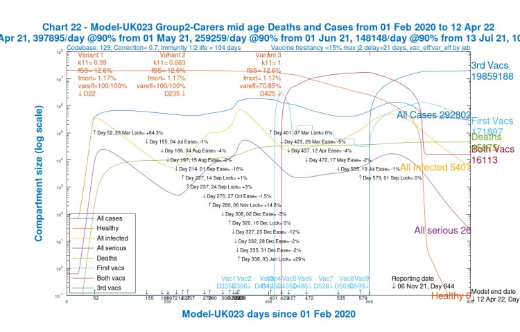
Chart 22 Group 2 Carers/mid-aged, for scenario UK023 with vaccinations. 17th May 1.8%, 19th July 1%, 1st Sep 2% NPI relaxations. v3 transmission k11 = 1, var_eff = 70/85%. v3 fss and fmort as v1 and v2. Model 800 day outcomes to April 12th 2022 – Healthy, All cases, All infected, Seriously Sick and deaths. 1st jabs from 18th March 2021, both jabs from 8th April 2021. 
Chart 23 Group 3 Old/At risk adults, for scenario UK023 with vaccinations. 17th May 1.8%, 19th July 1%, 1st Sep 2% NPI relaxations. v3 transmission k11 = 1, var_eff = 70/85%. v3 fss and fmort as v1 and v2. Model 800 day outcomes to April 12th 2022 – Healthy, All cases, All infected, Seriously Sick and deaths. 1st jabs from 1st January 2021, both jabs from 1st January 2021, Boosters from 22nd September 2021. 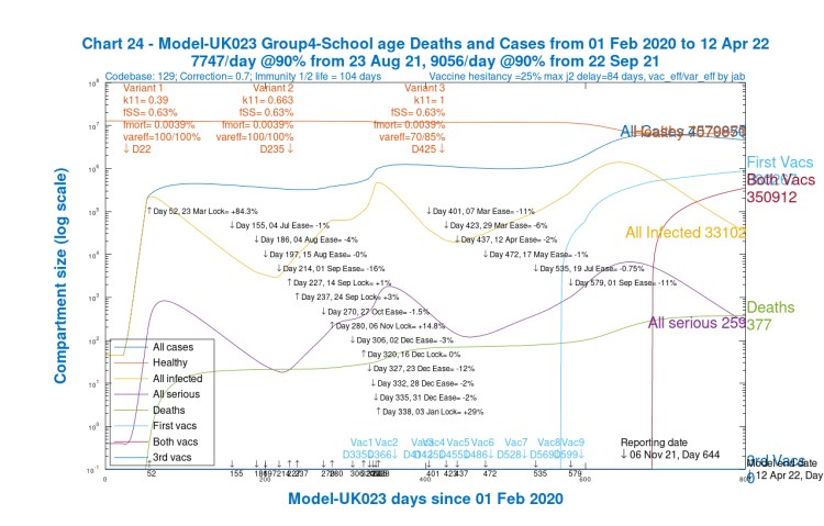
Chart 24 Group 4 School-age children, for scenario UK023 with vaccinations. 17th May 1.8%, 19th July 1%, 1st Sep 2% NPI relaxations. v3 transmission k11 = 1, var_eff = 70/85%. v3 fss and fmort as v1 and v2. Model 800 day outcomes to April 12th 2022 – Healthy, All cases, All infected, Seriously Sick and deaths. 1st jabs from 23rd August 2021, both jabs from 15th November 2021. Chart 2 for scenario UK023 with vaccinations. 17th May 1.8% ,19th July 1% and 1st Sep 2% mean NPI relaxations. v3 transmission k11 = 1, var_eff = 70/85%, fss x1 and fmort x1. Model 800 day outcomes to April 12th 2022 to November 6th. Active, all infected and serious modelled cases
The Variant view
The following chart 303 shows more detail about the phased effects of the three variants that we saw in the first Chart 318 in summary. It shows the original variant from March 2020, the Alpha (from September 22nd 2020) and Delta (from April 1st 2021).
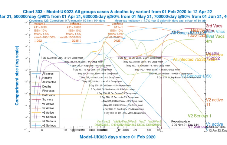
We have to bear in mind that the effect of the Delta variant, from its arrival in the UK in April 2021, would have been far more serious had vaccination not already started 3 months before; my January 2021 work on variant timing showed that variants that arrive in times of high NPIs and/or vaccination have less effect.
My March 2021 analysis with much more detailed UK data, in support of a submitted paper with Alex de Visscher and Tom Sutton, corroborated this.
But even so, in April 2021, Delta was so transmissive (2.5 times the original variant and 1.5 times Alpha) that it managed to gain a foothold and squeeze out the previous, less transmissive Alpha variant (2/3 the transmission of Delta), which had already been in decline, as we see from the charts 318 and 303, partly through the effect of vaccination.
Nearly all of the cases and deaths after May 2021 are from the Delta variant, and even at the 800 day point, many (1,850) serious Delta cases remain.
Discussion
The model has worked well in tracking, and then forecasting the cases and deaths from the pandemic in the medium term. I have always made appropriate model assumptions and adjustments regarding current and future NPIs and vaccination rates, and potentially different vaccine efficacies against different variants, as some others have, and so projections are not cast in stone.
The simulations (parametric runs of the model) serve to illustrate the more important influences on pandemic development. I have run several parametric runs for slightly different vaccination profiles and Delta sensitivity to vaccines, but without any new assumptions for Festive period public relaxations or Government NPIs. They show quite a consistent projection of declining serious cases, from the current peak, and deaths plateauing a little over 150,000, as the charts above show.
Booster jabs have now indicated how we might manage the endemic nature of SARS-Cov-2 in future, building regular vaccination updates into our annual (and possibly bi-annual) winter flu vaccination programmes, and this current phase of booster jabs is now included in my model, counteracting to some extent the immunity waning that is also included.
Model summary – for those who like to sweat the detail
For those who don’t want to sweat – click here to jump past this!
The model flowchart
My model is a more complex version of the Susceptible-Infected-Recovered (SIR) model I have described before, but at present with 228 compartments rather than just three, in order fully to describe the multiplicity of situations within which people can find themselves in the pandemic.
The compartment model divides the population into 228 clusters representing their status, beginning with Unifected (Susceptible in the SIR model) and then Incubating (I, IV, IV2 and IV3) as any become infected, asymptomatically at this stage.
All compartments are divided by age/vulnerability population groups (4 at present, labelled by “j” in the flowchart).
Infected compartments, Incubating, and then, as symptoms develop, Sick, Seriously Sick and Better are also subdivided by variant (3 at present, labelled by “i” in the flowchart).
There is an infection progression column in the flowchart for each state of vaccination – none, 1, 2 or 3 jabs – headed by U, V, V2 and V3 respectively. Each of them can lead eventually to a Recovered compartment, R, RV, RV2 and RV3 respectively, for each population group. People can also move across the chart, from U to V, then to V2 and then to V3, by being vaccinated at the rates r8, r28 and r38 indicated.
Finally there is one compartment for each population group, D(j) representing Deaths.
Flows of people between all of these situations are shown by the arrowed links, with the various “r” rates, which can also depend on i (variant) and j (group), also replicated for the four vaccination states, one column of the flowchart for each vaccination state.

Overall infection rates from infected compartments
A core part of the code sets up the “r1” array – aggregate rates of infection caused by the infected compartments, leading to transfer rates of people from the Susceptible compartments, U, V, V2 and V3, to the Incubation compartments I, IV, IV2 and IV3 respectively.
The aggregate rate of infection r1 determine the flow rates, for example from U (Uninfected Susceptibles) to I (Incubation) as per the SIR style flowchart above.
Similarly, infection rates r9 from V to IV, r29 from V2 to IV2, and r39 from V3 to IV3 are determined, which, importantly, allow me to track progress of infection (at much lower levels) in vaccinated people, as well as unvaccinated, through the pandemic.
Calculating the r rates
The concept of the model’s overall r1 infection rate parameter is very close to that of the “R(t)” effective reproduction number, representing the number of people one person might infect at any time. See the later section on R0 for the relationship between R0 and R(t).
The relevant variables are all calculated as arrays with dimensions related to jab (none, 1, 2 or 3), m (variant number, 1, 2 or 3 – i.e. original, Alpha and Delta respectively) and k (Population group 1, 2, 3 or 4 – young adults, mid-age adults, old/vulnerable, and children respectively, as in the table above).
Firstly, infection rates p1(jab, m, k), from any infected compartments, are defined and calculated iteratively by a loop over jab, m, j and k:
p1(jab, m, k) = p1(jab, m, k) + k11(jab, m, j, k).vac_inf_prev(jab, m).Ijab(jab, m, j) +
k12(jab, m, j, k).vac_inf_prev(jab, m).Sjab(jab, m, j) +
k13(jab, m, j, k).vac_inf_prev(jab, m).SSjab(jab, m, j) +
k14(jab, m, j, k).vac_inf_prev(jab,m).Bjab(jab, m, j),
where the k11, k12, k13 and k14(jab, m, j, k) arrays represent the proportionate infectiousness of people in the four infective states Ijab (Incubation), Sjab (Sick), SSjab (Seriously Sick) and Bjab (getting Better), of which there are four sets, one for each state of vaccination, all replicated for each population group j.
Cross-contamination code between population groups j and k in the formula above, summed over j, represents infections transferred between groups (e.g, between children and their parents). I use harmonic means of the infection rates in the source and target compartments for part of that.
I’d welcome feedback on whether/which of arithmetic, geometric and harmonic means are best used in infection contexts, but the harmonic mean, that I have used, is the most conservative (lowest), and is suited generally in mathematics to the “averaging” of rates. It is certainly more justifiable than the arithmetic mean, and, I think, better than the geometric mean.
The vac_inf_prev(jab, m) values are fractional multipliers representing the relative infectivity of vaccinated people vs. unvaccinated people for a given number of jabs jab, for a given variant m, compared to the original variant.
The “jab” suffixes for the compartment arrays, eg Sjab(jab, m, j), defined for the four sets of compartments separately for none, 1, 2 and 3 jabs (and also for each population group) allow me to index and track through the pandemic the different Susceptibilities and Infectiousness of people in those vaccination statuses (with higher susceptibility for no jabs, and relatively lower for various numbers of jabs, depending how many) with all of those able to be set by variant and by population group.
Infection rates q1(m, k) are defined for each group k, by variant m, by iteratively summing p1 over jab, starting the loop at q1(m,k) = 0:
q1(m,k) = q1(m,k) + p1(jab, m,k).
Finally, r1 is calculated from q1 acting on each of the four jab statuses, as the proportion of q1 acting on the relevant “susceptible” groups for each jab status:- on U for no jabs, and equivalently (at typically lower, and mutually different rates) on V, V2 and V3 (for single, double and triple jabbed people).
The divisor Pop in the formulae below is the total population, so that the effect of q1(m, k) for each variant and group is proportionately allocated to the numbers of people in the four Susceptible vaccination states (none, 1, 2 and 3) in each of the four population groups:
r1(1, m, k) = q1(m, k).U(k)/Pop,
r1(2, m, k) = q1(m, k).V(k)/Pop,
r1(3, m, k) = q1(m, k).V2(k)/Pop,
r1(4, m, k) = q1(m, k).V3(k)/Pop.
Other flow rates
Taking U as an example, vaccination rates r8_active flow out of U(k) to V(k) (modified by vaccine hesitation vac_hes(k) elsewhere in the code, varying by group), and similarly for flows r28 from V to V2 and r38 from V2 to V3.
Waning rates ri(jab, k) return into U(k) from the recovered R(k) compartment for the relevant group k (starting with jab = 1 for unvaccinated), and similarly for RV(k), RV2(k) and RV3(k) towards V(k), V2(k) and V3(k) for jab = 2, 3 and 4 at rates ri (2, k), ri (3, k) and ri (4, k), respectively as seen in the flowchart.
The r1(jab, m, j) calculated above (and the infection rates r9 from V to IV, r29 from V2 to IV2, and r39 from V3 to IV3 also derived directly from the r1) define the infected flows from the Uninfected compartments U, V, V2 and V3, starting the movement of people as the epidemic develops the into the various infected states and beyond.
The differential equations
Rate of change differential equations are defined for every compartment in the model. Every flow out of a compartment is matched by an equivalent flow into another compartment, balancing the whole structure, so that no people are “lost” in the model, apart from those who die and arrive into D. I include no demographic births and natural deaths in the model, since the timescale of 800 days for the simulation is far less than a human generational cycle.
The r1(jab, m, j) I have described are used in the Ordinary Differential Equations (ODEs) defining the rate of change of numbers in the uninfected compartments. For the rates of change dUdt(k) for U, for example, for group k are defined, iteratively again, starting at dUdt(k) = 0, by
dUdt(k) = dUdt(k) – r1(1, m,k) – r8_active(k) + ri(1,k),
summed over the m variants. Rates not depending on m, e.g. r8_active(k), are only included for once, for the first iteration, avoiding duplication.
Corresponding infection transfer rates r9, r29 and r39 from people in the three Vaccination statuses to similar Incubation states are derived from r1(2, m,k), r1(3, m,k) and r1(4, m,k) respectively, with multipliers such as (1 – vac_eff(1, 1) x var_eff(m, 1)) reflecting the relevant base vaccine efficacies vac_eff to groups (group 1 for this case) and vaccination phase (phase 1 in this case) by the proportion of the efficacy, var-eff, against subsequent variants m>1 compared to the first.
Equivalent balancing transfer rates r1(1, m,k), from U(k) into the Incubation group I(m, k) for each variant m, are included in the differential equation for the rate of change to I(m, k):
dIdt(1, m, k) = r1(1, m, k) – r2(1, m, k),
where r2(1, m, k) is the onward transfer rate out of Ijab(1, m, k) (Incubation) towards Sjab(1, m, k), the Sick compartment for unvaccinated people, and similarly for each vaccination state.
Such differential equations are iteratively summed over each variant m to include the further transfer rates that depend on m. For example for dUdt(k), in order that as many variants as there are (3 at present) all contribute; we add, therefore, to the dUdt(k) from the equation above, for each m>1:
dUdt(k) = dUdt(k) – r1(1, m, k).
As previously explained, r8 and ri, that don’t depend on m, only appear once, and aren’t added again, as they need only to be included for the first iteration, for m = 1.
The “half-life” interpretation of the transfer rates
Many of the “k” numbers, to which the transfer rates “r “are related by factoring in the size of the source compartment, represent the “delays” as between, for example, someone getting sick (S), and then either recovering to B (and then to R), or, alternatively, becoming Seriously Sick (SS); and if becoming Seriously Sick, and then either getting Better, or Dying.
Such k rates (per day), therefore, are effectively the inverses of the half-lives (in days) spent in those various compartments.
The immunity waning rates, ri
The immunity waning rate per day ki(1,j) for unvaccinated people (jab = 1) from R(j) to U(j), and defining Rjab(1, k) = R(k) (which allows me conveniently to index the Rjab(jab, k) values by jab, is given by
ki(1,j) = log(2)/150,
from which ri(1, k) is derived by
ri(1, k) = ki(1, k).*Rjab(1, k),
representing a half-life of 150 days for immunity waning ki(1,j), for unvaccinated people in group j, and similarly for other jab statuses for jab = 2, 3 and 4, with Rjab(2, k) = RV(k), Rjab(3, k) = RV2(k) and Rjab(4, k) = RV3(k). These half-lives can be set differently by group k as well as by vaccination status, and there is some evidence that this is indeed the case in practice.
We probably won’t know the full details of the relative infectiousness and immunity conferred by vaccination for a long time, allowing much more research to be done. This 24th May Nature article illustrates some of the complexities. Immunity waning certainly happens, but the article also says “Consistently, circulating resting memory B cells directed against SARS-CoV-2 S were detected in the convalescent individuals. Overall, our results indicate that mild infection with SARS-CoV-2 induces robust antigen-specific, long-lived humoral immune memory in humans.“
From Incubation to Sick, the r2 rates
r2 in the ODE for dIdt(m,k), for transfers from Incubation to the Sick compartment S, is derived from a daily rate per person k2 for group j, variant m and jab status jab, given by
k2(jab, m, j) = log(2)/5.1
representing a half-life of 5.1 days for Incubation of infection, with r2 given by multiplying k2 by the size of the relevant Incubating group Ijab by
r2(jab, m, k) = k2(jab, m, k).Ijab(jab, m, k),
and these k2 rates can also be set differently for jab status jab, variant m and population group k.
ODE summary – mechanistic modelling
ODEs, such as those described above, are defined for all of the compartments in the model, including all the various transfer rates between compartments representing vaccination, infection, illness, serious illness, and recovery or death.
Those infection rates are modified at every time step in the model by NPIs (Government actions, public behaviour and responses) and vaccination status prevailing at any time. All of this is done for all 228 compartments in the model at each time step (1 day) over 800 days for the simulation. That’s why it takes an hour to run on my MacBook Pro.
That processing load, and the combinatorial issues of data sourcing, are why I’m sure some such as Francesco Zonta, Andrea Scaiewicz and Michael Levitt like their phenomenological approach, as represented in their top-down Gompertz curve fitting to published data – just a few parameters, little data sourcing, little coding and little computer time (no matter how many countries).
That work was updated in the same authors’ latest publication, which uses a nodal network structure for the setup of the population and infective relationships, and mentions NPIs, so I guess they are moving to a more compartment-style modelling technique. More analysis to follow.
I prefer the bottom up specificity of my approach, which falls into the class of mechanistic modelling. It is so described because the ODE methodology allows the mechanisms of infection transfer to be modelled, taking account of the influence of prevailing conditions of NPIs, public behaviour, vaccination, immunity waning, vaccine hesitation and many other time-varying parameters.
This allows better forecasting (actually, forecasting at all) when environmental conditions change, versus the phenomenological top-down curve-fitting methods which don’t recognise the mechanisms (causations) of infection transfer for multiple variants, subject to the influences of the changing NPI and vaccination environment upon them. Curve-fitting is essentially “steering by the wake”, not a good idea when winds and tides can change.
In my opinion, having no forecast is better than relying on a bad forecast, and I’m afraid we have seen plenty of the latter from phenomenological methods.
But my mechanistic model is a lot of work, even for one country, let alone deploying it for a range of countries. A look at the EU, and then Scotland shows some of the country-specific data differences clearly.
A brief look at the EU situation
Comparing the situation in some EU countries with the UK highlights some of the differences that would need to be evaluated to arrive at the many relevant model settings required for each country, where some of the outcomes are hard to explain without a good understanding of the influence of underlying mechanisms and changing prevailing conditions on pandemic development.
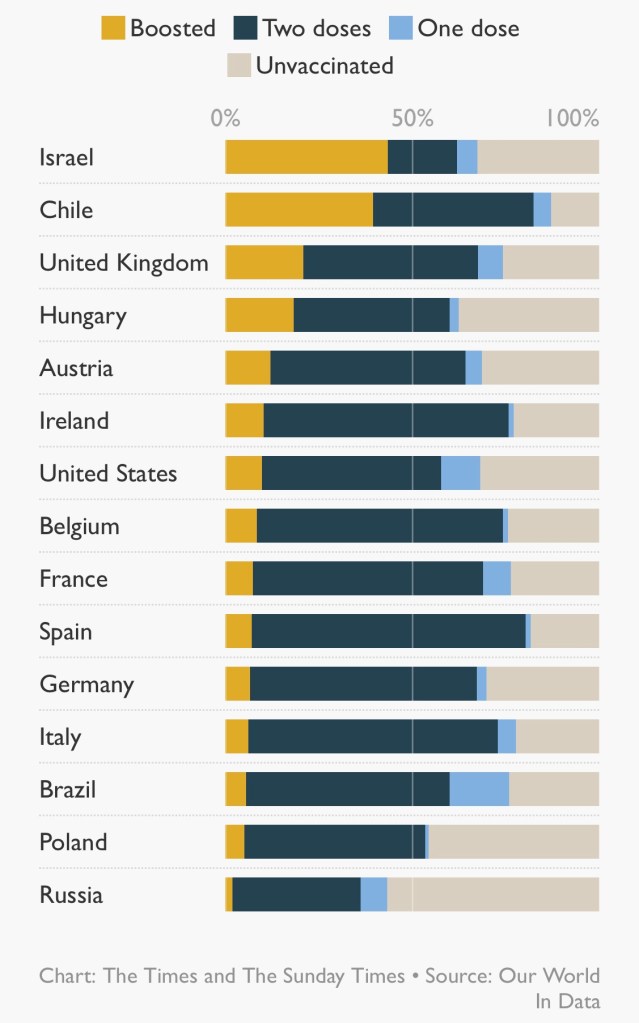
The BBC reports that case rates in some European countries are rising quite quickly, compared to the UK, leading some countries to consider re-introducing some major NPI measures – but not calling them “lockdown”, a term becoming politically unacceptable nowadays. The UK’s own Government Coronavirus news page, which reports in detail on the UK situation, also reports the following chart for Europe.

Four of the countries with the most steeply increasing case rates are taking special measures, as are some others.
Austria‘s government will order about two million people not fully vaccinated against Covid-19 to stay at home as the country experienced a record high in infections. Austria has one of the lowest vaccination rates in western Europe.
The measures, which come into force on 15th November, prevent unvaccinated people over the age of 12 from leaving their homes except to work, buy groceries, go for a walk or attend medical appointments, such as getting vaccinated. Jabs are now mandatory for health professionals. Unvaccinated students are also told to stay away from campus for two weeks. [Stop press: announced 19th November, from Monday 22nd November, Austria will move into complete lockdown for three weeks.]
The Netherlands is to re-introduce 7pm closures for restaurants, cafés and non-essential shops, restrictions on attendance at mass events, advice on working from home and limitations on numbers of domestic visitors.
Euronews reports that “Germany‘s disease control centre is calling for people to cancel or avoid large events and to reduce their contact with others”.
In its report on Belgium, Euronews stated on 26th October that the Belgian government had extended mandatory mask-wearing in indoor settings, and encouraged people to be more “prudent”, but stated that they would not limit activities. They also extended use of the health pass — the COVID safe ticket — to more events.
This is all despite the fact that vaccinations rates have been quite high in those, and in many other European countries, some with more percentage coverage compared with the UK.

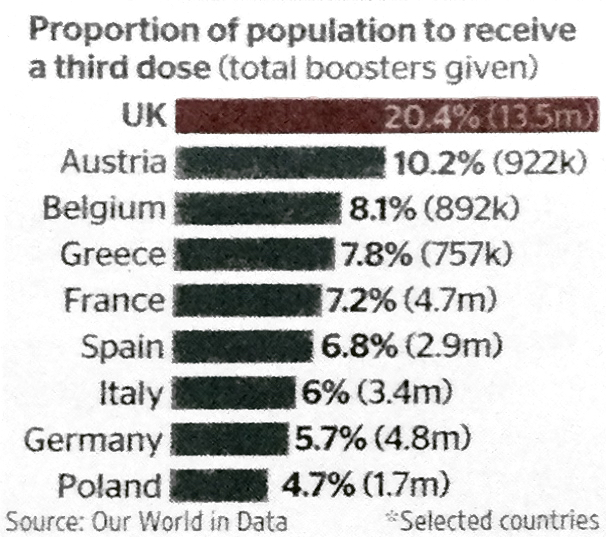
Many other factors, as we have seen in the UK, are involved too, including the proportion of the population that have received booster jabs.
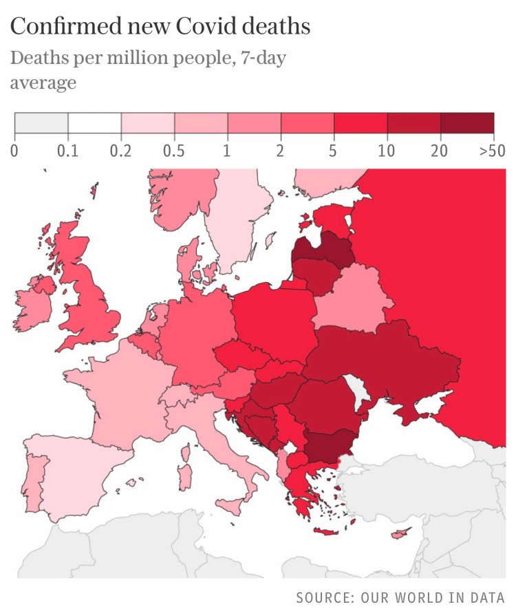
Euronews reports also include eastern Europe, some of whom are faring relatively even more poorly with the pandemic than western ones, as a Financial Times article discusses.
The following charts for eastern European countries, for cases per 100,000 and deaths per million, highlight, as the article says, that “the figures contrast starkly with western Europe, where death rates are about a tenth of those in the east and stand at less than one per million in several countries.”

The European Centre for Disease Prevention and Control puts the new wave down to the more transmissible delta variant, middling vaccination rates and a relaxation of social distancing measures in some European countries.
It predicts that only countries with vaccination rates of over 80 per cent – such as Spain, Portugal and Malta – will escape pressures over winter. “These few countries are likely seeing very little waves with a very low impact in terms of hospitalisations and mortality,” it said. We can see the broad picture for mortality across European countries in the following chart.
Contrast with the UK
As for the UK, the Prime Minister continues to say that he sees no need yet for the “Plan B” that appears as a potential option on the Government’s coronavirus website, while hinting that Europe’s woes might yet wash up on our shores, although most experts think this unlikely.
The Times newspaper quoted a UK Government source on November 20th as arguing that despite criticism of high case rates in the summer, it was helping to avoid a surge now. “Opening up in the summer was clearly the right call. But what Europe shows is there is absolutely zero room for complacency. The disease can move quickly, so the road ahead is not straightforward.”
We will see below that some experts think that the UK is now better protected, not only thanks to vaccination, but also because immunity was enhanced by our high case rates earlier in the year.
It has to be said, however, that cases having been high here since the summer, more than 14,000 Covid deaths have also been recorded since Freedom Day on July 19. This highlights the moral and ethical question involved in achieving national immunity even partly through natural infection, as well by vaccination.
Hospital admissions, which have fluctuated at between 700 and 1,000 a day for nearly four months now, are now starting to trend down as booster vaccines take effect.
UK expert opinion, and the importance of booster vaccination
Graham Medley, who chairs the UK Government’s advisory SAGE Scientific Advisory Group for Emergencies, was reported by The Times as saying that the size of the winter Covid wave would come down, owing to five factors. After vaccination [first], he says that reducing transmission is crucial. “This means [second] testing frequently, especially before and after events with multiple people. Third, if you test positive, then stay isolated, and [fourth] tell others that you have been with them so they can test or isolate themselves as well.”
His final [fifth] factor is protecting older and more vulnerable people by ensuring those carrying the virus avoid them.
As an older person myself, I’m not sure that I buy the feasibility or reliability of infected people avoiding me, other than through my own self-isolation. I would be more confident of the first four protocols.
The fifth was a “refinement” of his statement a year ago, which I reported in my October 29th 2020 blog post, when Prof Medley said in a narrative piece in the Lancet “There have been increasing suggestions that one option is to simply protect everyone who is at risk of infection and allow the epidemic to spread in those at low risk…I noted that this approach is conceptually appealing but impossible in practice. It is not a strategy I endorse.“
I had also pointed out the problems with isolating older people in my 22nd September 2020 blog post, citing work on social mixing by Adam Kucharski, and his Twitter thread, when he said “There have been attempts to have ‘shielding’ of risk groups (either explicitly or implicitly) in many countries. But large epidemics have still tended to result in infection in these groups, because not all transmission routes were prevented.“
Imperial College’s Prof Neil Ferguson, is reported by the BBC to have said that the UK is unlikely to experience a “catastrophic winter wave” of COVID cases that would require a Christmas lockdown similar to last year. He also indicated that booster jabs for younger people, after the priority groups, would help.
Paul Hunter, Professor in medicine at the University of East Anglia, believes that continental Europe is now behind the UK. “The UK is now in a better position in terms of immunity than most of Europe because we’ve had a lot of infections and we’re now rolling out the booster jab,” he said.
The UK booster vaccination programme has almost certainly already made a big difference, in the context of waning immunity from the earlier vaccination phases. Third jabs started quite early in the UK, just as the original vaccinations did.
There is a view that the booster jab is a game-changer, and that a third dose is not just a “top-up” — it completes the course, offering immunity levels that two jabs alone could not reach. Britain is giving booster doses faster than the rest of Europe, with more than twice as many doses per head as Austria, France or Germany.
Prof Paul Hunter said: “The early signs are that the booster provides substantially greater protection against infection and symptomatic illness than any two-dose regime. That protection may still wane but it will last longer than we’ve seen for two doses.”

Is Paul Hunter right, or does immunity waning have the same degrading effect on immunity after three jabs? There is an argument that, as long at the virus doesn’t mutate significantly, even as immunity wanes, the body learns how to react to the infection, and can still respond accordingly.
In addition to the 24th May Nature article mentioned above, a later Nature article said on 14th October “The most recent studies suggest that hybrid immunity is, at least partly, due to immune players called memory B cells. The bulk of antibodies made after infection or vaccination come from short-lived cells called plasmablasts, and antibody levels fall when these cells inevitably die off. Once plasmablasts are gone, the main source of antibodies becomes much rarer memory B cells that are triggered by either infection or vaccination.”
Age-related infection rates in the UK
The following chart confirms what I indicated earlier, that case rates per 100,000 of the adult population in the UK are beginning to fall slightly at the moment. I emphasise that this is a chart for recent months in 2021. If it were to extend back to 2020, it would show a very different picture as between the older/vulnerable groups vs. the rest.

Vaccination in 2021, including the recent booster programme, for which older and vulnerable people are again a priority, has made a huge positive difference in outcomes for the older groups, as I showed in my earlier comparative model charts for four population groups in the UK.
A further refinement of this chart was subsequently published, showing that children aged 5-9 (unvaccinated) now lead the case rates in England, having just overtaken children aged 10-15. It’s a complex and moving (in both senses) picture – in some age ranges it is a fluctuating picture.

This all serves to indicate that the detailed data behind any modelling is very important. As we look at the charts of reported daily cases in many EU countries, the outcomes can be quite counter-intuitive, as we saw earlier for the UK where proportionate case growth by age-range has moved from the older, to younger adults, and now to the very young, because of the movement in phasing and rates of vaccination across age and vulnerability groups.
These widely varying country outcomes show a) that pandemic modelling has to be very specific by country, not only because of the widely varying vaccination contexts; b) that outcomes vary by age/vulnerability group, which means that countries’ demographic differences are important; c) that parametric modelling is important to help decision-makers in different countries project the differential effects of their various mixes of potential mitigations; and d) that it is therefore important – and a lot of work – to ensure all such required data is available to a model to make any projections valid and useful.
A Scottish perspective
Living in Scotland as I do, I see some differences in the purely Scottish outcomes, since much of the pandemic management is local, even though the data driving my model’s outcomes are UK wide, and are therefore weighted by the populations across each of the home countries in the UK. These differences can often be timing differences, or differences of emphasis in the NPIs and public behaviour, and of course there will be demographic differences in population mix too, affecting vulnerabilities to infection.
There are some interesting comments at the Science Media Centre in early September regarding Scotland’s increasing case rates at that time. Prof Sheila Bird, at the MRC Biostatistics Unit, University of Cambridge, showed this table,
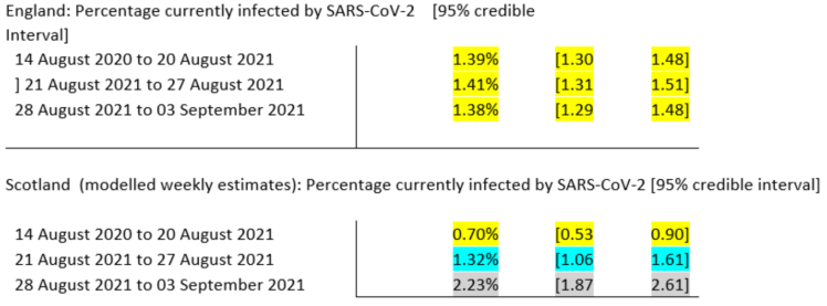
saying that “One possible reason for this divergence in recent weeks is Scotland’s earlier return to school – about 2 weeks ahead of England, but there are many factors which contribute to the prevalence of infection and so this is somewhat speculative, albeit anticipated.”
In my model, I had used the English date for the return to schools, September 1st, since this population is by far the largest of the four home UK countries.
Another, Prof James Naismith, Director of the Rosalind Franklin Institute, said “It was expected that Scotland’s school return (19th August) would lead to rise. Since English schools, did not go back until 1st September, the ONS data released today will not report on the effect of English school’s return. I would expect next week’s ONS data to show the beginning of a rise due to schools, this is because I expect England to follow Scotland.”
He also thought that “Too much political discussion focusses on the differences between the UK’s nations, with even scientists claiming one approach is much superior than another. The effect of these “differences” are rather small, looking at the data within England shows similar sized variations. The UK, either whole [or] as individual nations has had a depressingly terrible pandemic. The cumulative death rate (our world in data) is much higher than many comparable countries, not being the absolute worst is hardly worth bragging about.“
Prof Rowland Kao, University of Edinburgh, whom I have quoted several times before in my blog, notably regarding the cost in lives of the delayed lockdown in March 2020, said “Thus in many ways, Scotland’s experience can be viewed as a sneak peek into possible rises in cases that may occur in England over the next few weeks“.
There were more opinions from Prof Simon Clarke, University of Reading and Prof Kevin McConway of The Open University, who, like the others, are highly respected academic analysts, advisers and commentators around the pandemic.
Since those early September views, the BBC reports that in the last two months, the situation has changed again, with a large reduction in cases in Scotland, and just a modest increase in early November, as there has been in the UK generally.

The Times newspaper reports that “Covid deaths in Scotland are predicted to halve next month as vaccination levels continue to rise steadily. There were an average of 20 people with the coronavirus who died each day during the first week of November — however, an updated model from the Scottish government on how the country is coping with the pandemic expects that number to drop significantly.”
Along with much other detailed data, that weekly report number 77 from the Scottish Government, published on 4th November 2021, states that “Hospital and ICU occupancies are in a plateau. There continues to be uncertainty over hospital occupancy and intensive care in the next three weeks.”
The following chart from that report, covering case numbers in Scotland from July to early November, confirms the reductions shown above since early September.

The report also highlights that several data sources are used for the chart, with different cut-off points. As it says: “R, growth rate and incidence are as of 26th October (dashed line 1). The Scottish Contact Survey uses data to 3rd November (dashed line 2). The Scottish Government modelling of infections, hospitalisations and ICU beds, the long Covid analysis, the medium term projections and modelled rates of positive tests per 100K use data to 8th November (dashed line 3). Wastewater analysis uses data to 9th November (dashed line 4).”
Discussion
The requirement for such detailed and low level country data sourcing shows why I have focused almost totally on the UK, and not attempted multi-country modelling, except a year ago for the USA, when the situation wasn’t so complicated by multiple variants and vaccination, or even by any extensive federal programme of NPIs in the USA.
Nowadays we would surely have to analyse the USA on an aggregated, state-by-state basis, as, for example, vaccination attitudes vary so much across the political divide, and therefore across the geographical demographics, just as we should for Europe.
It is fair to say that even my modelling of the UK is a for an aggregate of four somewhat different home countries. One (England, 56.2m people) is much larger than the others, and my illustration of the Scottish situation (for about 5.5m people) indicates that timing differences aren’t too large. Wales comprises 3.2m people, and Northern Ireland is 1.9m.
The Scottish National Health Service is separately funded, but part of the whole in composition, spirit and ethos. Many of the English regions, as well as Wales and Northern Ireland, also exhibit differences of emphasis and delivery.
I am making the judgement that the principles of my modelling, and the relative importance of the model parameters, are valid UK-wide. Many of the experts quoted above, for example, expected England to follow Scotland(!) in relation to the two weeks timing difference in school terms.
How R0 and R(t) relate
That Scottish data mentioned “R“, and I take the opportunity to clarify the use of the term.
R(t), the effective reproduction number at time t, drops out of my model’s aggregate infection rate r1 calculation, pretty much, but I don’t report it specifically, or plot it anywhere. Maybe I should, but in my model it is a by-product, not a source of analysis. See my recent September 11th blog post for more on the relevance of R0 to infection modelling.
R0 is a fundamental characteristic of a (virus) variant, assuming a well-mixed target population. As soon as public behaviour is modified by NPIs, vaccination or anything else that affects contact rates and therefore infection rates between people, the focus shifts to the effective reproduction number, R(t), which varies through time.
During an epidemic, the effective reproduction number R(t) at any time t is what reflects the experienced infection transmission rates at that moment (not the theoretical maximum, represented by R0).
R(t) will always be lower than R0, because the “well-mixed” nature of the population (a simplifying assumption when looking at the initial threat a virus poses) is effectively always reduced by NPIs and vaccinations.
The Delta variant, whose transmission rate is 2.5 times that of the original variant, also has R0 2.5 times that of the original variant, pretty much by definition.
You can understand that if the effective R(t) < 1 is to be achieved, particularly for an extended period, it more difficult when the starting R0 ⩬ 7 for Delta, rather than when R0 ⩬ 2.5 (for the original variant), or when R0 ⩬ 4 for the Alpha variant.
Discussion
If you think the model description is too much detail, be grateful; my overall code is several thousand lines, across all of its modules. I have tried to summarise, however, some key structural points in the model.
I have also tried to show why data sourcing is quite an issue for such disaggregated models, requiring much work to adapt them to any particular country. It’s why I have focused mainly on the UK, with just the occasional foray into the USA, for example at Thanksgiving in late 2020, when the data was simpler (eg no vaccination), and thanks to President Trump’s federal inactivity. I saw possible parallels, and lessons to be learned, between pandemic development at Thanksgiving in the USA and at Christmas/New Year in the UK.
My previous 10th November 2020 blog post, Make America Well Again, showed some projections for the USA for the period from the November 3rd US Presidential election, through Thanksgiving, to President Biden’s Inauguration day on January 20th 2021.
My model’s calculation for the cost of inaction (minimal NPI adjustments) vs. an immediate and sensible national strategy for upgrading lockdown in that 70 days or so, at the end of 2020 and the beginning of 2021, was 56,000 American lives lost. Even if it were a fraction of that it would be too high a cost.
That post also provided a UK update for the period through the 2020 Festive period, which we are approaching again this year.
I will soon make some parametric runs for the 2021 Festive season, when, if public persuasion fails, and despite the Prime Minster’s optimism, I expect the UK Government to re-impose some NPIs (Plan B) to counteract some expected Festive relaxation of the precautions currently being taken voluntarily by the UK population.
I mentioned the concept of a “saddle point” at the beginning of this blog post. In simpler terms, Wikipedia describes it in general using the following illustration.
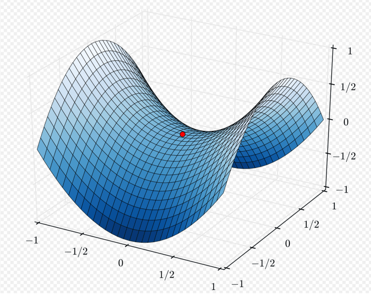
Starting at the red dot, representing where we are at the moment, things look fairly flat in any direction initially; but going far to the front or back of the saddle takes us higher, and going far left or far right, we go lower. We will see over the next few weeks which way the UK pandemic is going.
Concluding thoughts
I do expect the context for the pandemic in the UK to change – via plan B or otherwise – but I don’t expect the extent of negative outcomes we had last year, now that so many of us are protected by vaccination. Antiviral drugs such as Merck’s molnupiravir and Pfizer’s Paxlovid are also coming along, which look as if they will also be a big help, starting in early 2022.
I’m expecting, in the medium term, to move down the saddle, whatever the short term bumps (as Professor Jonathan Van-Tam, the deputy chief medical officer for England, warns us) into a situation where the epidemic becomes endemic, like winter ‘flu, which itself might be an issue this year, owing to the lack of immunity from last year.
We won’t, however, want to have to contend with another highly transmissive (or worse, a vaccine resistant) Covid-19 variant, or suffer more of that antivaxxer nonsense that encourages vaccine hesitation amongst those who don’t have a medical reason to do so, any of which would tend to take us higher up the saddle.
Let’s also hope that our optimism about the Delta sub-variant AY.4.2 is justified.

One thought on “Coronavirus pandemic modelling review”