
Introduction
My title for this post is drawn from a slide I have shown before, from the 17th April Cambridge Conversation webinar, which I reported in my April 17th blog post, and also in my April 22nd blog post on model refinement, illustrating the cyclical behavior of the Covid-19 epidemic in the absence of pharmaceutical interventions, with control of cases and deaths achieved, only to some extent, by Non-Pharmaceutical Interventions (NPIs).

I show this slide again, as it indicates similar, but independent views of two Universities of how the epidemic might evolve until a vaccine can be made available.
Even if a vaccine is feasible, we don’t yet know when and if a safe option will be available universally, how well it will work and for how long any conferred immunity might last.
I have made an adaptation of my own model to illustrate such a cyclical effect, both for UK and US data, although not as a forecast but as an illustration of how my model looks at the situation (and how it might be improved).
Adam Kucharski view on the epidemic lifecycle
Related to this characteristic cyclical projection for the epidemic is this series of tweets by Adam Kucharski (https://twitter.com/AdamJKucharski), a lead researcher at the London School of Hygiene & Tropical Medicine, whom I have quoted before in my recent post on September 22nd when talking about about age-related dependencies in the epidemic.
I’ll add his series of tweets verbatim, as I think it is important to capture the full meaning, relating as it does to my own opinion about “curve-fitting” methods for modelling the SARS-Cov-2 epidemic. I nearly said “forecasting” instead of “modelling”, but I simply don’t think the curve-fitting technique justifies that description.
Adam starts with “A short thread about a dead salmon and implausible claims based on epidemic curves…” and continues “A few years ago, some researchers famously put an Atlantic salmon in an fMRI machine and showed it some photographs. When they analysed the raw data, it looked like there was evidence of brain activity… https://wired.com/2009/09/fmrisalmon/“.
“Now of course there wasn’t really any activity. It was a dead salmon. But it showed that analysing the data with simplistic methods could flag up an effect that wasn’t really there. Which leads us to COVID-19…“
“Earlier in the year, there were widely shared claims that COVID epidemics followed a ‘natural characteristic curve’, implying they all declined because of immunity rather than NPIs (Non-Pharmaceutical Interventions). Models fitted to epidemic curves also made strong claims about level of immunity reached.“
“Bizarrely, some of these claims suggested even COVID-19 in NZ and SARS in 2003 followed such ‘natural curves’, despite both being contained rather than spreading widely in the population. Which brings us back to the salmon…“
“Outbreaks go up and come down for a range of reasons: seasonality, control measures, behaviour, immunity. In some cases the disease isn’t even contagious, and the shape just reflects the incubation period – below is a diarrheal outbreak (https://cdc.gov/csels/dsepd/ss1978/lesson1/section11.html):“

“When putting forward an analysis method, it’s therefore important to test it on ‘control’ data to show if method is flagging up patterns that aren’t really there. E.g. below countries had what might at first glance look like ‘characteristic’ epidemics that ended naturally.“
“Except they didn’t end. They had follow up waves, which don’t match a simple single peak pattern. In hindsight, it’s tempting to conjure up post-hoc explanations for the multiple peaks, but the key question is whether an analysis method could have concluded this in real-time.“
“In short: if we see someone making strong claims based on analysis of the shape of an epidemic, we should think of what ‘salmon data’ we can use to check whether the logic holds up.“
What we see here parallels my statements in many of my recent posts – that curve-fitting to current data doesn’t form a basis for projections or forecasting, as it ignores (as a phenomenological method), the underlying causations – the virology of the virus, Government (both national and local) actions to contain the virus, and individual and population responses to those interventions.
Modelling interventions
This is why I believe that a major and necessary part of a forecasting methodology is a mechanistic method that models those virus mechanisms, interventions and population characteristics, so that as well as a fit to current data (for which a quick view might be assessed through curve-fitting), we can make forecasts on the basis of postulated, projected, announced and actual Government interventions and individual/population responses.
Even those curve-fits to historic data should not then conclude that what is being reflected (as Adam says above) is the natural life-cycle of the virus within the given target population. The current and historic data that is being fitted is itself dependent on any Government interventions throughout that period, together with the population responses, which vary very much over time; the pattern of interventions varies between nations, regions and localities.
I have presented this table from the Imperial College modelling before, from their March 16th paper 9 that was influential at the time on the Government’s move to a lockdown approach.

This paper explored many intervention options, alone and in several combinations, to assess the potential outcomes, and I have referred to it many times. It includes, in its assessment of any current intervention approach, the effect on the longer term; as the paper says on its page 7:
“The aim of mitigation is to reduce the impact of an epidemic by flattening the curve, reducing peak incidence and overall deaths (Figure 2). Since the aim of mitigation is to minimise mortality, the interventions need to remain in place for as much of the epidemic period as possible. Introducing such interventions too early risks allowing transmission to return once they are lifted (if insufficient herd immunity has developed); it is therefore necessary to balance the timing of introduction with the scale of disruption imposed and the likely period over which the interventions can be maintained. In this scenario, interventions can limit transmission to the extent that little herd immunity is acquired – leading to the possibility that a second wave of infection is seen once interventions are lifted.“
Any modelling, therefore, should be able to take account of any such influences on the reported numbers hitherto, in order to inform the modelling/forecasting going forward; if those interventions change going forward, the model has to be able to reflect that in some way if a forecast is to be worth using.
The opening chart to this post concerns the cyclical nature of the epidemic based on postulated interventions that respond to ICU bed occupancy needs. There are other ways to do this, but a proper forecasting methodology should allow such strategies to be compared; this is what SPI-M (the Scientific Pandemic Influenza Group on Modelling) do, in advising the UK Government through SAGE (the Scientific Advisory Group for Emergencies) about such options. Both Imperial College and the London School of Hygiene and Tropical Medicine contribute to SPI-M.
United Kingdom model variations
I have good data concerning the various interventions and their timings for the UK, and so any future behaviour of the forecast starts with the current picture, which reflects the history of such measures in the UK.
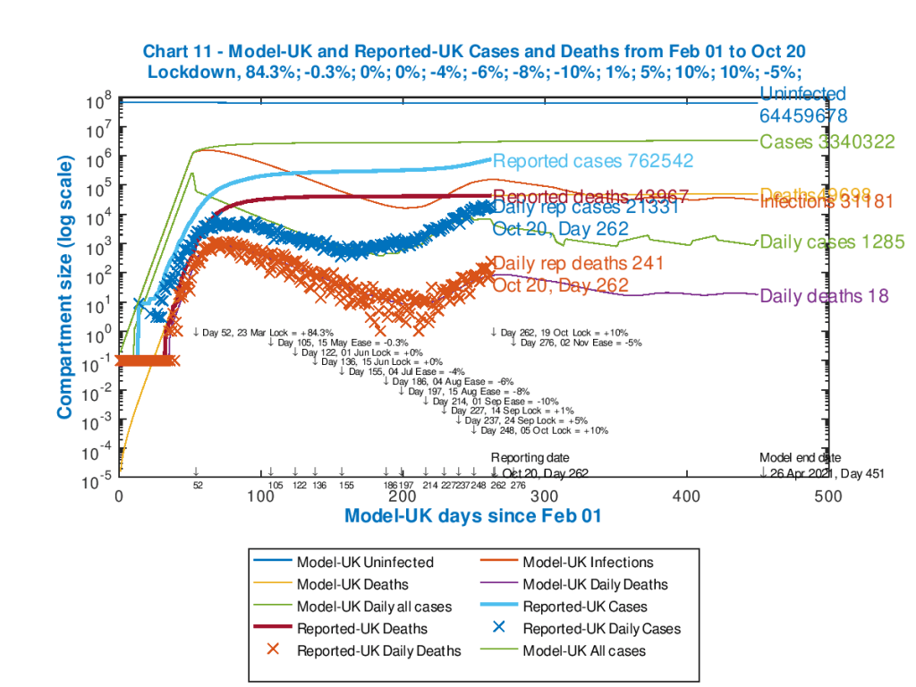
I reported this in my last post, on October 6th, postulating a school half-term “circuit-breaker”, on 19th October for 2 weeks, and I present the same model outputs here, although the UK Government have this last week been negotiating a set of regional and local “tiers” of partial lockdown in England, also reflected in various ways in the other home countries of the UK. Since the outcome of those negotiations isn’t yet clear, I will stay with the same model parameters for the purposes of this post.
Here is the previous Chart 11 from last time, depicting both cumulative and daily data, both for cases and deaths, and for both reported and modelled outcomes. I have updated it to the current (October 20th) reported data.

We see here that the reported UK cases and deaths are increasing, and this is likely to be the case until further UK Government intervention measures have had time to take effect.
While understanding the need for even more financial support for regions, it is surprising to hear some local government officials talking in terms of “a deal”, as if the epidemic weren’t a threat to health and lives. This a priori negotiation endangers the timing of interventions, which we have seen before is crucial to saving lives (see my May 14th post concerning what might have happened if lockdown had been two weeks earlier).
Imperial College periodic triggering
I show the Imperial College chart I have also used before that explains a little more about the trigger points that have been used to set interventions at any time, and then to relax them afterwards.
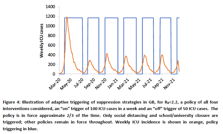
As indicated in this original Figure 4 caption in their pivotal March 16th Report 9, the Imperial College team used Intensive Care Unit (ICU) bed requirements as the trigger; bed requirements rising above 100 turns on the extra interventions, and reducing to below 50 turns them off again.
SIR modelling summary
I don’t yet have such a detailed way to manage this triggering, but my model (whose original version was authored by Prof. Alex de Visscher of Concordia University in Montreal, available in this paper) does have another aggregate way of doing this, which I have been exploring, using “Seriously Sick” numbers of people as the criterion for extra interventions.
The model is a development of the “Susceptible – Infected – Recovered” (SIR) family of models, where the population is divided into compartments, at any given time “t”, and differential equations manage the flow of people from one compartment to another according to parameters which describe the infectivity, duration and other characteristics of the SARS-Cov-2 virus. I described SIR models in my post on April 2nd, exemplified by a particular version, the Gillespie model, and also in my post on April 8th where I also showed how the R0 number calibrates the progress of the epidemic.
At its simplest, the SIR model has those three compartments; but my model (as described in Alex’s paper and in my blog post on April 18th) has seven compartments – Uninfected, Incubation, Sick, Seriously Sick (SS), Better, Recovered and Deceased.
Exploring the model – work in progress
While the SS compartment doesn’t exactly correspond either to hospitalised patients, or to ICU patients in particular, it does describe a sub-compartment representing people who are badly affected by Covid-19, and whose number we would like to control. Other compartments could be used, but this seems to be the one closest to an ICU interpretation, at some level. In the model, a fraction of the SS group can be used to reflect “critical” patients, and this is currently set at 40% of the SS compartment (but can be adjusted).
Thus, as I explore this aspect of my UK modelling, I have set an initial “trigger” point for further intervention at over 3,500 Seriously Sick people, and a lower trigger point of under 1,500, as a first data trial to see what the effect on the model outcomes might be. Often models can be counter-intuitive in their behaviour as there are so many “moving parts”; I was interested in model behaviour under these conditions. It also required a little more programming, so this is a work-in-progress at the moment.
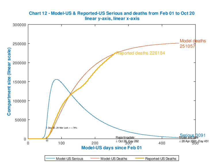
The simpler chart 12 below will allow us to see the effect in more detail. In the unconstrained case, Chart 12 (employing the same data as the fuller chart above) is presented next. It also helps that this chart 12 can be plotted on linear axes, since the chart doesn’t have to cope with variables in the millions (e.g. the cumulative cases) at the same time as much lower numbers in 1, 2 or 3 digits.
You can also see very clearly the capability of the model to embrace intervention timings and effectiveness, which are shown in the body of the chart.

The initial spike in Seriously Sick patients (the blue curve) was during the start of the UK’s Covid-19 UK epidemic, and the March 23rd lockdown (coded into the model) on day 52 starts to take effect, allowing for a delay owing to the incubation period of Covid-19, with the peak in Seriously Sick reached a little later.
The second hump in the chart for Seriously Sick occurs towards the end of summer, as the modelled intervention percentage effectiveness in the model is reduced to reflect Government and population relaxations in the lockdown measures and responses respectively.
As the increases in percentage effectiveness I have added in for September 14th, 24th and October 6th take effect on the growth in cases and deaths in late summer, reflecting some Government re-implementation of aspects of the interventions, that hump in the curve begins to diminish; after that is the postulated “circuit-breaker” on October 19th.
Probably a good deal more relaxation should have been built in to that late summer period, as we have seen a significant minority of people effectively becoming super-spreaders in their local areas.
Model chart for cyclicity
The corresponding chart to my main Chart 11 above, but for cyclical intervention controls on the Seriously Sick number is the following, where we can see the cyclical variations in the Daily Cases as the interventions take place triggered by the SS threshold (particularly the lower one).
My model technique for this is by no means perfect, in this first trial, and needs more work, but the outcome clearly illustrates a similar (but reduced) effect compared with the Imperial College (and Harvard) models. Managing the interventions through upper and lower thresholds for Seriously Sick numbers has some further implications too.
Here is the corresponding Chart 12 for this cyclical intervention management case.

This image doesn’t look so different from the previous Chart 12, but what can be seen at the lower right of the chart are bumps in the Seriously Sick curve, reflecting not only control of the upper threshold but also relaxation of interventions at the lower threshold (set at 3,500 and 1,500 respectively).
This effect doesn’t look so dramatic on the UK chart, because I had already built in a long series of interventions before this point (tabulated in the body of the chart), to reflect reality over the last six months, which has already brought the Serious Sickness rate down a great deal.
(In the next section, we will see for the USA, for which I have no added further interventions after the initial one to reflect the first response by the US Government in March, that a series of postulated subsequent interventions in the model make a very big difference.)
As we can see by comparing the two charts above, the numbers of Seriously Sick (SS) and fatalities go up a fraction by April 26th 2021 (because my lower bound on SS is still quite high at 1,500). In the model, there are periodic relaxations of the interventions in this version (following October) which aren’t in the base model (because I am trialling cyclical, SS-driven interventions), and these don’t impose such a tight control on the sickness and death rates as the original model.
I will continue to work with this, but I recognise that all postulated intervention measures nowadays are being taken against a background of a) herd immunity considerations for the future, b) the negative effect on the economy, c) other impacts on health, both mental, physical, and d) on the NHS, which all feed back to individual and population health.
The USA
I have less detailed data about the USA, but since my only intervention data point was for the initial lockdown, also in late March, modelled with an effectiveness of 74% (i.e. the transmission rate of the virus was reduced in the model to 26% of its starting number by a bundle of interventions on that date), it is possible to see the difference between no further interventions vs. the approach of adjusting intervention effectiveness upwards and downwards by triggering through the modelled Seriously Sick number.
I have set the upper and lower bounds at the same proportions of the much larger USA population compared with the UK. I have plotted charts separately for no further interventions, and for the cyclical/periodic intervention triggered by the Seriously Sick numbers. First, two charts comparing all the data.
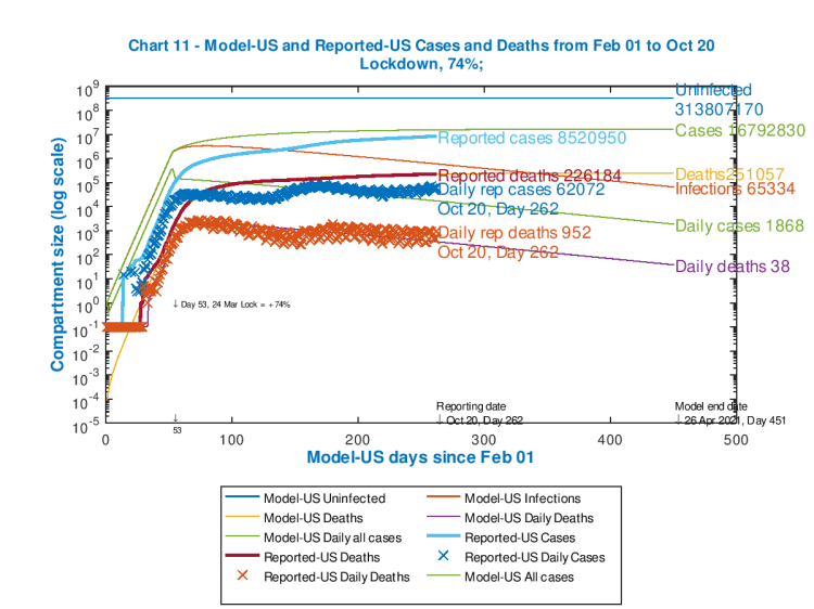

We see, in the case of such interventions, on the right, the much reduced number of modelled cumulative cases and deaths (down from 17m to 3m cumulative cases, and down from c. 250k to 135k cumulative deaths by April 26th 2021), although at the end of the simulation the daily rates of deaths and cases are higher than for no interventions (one of those counter-intuitive outcomes I mentioned before, as for the UK model). This negative aspect of the outcome can be reduced by reducing the lower threshold for Seriously Sick.
There is an aspect of “curve-flattening” to this, but the main effect is that severe measures early on, to drive down the steeply increasing case and death rate, become less severe, and are modified (downwards) as the Seriously Sick number comes within the bounds set.
A reduced lower (or indeed upper) bound would bring the numbers down in the long term, but by then (in the real world) other factors would come into play in any case – a vaccine, hopefully, or other management measures that are less invasive and damaging to the economy and to society.
A postulated vaccine delivery date, its rollout to the community in stages, and assumptions about its efficacy and the duration of any immunity conferred would all need to be brought into the modelling framework. SIR models can and do handle vaccine implementation.
See the section below about a vaccine model, which also throws up some counter-intuitive aspects.
Now I show the reduced charts for the USA, focusing more on the Seriously Sick (SS) curve, on the left with no interventions apart from the starting one, and on the right for the subsequent SS triggered interventions:

These charts show very clearly the reduction in cumulative deaths, and also the periodic or cyclical behaviour of the Seriously Sick curve as the intervention measures are varied automatically as the SS curve crosses the upper bound (once, and increase of 10% in effectiveness) and multiple times (five) for the lower bound (a decrease of 10%). Those two limits are set at about 17,000 and 7300 respectively (the same proportions of the overall US population as for 3,500 and 1,500 for the UK population).
After the initial spike in SS and deaths, the death rate in the model is fairly steady, because the SS rate (and by implication the case and death rates) are controlled by the periodic interventions within fairly tight bounds.
I emphasis that this is not a forecast, but is work in progress to explore how my model works for such a strategy, and to help assess parameters (and some coding logic changes) that best reflect that strategy.
I leave the reader to draw tentative conclusions from the comparison of the actual, reported deaths in these USA charts with the modelled numbers, reflecting a cyclical level of control on the modelled Serious Sick numbers through further interventions.
Is a vaccine the exit?
This 2011 paper on vaccine modelling (for influenza) is interesting as it also mentions some non-intuitive outcomes when disease transmission rates are time-dependent, as they are for periodic interventions (which modify transmission rates by, for example, social distancing and such measures) as well as for the changes brought about by a vaccine programme. As this 2011 paper says:
“Unlike in the case of constant parameters, where vaccination and treatment will always help reduce morbidity, the case of periodic transmission rate β(t) may generate non-intuitive results.“

What we see on the two charts on the right ((b) and d)) is the effect, in this model, of a 10-day delay in applying a vaccine.
The authors state “Results suggest that the effectiveness of vaccination and drug treatment can be very sensitive to factors including the time of introduction of the pathogen into the population, the beginning time of control programs, and the levels of control measures. More importantly, in some cases, the benefits of vaccination and antiviral use might be significantly compromised if these control programs are not designed appropriately. Mathematical models can be very useful for understanding the effects of various factors on the spread and control of infectious diseases. Particularly, the models can help identify potential adverse effects of vaccination and drug treatment in the case of pandemic influenza.“
Most commentators agree that anything we are doing before approval for a vaccine for SARS-Cov-2 is, in a sense, palliative, controlling the spread of the virus and reducing the load on medical services until a safe, effective vaccine is universally available.
I would also say that most (but not all) also agree that allowing parts of the population to be become infected, increasing the proportion of those with antibodies, through infection rather than vaccination, is not a feasible (or ethical) way to achieve a sufficient level of “herd immunity”. I discussed this in my August 14th blog post, also examining increasing case rates and age-dependency, as well as Sweden.
It seems that 20% immunity might be achievable in such a way, but the required 70% or so isn’t reachable, as this paper about Sweden authored by Eric Orlowski and David Goldsmith asserts, and that in any case many unnecessary deaths would result from such an experiment. For the size of the country, and compared with its more directly comparable nearest neighbours Denmark, Norway and Finland, Sweden might already have seen that.
I discussed and derived the necessary herd-immunity fraction (H) for Covid-19 in my blog post on June 28th. I showed that:
H=1-TD/d(loge2)
where TD is the case doubling time, and d is the disease duration.
For example, for doubling period TD=3 days (which was the unconstrained value we experienced early in the epidemic for Covid-19), and disease duration d=14 days, then H=0.7; i.e. the required herd immunity H% is 70% for control of the epidemic.
Presumably this might be why the USA’s Dr Fauci would settle for a 70-75% effective vaccine (the H% number), but that would assume 100% take-up, or, if less than 100%, additional immunity acquired by people who have recovered from the infection. But that acquired immunity, if it exists (I’m guessing it probably would at some level) is of unknown duration. Vaccination take-up is a whole other problem.
TD and d are also related to R0 (the initial value for R for the disease), which is given by:
R0=d(loge2)/TD.
Thus the other expression for H% is given by
H%=(1-(1/R0))*100%.
I covered these derivations in more detail in that blog post on June 28th.
Arguably, Governments have already made trade-offs between short-term improvement in case and death rates, and the longer term impact on, for example, herd immunity (in both directions, as we see the effects on the population and the country as a whole, and their responses). In my view, this is, of necessity, a temporising approach to allow us to get to the point of a vaccination programme with as little damage to the population and health services as possible.
I do hope and expect that a vaccine is an exit route; but this would probably be in terms of reducing Covid-19 (or any mutations) to an endemic (rather than epidemic) and possibly periodic illness, so that we can treat it more habitually as we do other seasonal illnesses, through the support of a regular vaccine programme.
I have just had my triple flu vaccine for this year – the adjuvated (enhanced effect) H1N1 (Guandong-Maonan) / H3N2 (Hong Kong) / Washington 02/2019 Influenza vaccine – and I would guess this will be the future for SARS-Cov-2 vaccination at some point.
Discussion
In practice, the Covid-19 picture is far more localised and regional than it was back in March. The national picture is far from even, therefore, with those local and regional variations, and in turn interventions are far less universal than they were before.
This is harder to model, mirroring the increased difficulty the UK Government has this time around in persuading many separate and diverse parts of the nation to comply with its measures – as well as designing those measures to be fair, proportionate and effective.
My purpose in illustrating the cyclical model output is to highlight that the Government advisers at the Scientific Advisory Group for Emergencies (SAGE), and through them the modelling teams at the Scientific Pandemic Influenza Group on Modelling (SPI-M), will be engaged in these kinds of considerations to compare and contrast strategies and their potential outcomes.
Models are very sensitive to input data, as we have seen, and to the timing of interventions, which also reflects the nature of a highly contagious infectious disease, with its tendency towards exponential (or sub-exponential) behaviour.
Early decisions and actions can have a big influence down the line. Correspondingly, delay also has a very noticeable effect (at least in retrospect, as I indicated in my May 14th blog post). Hopefully those lessons have been learned well from the Spring.
Concluding comments
I was pleased that my model (thank you Alex de Visscher!) has within it the means to model this kind of epidemic management strategy.
The detailed data, for example on population movement, working patterns and other behaviours is available to large modelling groups, but not readily to me. There is another advisory group, working through SAGE, the SPI_B (the Scientific Pandemic Influenza Group on Behaviours) dedicated just to the behavioural aspects of the epidemic.
Advisory groups also have large multi-disciplinary teams (I’m glad to say), embracing virological and epidemiological knowledge and expertise (that I don’t have) as well as statistical, mathematical and modelling skills, of which which I have some, but in limited quantity!
But my purpose all along is to illustrate and inform, and I hope this post, along with my previous ones since March, has done that.
I have yet to run the Imperial College Model (CovidSim), which is published as part of many resources they make available, which I mentioned last time, and which has been run by the Edinburgh University Physics and Astronomy department, with some success (in my view validating the modelling technique), and I will do that.
But my model is capable of still more, as I hope you have seen, so I will continue to develop it.

4 thoughts on “Where’s the exit? – Coronavirus”