
Summary
In my most recent post on February 12th, I described modelling work I had done in support of Prof. Alex de Visscher‘s paper, in conjunction with Dr. Tom Sutton, on “Second-wave Dynamics of COVID-19: Impact of Behavioral Changes, Immunity Loss, New Strains, and Vaccination” which has now been published for peer review as a pre-print on Springer’s site at https://www.researchsquare.com/article/rs-195879/v1.
This work, for which my UK modelling (reported over the last 12 months in my blog) was used as a case-study, showed Alex’s development of a group-based model, dividing the susceptible population into four groups – 1) active/younger; 2) care-givers/mid-life; 3) vulnerable at risk; and 4) school-going youth. This allows the different susceptibilities of these groups to Covid-19 to be coded into the model to help analyse the potential outcomes, given different parametric inputs to a theoretical model.
Some time ago, in my blog post on September 22nd, I discussed the age-dependency of risk to Covid-19 illness, with references to social mixing and the difficulty of isolating parts of the population from each other. Adam Kucharski’s work, reported in my blog, showed data on such mixing, which showed the futility of a strategy of allowing younger people to mix and work freely, while isolating more vulnerable and older people, and expecting Covid-19 illness not to spread.
Nevertheless, some Covid-19 aspects are dependent on such broad groupings, such as vulnerability to severe illness and death, and, in the UK, the prioritisation of vaccination of the community.
Some mixing in the new model is allowed for by a cross-contamination factor between groups.
My existing model is working well, and still fits the progress of the UK Sars-Cov-2 epidemic in the UK, and is applicable to other countries. For that model, I have built developments for multiple variants and vaccination, reported in several blog posts, with the most up-to date being my blog post on February 12th referred above. I have now added such functionality into the new grouped population model, and this blog post reports on progress with that new model.
Introduction
In the model I have used the latest UK vaccination progress figures, and the UK Government’s announced intentions for the near future regarding the priority groups for vaccination. So far, I have mostly used Alex’s mortality and infection characteristics for the four different groups, although I have modified some parameters for Group 4, school-age children; the fraction becoming seriously sick, fSS, and associated mortality, fmort, since UK evidence reflects very limited propensity for children to become seriously ill, as well as nearly zero death rate.
I have included my previous three variants – the original one from early 2020; the “Kent” variant from September 22nd 2020; and a putative third one, to represent a possible Brazil or South African variant, from January 1st 2021.
As with my previous modelling, the third variant doesn’t make an impact, since it arrives (into the model) when Non Pharmaceutical Interventions (NPIs) are already high (and vaccination has just started to become effective). Current “surge” testing in postcode areas of the UK where a small number of these “third’ variants have been found has indicated only hundreds of cases, and so the model’s indications are reflected in reality.
I present charts for the overall comparison with published figures for cases and deaths, the contribution of the three variants, and also, utilising the group modelling, charts for each of the four population groupings.
The model is now ready for me to add the start of the UK return to schools (March 8th) and further, gradual relaxations of the current lockdown, and I will add those in a further paper shortly.
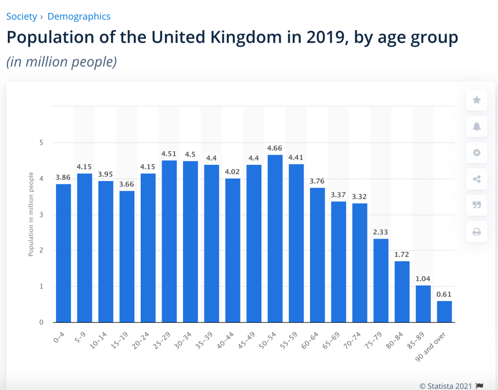
UK Population
Since a fundamental of the new model structure is the ability to break the UK population down into age-related risk groups, my starting point for the sizing of the groups is the following useful presentation from Statistica:
Priority list and schedule for vaccination
My earlier modelling, reported in my recent blog posts, indicates how vital the vaccination programme is to allow NPIs to be reduced during 2021. The possibility for NPI relaxation closely mirrors the vaccine deployment, as shown in my blog post on February 12th, and which Alex, Tom and I covered in the paper referred above.
“The outcome is that the vaccine programme in the UK has the potential to reduce the imposition of NPIs on March 7th by about 15%, without costing lives, this being the next time we in the UK are due for a major NPI review, potentially involving the return of schools at around March 7th.“
Thus a key corollary to the population data is the UK Government’s published vaccination schedule, which I use as data for the model, together with the vaccination rates and changes of vaccination efficacy, and the UK Government’s announced NPIs.
The Government decided to focus more on first inoculations, delaying planned second inoculation from the three weeks originally envisaged (and approved by the UK Regulatory Agency) to a maximum of twelve weeks. Most authorities around the world have supported such a move in principle, to help protect more people as soon as possible, since first doses were shown to confer reasonable protection.
The University of Sheffield reported their study with other Universities, including Oxford University and the University of Liverpool, which found that 99 per cent of people generate a robust immune response against Covid-19 after just one dose of the Pfizer vaccine.
The study, conducted by the Universities of Sheffield and Oxford also found that people who had previously been infected with the virus achieved extended immunity after one dose. This should encourage the take-up of the second, booster vaccine dose to achieve a similar effect.

Soon after this list was announced, the Government published further details about the schedule for some of these groups:
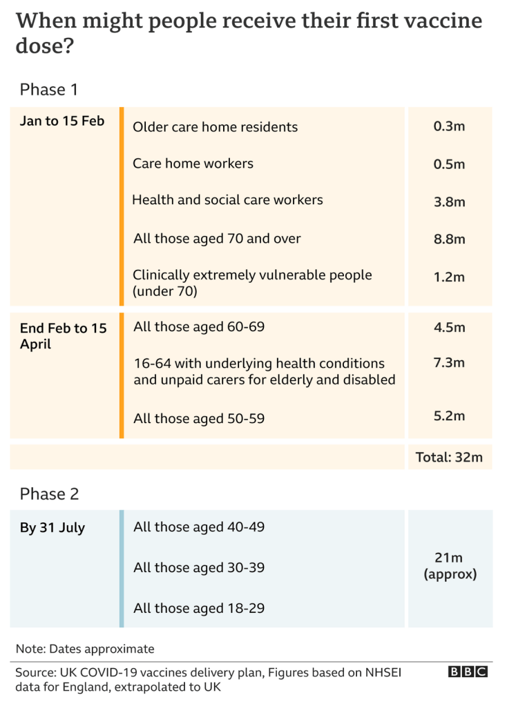
Despite some threat to vaccine supplies from Europe during April (a case of of “chien dans la crèche” or “Hund in der Krippe” perhaps?) the Government says that this schedule remains on track, so I have built this into the model.
As the BBC went on to say for those second doses:

There is no UK approval yet for the vaccination of children, and the serious illness and death rates from Covid-19 for children are very small, as reported in The Times in August 2020 (at a time when the second and third waves of infection had not yet been suspected).
Population groups in the new model
The total UK population in the model is 67.8 million, and utilising the population data above, I have defined the four groups for this first trial of the new model fairly simply, adding some variation to the age bands to help represent more closely the priorities for vaccination. I have weighted the % totals to add to the known UK population total (since there is some overlap in the numbers when vulnerability aspects are taken into account).
| Groups | Name | Age range | Total | weighted % of 67.8m |
| 1 | Active/younger | 17-39 | 23.68m | 33.5% |
| 2 | Caregivers/mid-age | 40-64 | 21.25m | 30% |
| 3 | At risk | 65+ | 12.39m | 17.5% |
| 4 | School age | 0-16 | 13.42m | 19% |
Non Pharmaceutical Interventions (NPIs)
The new model was developed for a theoretical population of 100m people, with 4 groups (the main focus) and five NPIs (each of them able to be tuned separately for each of the four groups). In reality the UK has imposed graduated NPIs far more frequently, which I have added into the model.
I have added new variants and vaccinations to it, and it is interesting to compare projections with my existing model.
For the 2020 history, I have chosen NPIs close to those I used for my existing model, simplified where possible to reduce complexity. Some of them had been set to zero in the original model, as they had been ineffective in practice in the light of public response to them. In the new model they still correspond to step changes in the UK Government’s lockdown and easing measures, starting with the original lockdown on March 23rd 2020, with the final data point for NPIs in the model on January 3rd 2021. The new model NPIs are:
| Day number | Date | NPI effectiveness change | Cumulative NPI status |
|---|---|---|---|
| 52 | 23/03/2020 | 88.25% | 88.25% |
| 155 | 04/07/2020 | -4.00% | 84.25% |
| 186 | 04/08/2020 | -6.00% | 78.25% |
| 197 | 15/08/2020 | -4.00% | 74.25% |
| 214 | 01/09/2020 | -9.00% | 65.25% |
| 227 | 14/09/2020 | 2.00% | 67.25% |
| 237 | 24/09/2020 | 2.00% | 69.25% |
| 270 | 27/10/2020 | -3.00% | 66.25% |
| 280 | 06/11/2020 | 10.80% | 77.05% |
| 306 | 02/12/2020 | -2.00% | 75.05% |
| 320 | 16/12/2020 | 2.00% | 77.05% |
| 327 | 23/12/2020 | -2.00% | 75.05% |
| 332 | 28/12/2020 | 2.00% | 77.05% |
| 335 | 31/12/2020 | -2.00% | 75.05% |
| 338 | 03/01/2021 | 10.50% | 85.55% |
The % NPI effectiveness changes mean that the normal transmission rate of any virus variant (people infected per day by an infected person) is reduced by that % figure; thus the simulation’s first lockdown reduction of transmission rate is on March 23rd by 88%. Equivalently, the transmission is reduced to 12% of its usual value.
Measures (NPIs) such as social distancing, shielding, working from home where possible, and/or all the rest of the measures enacted at any particular stage are represented in the model by different % changes in the model NPIs at those points of UK Government NPI changes and public responses.
In my next blog post, I will address the return to schools on March 8th (already trailed in my February 12th paper blog post) and further projected easing of the lockdown in the Government’s planned schedule, but for this post I am focusing on the base outlook from a known position at the very start of 2021.
The UK Government has allowed itself an interval between each successive NPI change, for analysis of the effectiveness (or otherwise) of the change, and reserves the right to adjust measures and their timing in the light of outcomes.
Group mortality
As it is well documented that children suffer far less serious symptoms from Covid-19, and that mortality is far lower than for adults, I have modified those parameters for the model for the UK situation. Other aspects of the role of children in transmission are not so clear. My changes for the fraction reaching Seriously Sick state (fSS), and mortality rate (fmort) are as follows:
| Group | Description | % of population | fSS | fmort | New fSS | New fmort |
|---|---|---|---|---|---|---|
| 1 | Active/younger | 33.5% | 4% | .2% | 4% | .2% |
| 2 | Caregivers/mid-age | 30% | 10% | 1.5% | 10% | 1.5% |
| 3 | At risk | 17.5% | 20% | 8% | 20% | 8% |
| 4 | School-going | 19% | 4% | .2% | .5% | .005% |
United Kingdom Reported Cases, active cases and deaths
The first chart 207 shows only reported data for the UK, sourced from the Worldometers UK website.

We see the 2021 significant reduction in active cases, leading to flattening of the overall cumulative cases and deaths curves in recent weeks. I use this reported data in the following Chart 17 to compare with my model predictions.
Charts for the group UK simulation
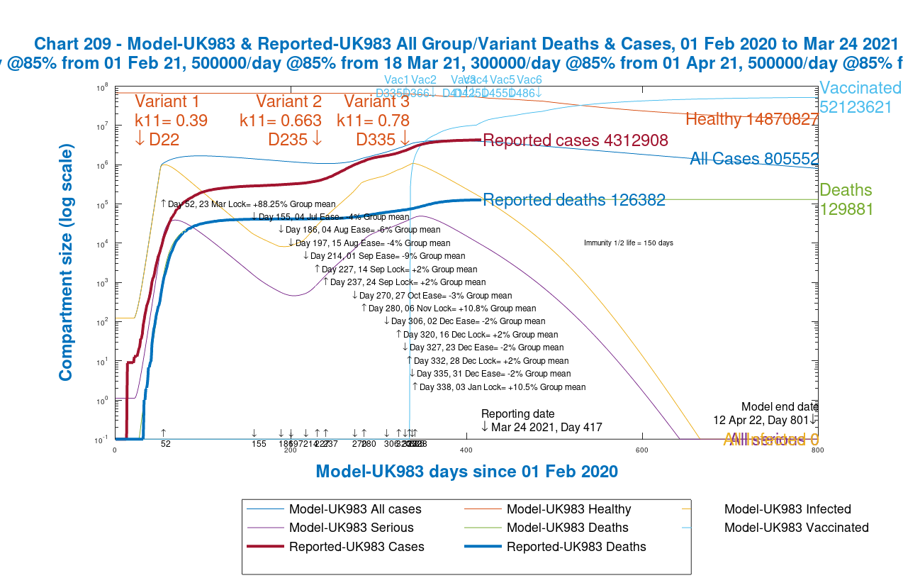
The following charts show the overall modelled progress of the pandemic in the UK, up to date as at March 24th. First, Chart 17 which compares the overall outcomes for active cases and deaths with the reported data above.

The fit of the modelled pandemic for this grouped version isn’t quite as close as for the original model, which has been refined over many months, but there are many more parameters to set in the new model. Instead of 16, the new model has 64 compartments, the term used for the sets of people in SIR models (the three compartment Susceptible-Infected-Recovered models that I described in my April 8th 2020 post) in different stages of health or illness. For four groups, and three variants, we have the following classifications:
| Compartment | Description of compartments | How many |
|---|---|---|
| U | Uninfected/healthy for each group (4) | 4 |
| V | Vaccinated people for each group | 4 |
| R | Recovered people for each group | 4 |
| D | Deceased individuals for each group | 4 |
| I | Incubating infected people, one per variant (3) per group (4) | 12 |
| S | Sick infected people, one for each variant, per group | 12 |
| SS | Seriously Sick, one for each variant, per group | 12 |
| B | Better people (recovering), one per variant, per group | 12 |
| Total 8 | All modelled compartments | Total 64 |
For the time being, I won’t attempt to make the simulation even more accurate for the current data inputs, because I will be changing some more parameters, to fit emerging information. For example, Public Health England has just released more refined data on priority vaccination groups, as follows:
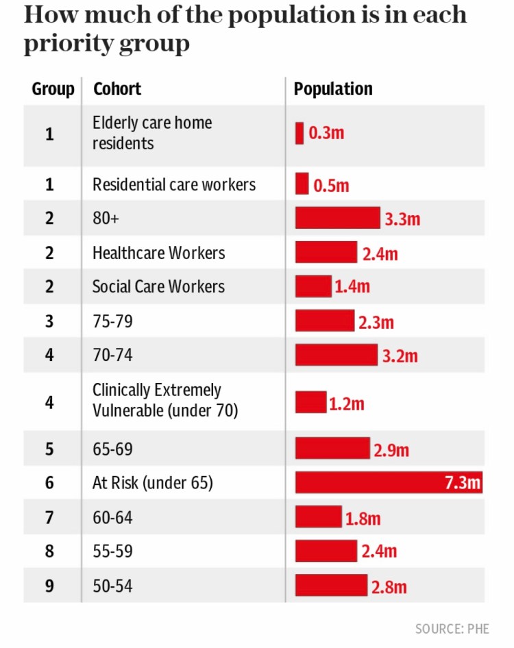
This will make a difference to the % of population within each of the four population groups, and such changes will alter the balance of infectivity and therefore the outcomes, as displayed in Chart 17 above. It gives an idea as to the complexities of the modelling process, which now that I have finished programming the new model functionality, becomes as much a data analysis problem as a computer coding problem.
Comparative Chart 17 for the original model
I have presented Chart 17 many times in previous posts for the original model, and here is the version up to date at March 24th. I haven’t materially revised the model or its settings for six weeks or so, since my February 12th blog post, while I have been working on the group model, so you can see that the original model is fairly robust and consistent. We do see a faster reduction in reported death rate over the last week or two, as the vaccination programme has accelerated beyond the rates in the original model, which are shown in the chart title.

Compared with that earlier model, the new model has a different vaccination schedule (in 6 phases rather than 2) at generally increased rates of vaccination, as I learn more about the UK’s progress in this area (including my own jab!) Other assumptions, settings and outcomes are different too; for example the early 2021 peak in second wave Seriously Sick, largely attributable to the second variant, is lower in the new model, but more work on both models (coordinating the input data) will bring things together. I cover the variant situation later on.
Vaccination schedule in the group model
I have increased the number of stages of vaccination in the model to reflect information that the UK Government has published about its intentions and priorities regarding the first dose schedule, the achieved rates, and the typical efficacy of the vaccines as reported from studies on antibodies stimulated by vaccines, including for different variants.

The situation we face in April regarding planned vaccination numbers is a product both of the desire to progress second doses, which are already beginning to increase, as well as the well-publicised issues with vaccine supply from Europe and India. Fortunately most of the vaccine production for British patients is based in the UK, at least for the AZ Oxford vaccine. Additional vaccines such as Moderna and Novavax will be available later this year.
| Model Day | Date | Vaccinations/day | Efficacy | Groups |
|---|---|---|---|---|
| 335 | January 1st | 300,000 | 70% | Group 3 at risk only |
| 366 | February 1st | 450,000 | 85% | Group 3 at risk only |
| 411 | March 18th | 500,000 | 85% | Groups 2 and 3 |
| 425 | April 1st | 300,000 (first doses) | 85% | Groups 2 and 3 |
| 455 | May 1st | 500,000 | 85% | Groups 2 and 3 |
| 486 | June 1st | 500,000 | 85% | Groups 1, 2 and 3 |
The available vaccinations are shared between the listed groups in the table on a per capita basis. Group 4, school-aged children are not yet scheduled for vaccination, as mentioned before, as there is no UK approval for inoculating children with Covid-19 vaccines.
I have ignored second doses for now, but I would approach that by increasing efficacy where required by adding some extra vaccination change points in the schedule. I have not ventured to ascribe different efficacy to different vaccines (they seem quite similar at the moment), or to explore the possibly different vaccine efficacy against different variants.
Prevention of transmission by vaccinated people
I have added model functionality to represent the different (probably lower) efficacy of vaccines in preventing transmission of infection from vaccinated people. I am convinced this will be necessary if such efficacy is much lower. There is an argument that community “herd” immunity is harder to reach if the vaccines aren’t good at preventing such transmission, even though they are highly effective at reducing severity of disease in those vaccinated.
The argument on this was well presented at a surprising source, where Matthew Woodruff, an immunologist at Emory University, Atlanta, US, is quoted as saying: “IgG antibodies act as thugs that react swiftly to all kinds of bacteria and viruses. But while they make up the bulk of our antibodies, they’re confined to our inner organs, such as muscles, blood and the lungs. But we also have another kind of antibody produced by our immune system, antibodies that deal with invaders as they enter the body from the outside and it could be even more important.
“Spaces like the nose, the throat, the lungs and digestive tract rely on another antibody, immunoglobulin A, or IgA antibodies. As yet, we don’t know how vaccines incite IgA antibodies that protect you as you breathe, eat, drink and touch your face. As the result of a Covid infection, your body manufactures huge amounts of these more-specialised IgA antibodies. Because they’re on the same respiratory surfaces that transmit coronavirus, it’s logical to assume people who recover from Covid aren’t spreading it any more.
It will probably take years for research to reveal how well vaccines can prevent Covid transmission.
But there’s another yardstick to tell if a vaccine is stopping a person from transmitting it. Community spread – the number of new cases. If numbers are rising, the virus is being passed on, if they’re falling, it isn’t spreading. Vaccines are working.
“I can’t imagine how the vaccine would prevent symptomatic infection at the efficacies that trials reported and have no impact on transmission.”
So we’ll have to wait to know for certain if people who got the vaccine can still transmit the virus.
Further work is being undertaken – “Project S” – as an entire town is vaccinated as experts race to understand if Covid jabs halt transmission.
In the study, known as a “stepped-wedge cluster randomised trial” in scientific jargon, the town, Serrana in in São Paulo state in Brazil, has been split into 25 areas. Vaccinators will immunise all adults in one area before moving to another, allowing researchers to compare infection rates in neighbourhoods that have and haven’t received the jab. Change over time will also be analysed – enhanced surveillance has been in place in Serrana since September.
“In general, a cluster trial is best placed to evaluate [the] impact of vaccination on transmission,” Dr Adam Kucharski, an infectious disease epidemiologist at the London School of Hygiene and Tropical Medicine who is not involved in the study, told The Telegraph.
“The vaccine both protects individuals within the cluster because they’re vaccinated (the ‘direct’ effect) as well as protecting them because transmission is reduced (the ‘indirect’ effect).”
But he cautioned against comparing results from different trials, as they have different parameters, and warned that just because one vaccine is found to prevent coronavirus transmission does not mean they all do.
Comparative charts for the different risk groups
The benefit of the groups model is to help understand in more detail the different outcomes for the different risk groups in the model. The slideshow below compares the 4 group outcomes, with the total population outcome across all groups too. Remember there are no vaccinations for school age children (Chart 24).


Even with the very low fSS and fmort I have set for children, 65 deaths (on Chart 24) is too high, but I can address this with further settings next time. Overall the model outcomes are within reasonable range of my base model, and exhibit the right kind of relationship between the outcomes for different risk groups, adding up to something that looks like the UK national observed situation.
By now you will understand that there are lots of adjustable parameters in the model. I probably need a research team to do all that is needed!
The effect of the different variants
I have three variants in the model, as stated in the introduction. The first starts at the beginning of 2020; the second “Kent” variant that seemed to start in the south-east of England, starting on September 22nd (when it was first analysed from a swab); and also a “placeholder” third variant that might stand for an incoming Brazilian or South African variant. It is possible in the model to add as many as we wish. The following timetable for the detection of the “Kent” variant, and its growth to dominate the UK case numbers, shows why the UK Government is being so careful about new variants now, restricting (making illegal with severe penalties) international travel for leisure purposes so tightly.
The analytical confirmation of a new variant is some weeks behind its arrival, and to be ahead of it, proactive restrictions have been set on travel to and from places where new variants have been seen or suspected.

The variant characteristics in the model are:
| Variant # | Model day | Start date | Transmission rate | Infection prevention* |
|---|---|---|---|---|
| 1 | 22 | Feb 1st 2020 | 0.39 | 67% |
| 2 “Kent” | 235 | Sep 22nd 2020 | .663 | 67% |
| 3 | 335 | Jan 1st 2021 | .78 | 67% |
The transmission rate figure 0.39, for example, means that an infected person would infect 0.39 people/day if no NPIs are in place to restrict normal interactions.
*The Infection prevention parameter (67% in table) is available but unused in the model at present, but would reflect the vaccine capability to prevent infection with the variant from vaccinated people.
The transmission rate for the second variant is at the top end of the confidence interval suggested by a January study for its assessed transmission rate. The third variant’s transmission rate (unilaterally attributed by me) is not important for the model at the moment, because, as we see below, the variant fails to takes off because it arrives into the model when NPIs are already quite high, and vaccination has already started.
Variant development comparisons
Below, I present chart 303 for both the Group model, and also for the original model as a comparison, showing the growth and decline of all three variants for the whole population. Slide the slider on the chart left and right to see the comparison.

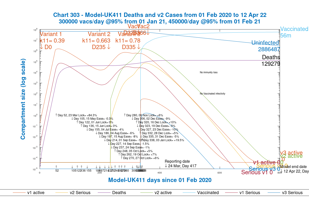
In the original model I have set no immunity half-life, but in the group model I have set it at 5 months (150 days) in line with a recent analysis of waning immunity.
There is likely to be a policy of vaccination booster updates in the future, possibly on an annual basis if the rate of immunity decline allows. Infectivity of vaccinated people is set at zero in both models at present, although as stated, the best assessment I have seen so far is that vaccines are only 67% effective in cutting transmission from vaccinated people.
In both models we see that the second variant becomes very important, as experienced by most countries, especially the UK, where that variant, or one like it (variants do share some common characteristics) has appeared. In the UK, it wasn’t publicised until late November, although it was present from September 22nd as evidenced by later analytical results from swabs taken then.
As a result of this experience, “surge” testing in some UK postcodes, where the Brazilian or South African variant has appeared in small numbers, has been initiated to control the growth of those potentially damaging variants, to avoid any surge in infections. There also remains concern that one or other of the variants might be more resistant to vaccines.
A lot has been learned about the virology of SARS-Cov-2 over the last 12 months, but there is far more to learn about the variants that are appearing around the world, and any common characteristics they might share, especially regarding the effectiveness of vaccines against them. It is hoped that the more recent modified RNA technique of vaccine development, as well as fast-tracked approval processes will allow faster responses to new strains of the virus.
Modelled vs. reported cases and deaths in both models
Finally, I present the charts from each model showing the comparison against reported numbers for cases and deaths overall. Once again use the slider left and right to see the original model vs. the new group model.
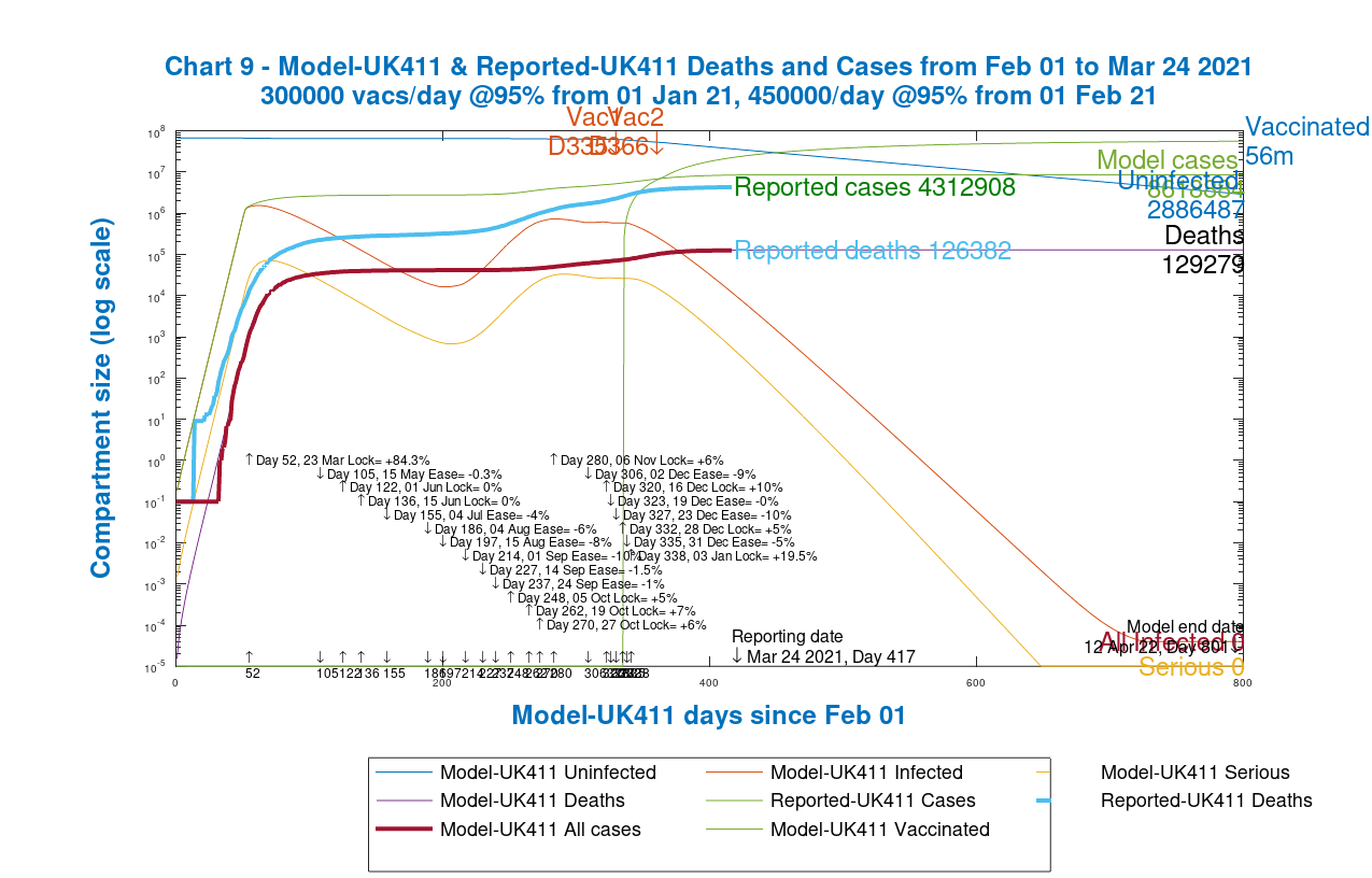
Both models do a good job of modelling deaths, but the group model is more accurate for cases, although because case reporting itself is less accurate, especially early on, I’m not too worried about comparisons with reported cases data.
Discussion
Further work on data
As can be seen, quite apart from coding development, there is a lot of work in populating models with accurate data, and I have quite a bit to do in this area. I’m pleased with the group functionality and implementation, however, and I think it offers great potential.
Changing age dependency of Covid-19 risks
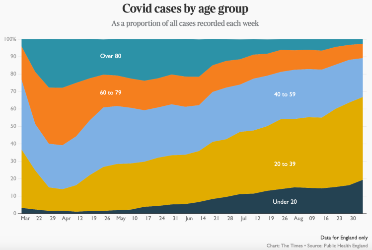
Age has been the single highest differentiator of people’s susceptibility to Covid-19, and I think it’s essential to have an age (and therefore relative risk) dependency structure in the model, so I will persevere with it. This chart from September 5th last year indicates movement in age dependency in case rates, when the disease impact was already beginning to change somewhat, as older people went out less, and younger people worked and socialised relatively more than them.
Today, we see from this slide used in a recent 10 Downing St update that because of vaccination, the relative death rates amongst the age groups is changing:
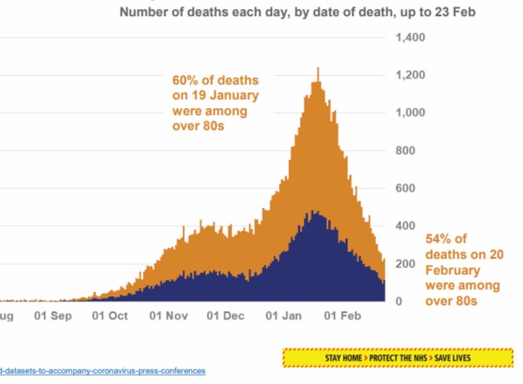
The proportion of deaths which are in the over-80s group is reducing quickly, thanks to the prioritisation of vaccination to those most at risk. There are other risk factors, as for example in this paper which contains the following chart, and these should also be (and are being) taken into account in Government vaccination planning.
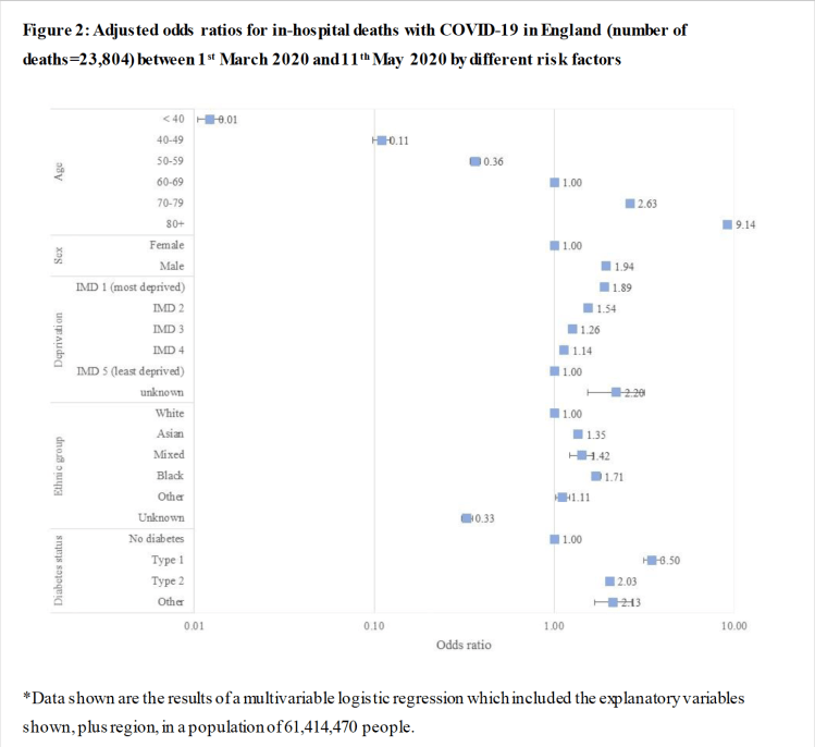
I have referred before to this paper which, while principally driven by the authors’ interest in the risk enhancement of Covid-19 to diabetics, also includes the ratios of other risk factors. The chart showed nearly a 10-fold increase in risk to over 80’s compared with the “control” person in the study; a white female of 60-69 years, with no deprivation or diabetes (ratio of “1” in the chart).
Professor David Spiegelhalter also addressed age-dependency back in May 2020, describing the following charts as “startling”, showing as they do a doubling of the risk of death from Covid-19 with every increase of seven years in age at that time. The left chart shows the straight line on a log chart which reveals the doubling rate from the slope, and the linear scale chart on the right shows visually the very steeply increasing risk for older people at that time (prior to vaccines), requiring older people prudently to stay indoors more than other parts of the community.

These are the kind of risks that have been changed – improved – considerably by the availability of the vaccines, and prioritised treatment of high risk groups in the population.
NPIs during 2021
The latest NPIs in the models so far are those included in the January 3rd lockdown. We have just seen schools returning on March 8th, and my next post will add that and further planned NPI relaxations for 2021.
In those next model scenarios, I will run projections for 2021, addressing the following summary roadmaps for England and Scotland, as examples of the approaches of the four home countries in the UK to easing the lockdown, achieved by reducing NPIs for the next few months in the model.

England’s lockdown easing roadmap 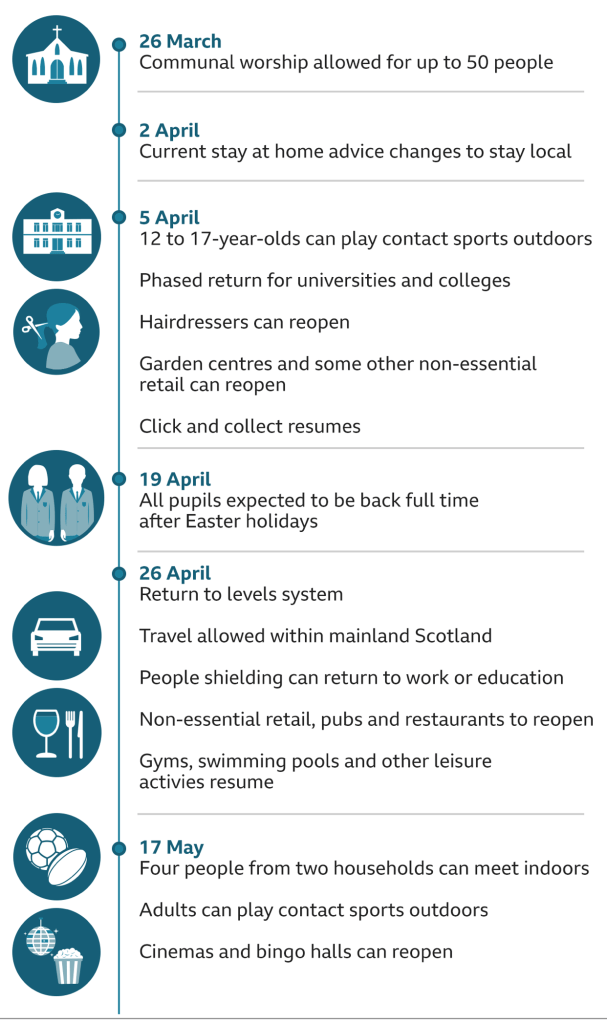
Planned lockdown easing schedule in Scotland
Such easing programmes, hopefully, are what vaccination will allow us to do without allowing SARS-Cov-2 to start to grow again.
Epidemics, and their models, have the propensity to become cyclical, as restrictions are imposed and removed, and then reimposed, as I showed in one of my earlier posts, and vaccination was always going to be the way to break that cycle, as I said in that post, and in others.
Evidence from Scotland for the effect of lockdown and vaccination
These conclusions of the modelling are borne out by the work of Bruce Guthrie, Professor of general practice at Edinburgh University, reported in the The Times on 25th March, who said that the lockdown and vaccines had brought the coronavirus reproduction number down closer to flu levels, and that without these measures the death toll would likely have been much higher.
The reproduction number of coronavirus without any restrictions is thought to be about 3 — meaning every carrier has the potential to infect three others — while flu has a rate of about 1, so flu outbreaks die out quite quickly compared with coronavirus.

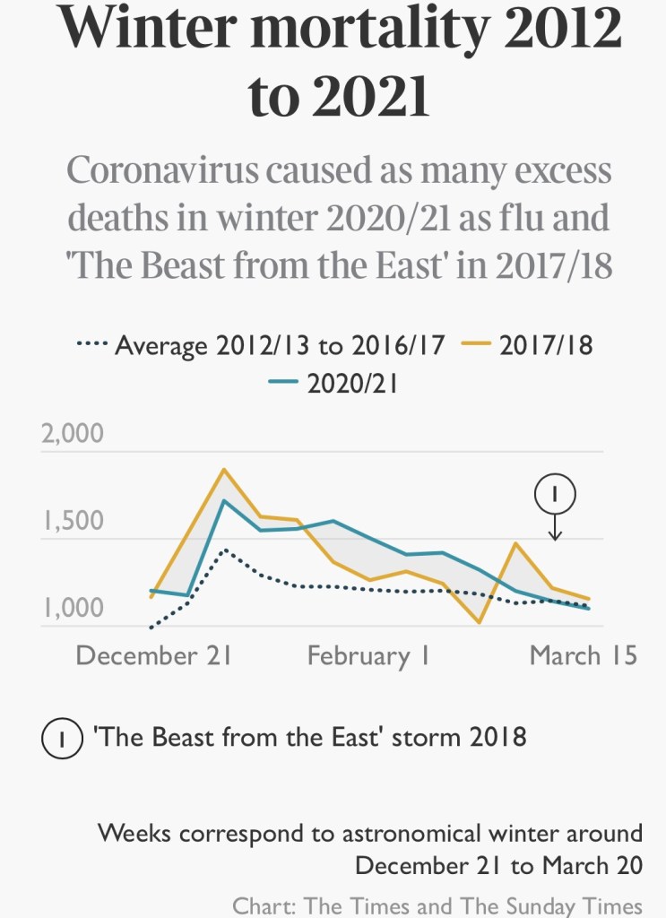
On the right, Winter mortality 2012-2021, and excess deaths flu 2020/21 and “Beast from the East” 2017/18
There were 3,583 deaths in Scotland linked to Covid this winter — including 3,024 where the virus was the underlying cause of death — but no flu deaths and over 1,000 fewer deaths from other respiratory illnesses. There were also over 500 fewer deaths linked to other illnesses that strike primarily in old age, such as cancer and heart disease.
Prof. Guthrie, a member of the UK government’s Scientific Advisory Group for Emergencies (SAGE), said: “We haven’t had any flu this year so if we had no restrictions you would have had a lot of flu deaths alongside Covid deaths. Flu dies out faster as most people have had it before and it evolves relatively slowly, so most people have immunity to whatever strain is spreading each year.
“Flu creates a short-lived spike because it runs out of people to infect, but Covid has created a prolonged death curve since the autumn despite all of the social distancing and lockdown measures.”
Prof. Guthrie said that the vaccine rollout was encouraging but it was too soon to accelerate the exit from lockdown.
The R number for different variants
I covered the relationship between the R number, herd immunity and the disease doubling rate in my blog post on June 28th 2020. Prof Guthrie’s charts indicated that the measures taken to protect against Covid-19 have also protected against flu, leading to little flu mortality this winter. This article by the BBC offers more general information about the R number.
If the transmission rate per day were given by 𝛽 (people per day infected by one infected person) and the duration of that person’s infection is d days, then the number of people infected by that person would be 𝛽d, and so it can be seen in a simple situation that the starting value for R, R0 = 𝛽d. Thus if d were 5 days, say, and 𝛽 = 0.39 as for our first virus variant, then R0 = 0.39×5 = 1.95 for these example figures.
If d were 7 days, R0 = 0.39×7 = 2.73; we see that the R number depends on observation of the disease. The corresponding R0 numbers for the second variant with 70% higher transmission 𝛽 = 0.663, for 5 and 7 day disease duration, would be 3.3 and 4.5.
In practice R at any time is calculated from more extended study of the virus and its life-cycle, depends on the assumed or observed average proximity and mixing of people at any time, and therefore varies over the course of the epidemic (and so it would be denoted R(t) for time t).
Concluding comments and next steps
From the simulation outcomes, in both versions of the model, it really does appear that vaccinations are already making a big difference to the at-risk communities, especially for older people who, from the discussion above, were by far the worst affected before.
My next task is to tidy the results a little, but first to rearrange the groups a little, now that more refined vaccination priority numbers are available, and to check the fSS and fmort variables against current data for the propensity to serious illness and morbidity for different parts of the community. A limiting factor is the extent to which such disaggregated data is available. Possibly parametric runs across a range of values will help.
The story, as I said in my most recent post, is that the vaccines are the only way of unlocking ourselves from the way of life we have endured during 2020.
And as was suggested in the article I quoted before concerning infectivity of vaccinated people, it’s vital that, even after receiving both doses of the vaccine, that everyone wears masks, practises social distancing and washes their hands when around those who haven’t been vaccinated – just in case.

4 thoughts on “Age and vulnerability related Coronavirus modelling”