Summary
In my April 8th 2020 post about the R0 reproduction number and the use of SIR models to model the pandemic, I developed a chart which predicted the proportion of the population uninfected by the end of an unconstrained pandemic.
A recent communication from a Twitter correspondent drew my attention to a Twitter thread by Trevor Bedford, which calculates the infected percentage of the population at the end of the pandemic given the effective R(t) value of the virus, the Delta variant in the USA in that case. Estimates for the R(t) value were drawn from USA data in that tweet thread.
My original chart from the early days of the pandemic allowed for an R0 up to 3, but the Delta variant that arrived in the UK a year later, in April 2021, has an R0 far higher than the original, as much as R0=7, perhaps.
My original chart would cater for the effective R(t) of 1.18 which features in Trevor Bedford’s tweet, but I wanted to see what the initial estimate of the infected (or uninfected) proportion of the population by the end of the epidemic would be for the Delta variant’s R0, prior to any mitigations.
I have therefore added to the scope of that previous post to develop a chart allowing those higher values of R0, even though when mitigation measures are taken (as they have been), the transmission rate of Delta is managed down significantly.
An example of the non-linearity of outcomes in such a pandemic is that although the Delta variant is a little over twice as transmissible as the original variant (maybe up to 2.5 times), the percentage of people remaining uninfected in the unconstrained scenario is reduced by a factor of between 50 and 150, from between 5% and 15% of the population for the original variant, at an R0 of between 2 and 3, to less than 0.1% for the unconstrained Delta variant with an R0 of 7.
Introduction
Since those early UK Government presentations about the pandemic over a year ago, the R0 Reproduction Number has been mentioned many times, and with good reason. Its value is a commonly accepted measure of the propensity of an infectious disease outbreak to become an epidemic.
It turns out to be a relatively simple number to define, although working back from current data to calculate it is awkward if you don’t have the data (daily) time series.
If you have, the way to do this is to look at the doubling period of cases at any time t, and work back from there, as I showed my later blog post on June 28th 2020, to show the effective value, R(t), at that time t, a value dependent on many factors such as the contact rate between members of the population, the time of exposure as well as the properties of the virus variant itself, such as its duration of infection.
If R(t) (the dynamic value of R) at any time t falls below 1, and stays there, then the epidemic will reduce and disappear. If it is remains greater than 1, then the epidemic grows.
You can see more about this, and the original development of R0 and its use in predicting infection outcomes at my Google docs at The SIR model and R0. That is a more technical document, presenting a derivation of R0, and its consequences. I used a few research papers to help with it, but the focus, brevity(!) and mistakes are mine (although I have corrected some in the sources).
New chart development
Expanding the y-axis of the original chart in that earlier work to include values of R0 up to 7 instead of 3 was simply a matter of doubling the number of columns in the supporting spreadsheet, adding the necessary additional R0 values, and recalculating the new cells with the corresponding formulae as before; see the various versions in separate sheets in the supporting spreadsheet at Google sheets.
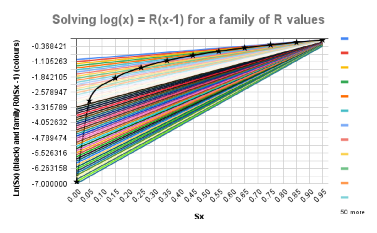
It is then a short step to plot new charts for y1 = loge(Sx) and y2 = R0(Sx -1), where Sx is the number of Susceptible (uninfected) people at the end of the pandemic, for a family of values of R0, telling us, by requiring y1 = y2, for any given value of R0, the value of Sx, according to my derivation at Google docs for the original post. We can read the solutions for the wider range of R0 from the following chart.

The black curve, y1 = loge(Sx), with stars at the data points, crosses each straight line y2 = R0(Sx-1) only once, where at such intersections, one for any given value of R0, the equation loge(Sx) = R0(Sx-1) is solved; the starred data points are given by:
| R0 (y-axis) | 6.91 | 3.00 | 1.90 | 1.39 | 1.05 | 0.80 | 0.60 | 0.43 | 0.29 | 0.16 | 0.05 |
| % uninfected Sx | 0.1% | 5% | 15% | 25% | 35% | 45% | 55% | 65% | 75% | 85% | 95% |
Thus for the original SARS Cov-2 variant in the UK with an R0 of between 2 and 3, say, then 15% to 5%, respectively, of the population might never have been infected when the pandemic ends, in the absence of any mitigation measures such as NPIs (Non-Pharmaceutical Interventions, such as social distancing) or a vaccine.
For the Delta variant, with its R0 nearer to 7, if the pandemic were similarly unconstrained (and the population equally mixed), then only 0.1% of the population would escape infection over the course of the pandemic.
This is a measure of the potential impact, at worst, of the far higher transmission rate of the Delta variant, if there were no mitigations (NPIs and vaccines) in place. The effectiveness of mitigations varies widely within and across countries, and so different environments might range between (say) the figure of R0=1.18 for the USA used in Trevor Bedford’s tweet thread, which from my chart might leave 30% of a population uninfected, and my worst case for R0=7, leaving only 0.1% uninfected.
Discussion
None of this takes into account any of the illnesses or fatalities caused by the Covid-19 disease. It is simply a measure of the unconstrained spread of the virus depending on its infectivity. My 50 posts on this topic since March 2020, culminating in my most recent post on September 3rd, with modelling of outcomes at a far more detailed level, offer more in terms of outcomes in the more realistic context of NPIs and vaccines.
That most recent September 3rd post looks at the progress of the pandemic in the UK, taking into account the historic and current UK Government programme of NPIs (and the public response to them), immunity waning (at 150 days half-life), vaccine hesitancy by population group (generally anti-correlated with age), multiple phases of vaccine inoculations (representing up to the typical two jabs required by most vaccines for best immunity) and also the possibility of vaccinated people not only becoming infected, but also of passing on the virus, even if not infected themselves.
Although my model is of an SIR (Susceptible-Infected-Recovered) type, which in its basic form has 3 compartments, one for each infection state, my current model flowchart, described in that September 3rd blog post, has 164 compartments to cope with the many interactions of all these factors across four populations groups of different vulnerability to three (so far) variants, with multiple (7 so far) vaccination phases, each with up to 2 inoculations.
Concluding thoughts
At least 18 months after the start of the pandemic in the UK, having endured somewhat cyclical lockdowns with many and varied Non-Pharmaceutical Interventions, the vaccine programme has been pivotal in allowing us to ease those restrictions to some extent, as Prof Alex de Visscher, Tom Sutton and I discussed in this paper in January 2021.
The degree of cyclicity (also described theoretically by Harvard and Imperial College, and described in my October 21st 2020 blog post) stems from the somewhat reactive and sometimes tardy actions of the UK Government, particularly before vaccines arrived.
To the UK Government’s credit, as a result of their early investment in supporting vaccine development, the UK was an early beneficiary of those vaccines. In these ways, both through NPIs and vaccines, the pandemic, and in particular the progress of the Delta variant, has by no means been unconstrained in the UK.
The Delta variant, with its much higher transmission rate, has swamped the earlier variants. It is thought that 99% of infections today in the UK are from the Delta variant, which has been typical of the experience of Delta in other countries where it has appeared.
This wasn’t a surprise at that point, partly because of the observed earlier fast growth of the Alpha variant in the UK in overtaking the first variant in the 4th quarter of 2020, but also from my reading.
In her book “An Introduction to Mathematical Epidemiology”, to which I referred on November 18th for my initial vaccination model, Prof Maia Martcheva outlines (p183 pp) the “Competitive Exclusion Principle”, that for many multiple virus strain scenarios, a strain with higher R0 value will supersede those with lower R0, as a result of competition between them to infect susceptible individuals.
The view of the Delta variant transmissibility presented here indicates that, without effective mitigations, we (and our National Health Service) might have been overcome by infection rates, which is why we have had to be so careful to reduce, in various ways, our contacts with others to manage down the effects of the transmission rate(s) of SARS Cov-2 in its various forms.
I might add that as vaccines are not 100% efficacious; that vaccine take-up is not universal (for medical reasons or through vaccine hesitancy); that some parts of the population in the UK have not yet been offered vaccines, children 15 and under being under review at present; and that vaccinated people can still infect others, it would still be prudent to continue some of the personal measures we take to protect ourselves and others.

One thought on “Implications of the R0 Reproduction Number in an unconstrained Coronavirus Delta variant environment”