*with thanks to John Wyndham (see https://en.wikipedia.org/wiki/The_Kraken_Wakes) and originally to Alfred, Lord Tennyson, for the original (15 line!) sonnet, The Kraken.
Introduction
It’s been some time since I last posted a report on my Coronavirus modelling, which was entitled “Omicron continues to surprise“, on July 17th 2022.
I have continued to improve and run my Coronavirus model daily since then, while Omicron, and now Kraken continue to offer some surprises. The code for my model is now at version 172 (it was version 170 for my July 2022 report), and I have added a dataset to represent the variant XBB.1.5, known informally as “Kraken”. Hence the title of this article.
My model has been running pretty well since that previous article, but I have noticed more recently that the modelled daily cases have run well ahead – by orders of magnitude (base 10) – compared with reported cases, while the modelled cumulative deaths have remained much closer to those reported. I do manage the model to achieve the best result that I can for the modelled vs. reported deaths, being the most critical output.
This blog post reports on where the model stands, and highlights this current puzzle with the Reported vs. Modelled Active Cases.
Current status of my model
In my most recent article on July 17th 2022, I included all variants up to and including Omicron, but since then, several months ago, we encountered the XBB.1.5 Kraken variant, added to my model from Day 973 (October 1st 2022). This article updates the model reporting to the current variant situation in the UK.
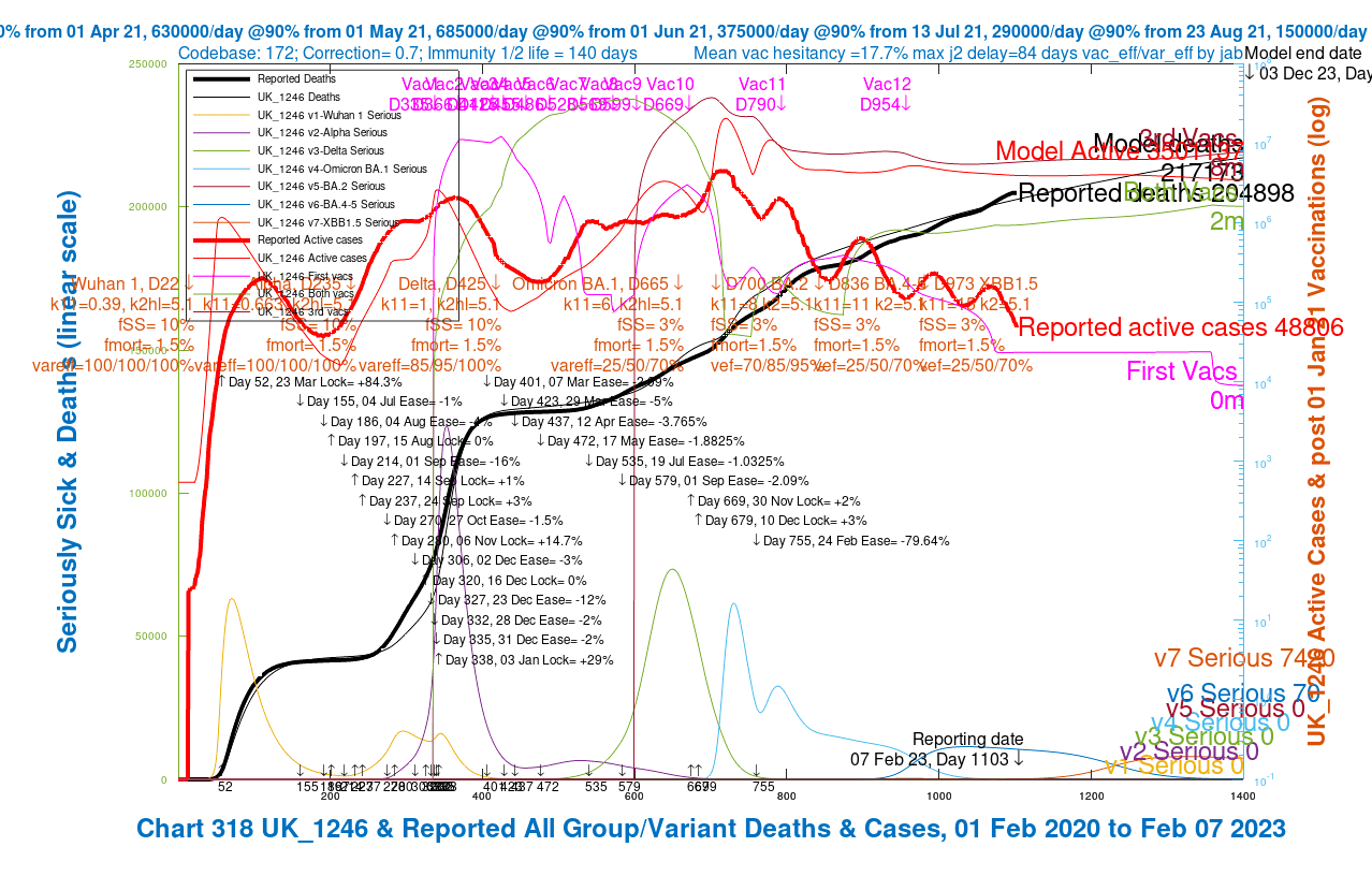
To show the Active Cases issue in the context of the very good match to published data in other areas of the model, I present four of the latest charts from my model, which now include all variants up to and including Kraken XBB.1.5, with four different assumptions about vaccine efficacy towards Omicron BA.4/5 and Kraken XBB.1.5.
The output is presented as a slideshow of charts for those four specific set of parameters, which highlight how different assumed vaccine efficacies to variants affect outcomes. The four scenarios presented all include the more recent Kraken variant, spanning somewhat different combinations of assumptions about vaccine efficacy to Omicron BA.4/5 and Kraken XBB.1.5.
Transmission rates
You will see from the charts that in all scenarios, the transmission rates – infectiousness – of the latest variants are very high, in accordance with our day-to-day experience of them. While the latest variants seem somewhat less virulent and dangerous, they do seem to be far more transmissible.
Relative to the Delta variant, where the k11 parameter for transmission was 1, Omicron BA.1, Omicron BA.2, Omicron BA.4/5 and Kraken XBB.1.5 have k11 transmission rates, as multiples of Delta‘s transmission rate, of 6, 8, 11 and 15 respectively, in all four of these scenarios.
Disease growth and transmission
The ability of a virus to grow and infect a wide population (both in reality and in the mathematics) depends on a range of parameters.
Ironically, if a disease/virus is too fatal, it will tend to die out itself, as diseases need the chance to infect as many people as possible before they kill the host. Experience with SARS-Cov-2, with its successive variants of Covid-19, shows that they are within the required sweet-spot of characteristics to out-compete their predecessor variants.
Variants out-compete the previous ones by ‘virtue’ of their infectivity, or transmission rate – the number of people they can infect in a given time period (a day, say) in a given population.
The recent variants in the UK have each outcompeted their immediate predecessor by being far more infective / transmissible. In the table below are the transmission rates I use in all four model scenarios for each variant, including the previous variants “Wuhan 1”, Alpha, Delta and the three Omicron variants, as well as the latest, Kraken.
| Variant | Model’s k11 transmission rate (people potentially infected per day in a susceptible population by one infected person) |
| Wuhan 1 | 0.39 |
| Alpha | 0.663 |
| Delta | 1 |
| Omicron BA.1 | 6 |
| Omicron BA.2 | 8 |
| Omicron BA.4/5 | 11 |
| Kraken XBB.1.5 | 15 |
The chart components
I will show below four charts, distinguished only by different vaccine efficacies to Omicron BA.4/5 and Kraken XBB.1.5, shown in the table above. Efficacies to the previous variants Wuhan 1, Alpha, Delta, Omicron BA.1 and Omicron BA.2 are unchanged from my previous work.
Many very important sets of parameters, used in the simulation of the epidemic, are tabulated in the body of the charts.
Covid Variants in the UK
Professor Christina Pagel, of University College London, published this chart of the recent successive Covid variants in the UK, comprising data from the COG project, the Covid-19 Genomics Consortium, which I describe at the Appendix.
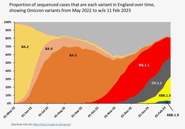
My model doesn’t follow this variant sequence precisely, but I will explore them in more detail in a later posting, with a revised dataset for my model to analyse.
The variant data descriptions for the seven variants of the Covid 2019 infection caused by SARS-Cov-2, currently included in the model appear, in red lettering across the centre of the charts, at the date of each variant’s appearance in the UK, and include transmission rate (k11 as defined in the table above), infection half-life in days (k2hl), tendency to cause serious illness % (fSS), mortality % (fMORT), and vaccine effectiveness % (var_eff) of 1, 2 and 3 jabs (abbreviated to “vef” in the chart annotations).
Non-Pharmaceutical Interventions (NPIs)
The NPIs, first introduced on 23rd March 2020 (Day 52 of the model), and going through many iterations until 24th February 2022 (Day 755 of the model), when the last statutory (as opposed to advisory) NPIs were removed, are tabulated in black lettering in the charts. I should emphasise that good advice remains to wear masks in unavoidably crowded situations.
Back in September 2020, SAGE (the UK’s pandemic Scientific advisory Group for Emergencies) published this explanation of NPIs. At the peak, NPIs involved advice to stay at home (apart from essential workers), mask wearing, the closures of schools, Universities and leisure and hospitality venues, amongst other measures. Many have now ceased, and how to protect oneself is now a matter for personal judgement.
To simplify the analysis, NPIs are represented in the model as overall percentages (%) of the transmission rate reduction they are designed to achieve at any given phase of the period (initially assuming public compliance).
Thus the Day 52 initial NPIs set on March 23rd 2020 are assumed in the model to achieve a lockdown of 84.3% – i.e. transmission is reduced to (100 – 84.3)% = 15.7% of what it would have been with no such NPIs.
All increases (“lock”) and reductions (“ease”) of NPIs in the model are tabulated in the charts, following that initial 84.3% lockdown, ending with the final removal of statutory regulations on 24th February 2022 at the -79.64% ease point.
These lockdown effectiveness data in the model, representing a combination of the measures taken and the public response to them, are my assessments of NPI effectiveness made at the time. They have a critical and crucial impact on the behaviour of the virus in the population, both in reality and in the model. I have made many sensitivity runs of the model to assess that impact from time to time, and reported accordingly in my blog posts over the last three years.
Vaccination phases
There have been many phases of vaccination in the UK, prioritised in timing for different groups of the population, depending on their vulnerability to the Covid-19 infection. In each phase of vaccination, such groups were often called for vaccination in priority order based on age groups.
An important aspect of the model is that it only vaccinates uninfected people, since whenever people are called for vaccination in the UK, they are asked not to come if they are infected.
But a substantial minority of people can have asymptomatic infections, and so in reality, people will be able to be vaccinated while infected by Covid-19. It’s difficult to be sure of the proportions of people in that category, and therefore this is an aspect of the model that usefully might be improved.
Whether it would affect the Active Case numbers materially is a question for the reader at this point. It certainly affects the number of people being vaccinated in the model, which depends on the proportion of uninfected people at any time.
Age groups in the model
The vulnerability of a person to Covid-19 depends, amongst other things, on their age, and the model contains four age groups, which I defined initially in my March 26th 2021 blog post. People are likely to be invited earlier for vaccination if regarded as high-risk.
Even though the main charts below show overall numbers, all analysis in the model is performed by age group, before being aggregated for presentation, and, therefore, I have charts available for each age group separately.
| Groups | Name | Age range | Total | weighted % of 67.8m |
| 1 | Active/younger | 17-39 | 23.68m | 33.5% |
| 2 | Caregivers/mid-age | 40-64 | 21.25m | 30% |
| 3 | At risk | 65+ | 12.39m | 17.5% |
| 4 | School age | 0-16 | 13.42m | 19% |
Charts
The slideshow below shows charts for four scenarios, with the efficacy of vaccines (shown as “vareff” in the charts for earlier variants, and as “vef” for the most recent variants, Omicron BA.2, Omicron BA.4/5 and Kraken XBB.1.5) for 1, 2 and 3 jabs for each variant, decreasing step by step only for the BA.4/5 and XBB.1.5 through the scenarios. The slideshow “autoplays” and fades in and out between the four charts; it can be advanced or rewound with the controls, at left and right, at any point.


As the scenarios progress, the recent few weeks’ modelled cumulative deaths curve (in thick black) rises slightly, nearer to the curve for reported cumulative deaths (thin black), but the reported daily cases (in thick red) remain well below the model’s version of that statistic (the thin red curve), by a factor of 1/60th, a vast discrepancy.
This is very surprising, given that until Day 700 of the modelled pandemic, around the beginning of 2022, the model was fairly well aligned for cases. It has remained well aligned for deaths over the whole period, as I have made adjustments to various parameters to keep it in step with current reporting, to enable a good base for forecasting.
From about the time that NPIs were removed (not long after Omicron BA.2 arrived), the reported active cases have steadily declined in a wave** pattern, whereas the modelled active cases have broadly remained at the same level as they were at the beginning of 2022. (See the next section for Prof Graham Medley’s explanation of this kind of wave behaviour).
The alignment for deaths has always been very good, but that has always been my priority for the model.
Numerical outcomes from the charts
The scenario outcomes, with corresponding vaccine efficacies (“vef“, the only chart parameter that changes between these four scenarios), are summarised in the table below.
| Scenario | Vac % efficacy “vef” for jabs 1/2/3 Omicron BA 4/5 | Vac % efficacy “vef” for jabs 1/2/3 Kraken XBB.1.5 | Reported / model active cases Day 1103 | Reported / model deaths Day 1103 |
| UK_1244 | 70/85/95% | 50/70/85% | 48806 / 3 million | 204898 / 200,000 |
| UK_1243 | 70/85/95% | 25/50/70% | 48806 / 3 million | 204898 / 200,000 |
| UK_1245 | 50/70/85% | 25/50/70% | 48806 / 3.5 million | 204898 / 201,000 |
| UK_1246 | 25/50/70% | 25/50/70% | 48806 / 4 million | 204898 / 203,000 |
**Wave behaviour of the reported active cases
I asked Prof Graham Medley back in February 2022 about the wave behaviour of the pandemic, as, for example, seen in the decline of reported active cases in the Chart 318 above. He said:
“Essentially, the dynamics are driven by the proportion of infectable people. With significant waning, this proportion oscillates around an equilibrium level. When there are more susceptibles than this level, R goes above 1 and there is an epidemic to remove them (make them immune), and when the proportion is below this level, R is less than 1, and the number of infections falls. This in turn allows immunity to wane away and susceptibility to start to rise again, and so on. The period and sustainability of the oscillations is determined by the rate of waning and the R0 – the transmissibility of the virus. They are linked through the equation:
R = R0 * S
where S is the proportion “susceptible” (i.e. that can be infected). S goes down when R>1 and up when R<1. Sometimes there is no oscillation (just goes straight to an equilibrium), sometimes oscillations are damped (they go up and down getting smaller as S settles down to 1/R0) and sometimes they are sustained (keep going forever). Which of these happens is largely determined by the relative values of waning and R0. Generally, the higher R0 the more likely you are to have oscillations….”
The reported vs. modelled cases issue
The Zoe app view of case numbers
I have seen queries, for example this one on Twitter by the University of Oxford’s Prof Trish Greenhalgh, “Wonder why Zoe app is reassuring me there’s no Covid in Oxford but people are emailing apologies for in-person meetings bc Covid??“, prompted by her observation that reported cases (at least those reported by the Zoe app for monitoring Covid status, created by Prof Tim Spector of King’s College, London to monitor Covid numbers) seemed to be running behind actual cases.
Reporting on the Zoe app currently has just over 4,800,000 users, according to its opening screen either on the web or on my iPhone, which is quite a small proportion of the UK population. It might well be a skewed sample, being of more interest to people (like me) who regard themselves as being at somewhat higher risk of catching Covid, and so it might be regarded by statisticians as a narrow and biased sample.
Thus those missing from Prof Greenhalgh‘s meetings might be representative of those not on Zoe at all, and so not counted and/or reported.
Zoe view of Covid cases trend in the UK
Prof Tim Spector of Zoe says in his recent YouTube video: “After reaching their lowest point for over a year, COVID rates are increasing again – a 61% increase in the last fortnight. We expect this to continue for at least another few weeks, so keep yourself as protected as possible by socialising outdoors when you can and maintaining good hand hygiene.
Keep logging your health in the ZOE Health Study app as this remains the most important tool we have for detecting hotspots of infection and any new, emerging symptoms of COVID and other illnesses.
For more info, check out Tim’s video as he looks at what’s driving the increase.”
Office for National Statistics (ONS) case sampling
While wondering if the official Covid-19 case number reporting might be in error, it is hard to see how official UK Government case numbers might have been consistently understated.
My understanding is that they are compiled from regular (at least monthly) active surveys by the Office for National Statistics – the Coronavirus (COVID-19) Infection Survey (CIS) – of the Covid health status of a random sample of over 100,000 people in the UK. The latest release is the February 3rd 2023 one.
The ONS page describing the survey methods states that “we collect up to 120,000 blood samples every month”, representing over 70% of those chosen to respond on their Covid status in the survey.
Public response to Covid
In my model, the Non-Pharmaceutical Interventions (NPIs) are, in effect, a combination of my assessment of NPIs and the assessed public response to them.
Initially, when NPIs started back in March 2020, I believe that the public response was very disciplined, with a good deal of peer pressure to comply. Latterly, as I have mentioned, my observation is more like one interpretation of Hamlet’s line about a custom being “more honour’d in the breach than the observance” (although that interpretation might be the reverse of what Shakespeare intended).
In any case, NPIs are only as good as the public response to them, and the public relaxations in adherence in the last year (for example, in terms of observable changes in mask wearing habits) might be seen as an indicator that if we were to rely on voluntary or proactive reporting of Covid-19 cases numbers, we might miss many instances of infection.
Are reported active case numbers robust?
If we were relying on such voluntary reporting, I can see, therefore, that there might well be divergence between reported and actual cases; my observation is that the population has become much more relaxed about Covid. Mask wearing, especially as it is not now legally or actually required in most places (apart from in health service settings, where it is requested) has become a visible indicator of this. Many people seem to wear a “chin mask” nowadays; convenient for access to the mask, perhaps, but completely ineffective unless raised. I wonder why those that simply ignore it, and leave it in place, do it at all – appearances?
But given that the ONS does active sampling and interviews, and takes blood samples in most cases, their infection figures should be quite robust.
Discussion
My question posed in the preceding section – “are case numbers robust?” – is the core reason for this blog post. I should welcome responses from those reading it.
I wonder if my model isn’t so far off in this respect as I think, and that there might be a much larger daily Covid-19 infection caseload (as my model predicts) than is being reported. It’s partly why scientists, engineers and others run models. Experiments and observation can check model predictions, but models can also run many scenarios as experiments, and check observations of the real world.
My Coronavirus model has always worked well for deaths forecasting, and continues to do so. It did too, up until nine months ago, for Active Case numbers, but by the time (July 17th 2022) of my most recent blog post before this one, Omicron BA.2 and BA.4/5 were opening gaps between reported Active Cases and the model’s view of the future in that respect.
You can click here to see that July 17th 2022 article, which opens the posting at Chart 318 from the UK_1196 scenario (shown below). All the other relevant charts and explanations are there too.
Here is the UK_1196 scenario chart from that post, well before the days of Kraken, at the July 16th 2022 reporting date (Day 897 of the modelled pandemic), when I was already seeing some divergence between Reported and Active Cases, in the days of Omicron BA.2 and BA.4/5.
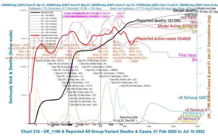
In this (and other charts from that time) I was using a Seriously Sick fSS parameter (the proportion of those infected falling Seriously Sick) of 10%, instead of the current 3%, for Omicron BA.2 and BA.4/5, which now resolves the emergent modelled vs. reported Deaths discrepancy at that time in the model; but it doesn’t materially affect the wider Active Cases discrepancy.
In that previous UK_1196 chart 318, as a result of the higher fSS parameter I was using at that time, is a Day 1400 outcome of 16,972 Seriously Sick people (all with the earlier Omicron BA.4/5 variant v6 in the model), much higher compared with the current model, with the later Kraken XBB.1.5 variant v7 added, with just 6,654 Seriously Sick at Day 1400 in the chart 318 for the current UK_1244 scenario, with similarly lower numbers (all less than 7,500) in the other charts in that slideshow shown earlier, which all have the same, lower fSS setting.
Summary
After so much analysis, I remain uncertain as to whether the wide discrepancy between Reported and Modelled Active Cases, at the same time as the Modelled Deaths match Reported Deaths quite closely, is a model (or data) deficiency, or whether the model is, at least to some extent, highlighting a gap between how the public experience Covid-19 on the one hand, and how they (possibly under-) report their Covid-19 situation on the other.
I hope this article might prompt some responses to this uncertainty.
Appendix
Professor Christina Pagel, of University College London, published a chart this week on her Twitter account of the recent successive Covid variants in the UK. The chart presents data from the COG consortium, a research project of which, as we see, the University of Glasgow is part.

I will explore the additional (and superseded) variants, BQ.1.1 and CH.1.1, which I didn’t separate from my BA.4/5 hitherto, in more detail in a subsequent blog post. Here is the chart I referenced in the main text:
The COG consortium comprises several Research organisations and Universities, forming a UK-wide collaborative network for SARS-CoV-2 genomics, research and training.
Prof Pagel presents this chart as follows in her Twitter feed:- “Quick English Omicron subvariant update: 3-way split in England at the moment between BQ.1.1 (Dec wave), CH.1.1 & XBB.1.5 (current wave). Only XBB.1.5 is growing now (now at ~30%). Bottom right is new kid on the block XBB.1.9…“
My model doesn’t follow this variant pattern precisely, particularly for BQ.1.1 and CH.1.1, which I had subsumed and labelled within my XBB.1.5 model variant, starting on 1st October 2022 (Model Day 973) so I will disaggregate them, and explore the effect they variants have on my model in a later blog post. Maybe we will also see more of XBB.1.9 by then – or not.

4 thoughts on “The Kraken Wakes* – Coronavirus”