
Introduction
I have continued to run my own Coronavirus model, my recent prior report on February 9th this year having immediately followed the outbreak of the “Kraken” variant, Omicron XBB.1.5, in the UK.
This brief post provides my own latest charts from my model, in the light of cessation of the UK Government’s own Covid reporting.
I do hope that with the help of vaccines, we have seen the end of any rapid growth in Covid infections, serious cases and deaths; the current reported data supports the view that growth continues to slow.
But you will see that my model forecasts a further 11,000 Covid-related deaths over the next year or so, by March 14th 2024, Day 1500 of my model, whose charts model the pandemic since it began in the Uk in February 2020.
Cessation of ONS Covid reporting
Since about mid- March, UK Government reporting, as picked up by Worldometer, which I use to populate my model with Reported Data on Deaths and Active cases, seemed to have ceased, and indeed reports (such as this one) confirm that UK Government announcements paused as of the end of March 2023, although my own observations (through my model reports) suggest that official UK Government reported data (through the Office of National Statistics (ONS) started to fall away from March 16th. Other announcements suggested that reporting would become weekly rather than daily, so it has been a slightly unclear end to the provision of UK official Covid public data.
The relevant UK Office for National Statistics (ONS) page currently states that “This page is no longer being updated. The final weekly Coronavirus (COVID-19) Infection Survey release was published on 24 March 2023. Please search the ONS release calendar for the most recent ONS releases.“
But my model and charts indicate that firstly, daily Deaths reporting stopped in mid March, and then over the next few days, Active Case reporting reduced to zero, as you will see from my chart below.
This post simply confirms what I have been observing. My own model, with many developments over three years, and more than 50 of my reports such as this one, remains valid, although charts reflecting comparisons with reported data clearly show the diminution of official statistics.
Reported data only
Let’s look first at my Chart 207 of the officially released data on Cases, Active Cases and Deaths for the UK, from 15th February 2020 (Day 1) until 14th April 2023 (Day 1169). There is no modelled data in this chart, it comprises purely public information.
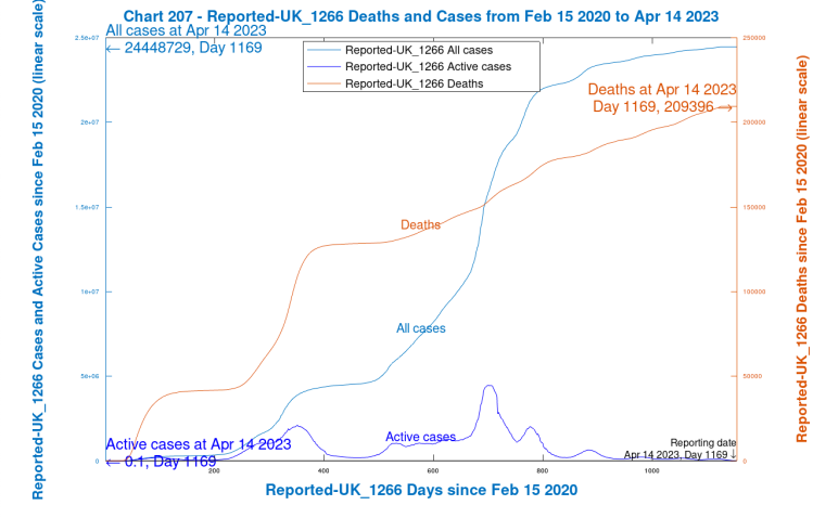
We can discern here that Reported Deaths have flatlined (if you’ll excuse the expression) for the last couple of weeks at the extreme right of the chart. The slowdown in growth of Reported All Cases is consistent with the currently very low number of Reported Active Cases.
Chart 209, Modelled and Reported Cases, and Deaths
My Chart 209 below plots aggregate Covid related Modelled Infections, Cases and Deaths, together with Reported Cases and Deaths for comparison against the modelled versions.
Modelled Serious cases and those remaining healthy (never infected) in the model are also presented on the chart.
Modelled Vaccinations (by first, second and subsequent jabs) are also shown, with First Vacs for the most vulnerable start in January 2021, and Second Vacs starting shortly afterwards; the UK vaccination programme required a minimum of two vaccinations per person at that time.
Since then, of course, there have been many phases of vaccinations, and I include 12 of them in the model. I don’t show the multiple vaccinations separately, after the inception phase, because the information on them isn’t readily available, and in any case would be even more complicated to show. There have also been a number of different vaccines in use (Pfizer Biontech, Moderna Spikevax, Novavax, AstraZeneca and all the rest) and these aren’t distinguished in the model either, for similar reasons.
Note that in my model, only uninfected people are vaccinated (which is the National Health Service (NHS) intention). In practice, however, although this is the intention, some people who don’t yet know they are Covid positive are vaccinated (but not in the model).

We also see on the chart (in red text) the timing for the incidence of the 9 variants so far (at least those recognised by my model, from Wuhan 1 through to Omicron XBB.1.5) and also, in black text in the body of the chart, the various levels of Covid Non-Pharmaceutical Interventions (NPIs) in the UK, their many changes both up (Lock) and down (Ease), and the days on which NPIs changed, starting with the first UK lockdown on Day 52, March 23rd 2020.
The last change in the UK was on 24th February 2022 (Day 755 in my model), when all legally enforceable Covid restrictions were removed, although strong advice remained (and remains) to take care in unavoidably crowded environments.
Individual Variant chart 303
In this busy chart 303 I show the incidence, growth (and decline, where relevant) of each of the nine individual variants recognised by the model, from Wuhan 1 through to Omicron XBB.1.5. It is inevitably rather complicated, and I show it just for completeness.
I should also say that all modelled cases and deaths are calculated by the model by four age groups (0-16 years, 17-39, 40-64 and 65+) separately, but are shown in aggregate (i.e. for all age groups together) in the charts in this post. Age group charts are available!
Covid-19 Case and Death rates are very age dependent, so it is important to do those calculations “bottom-up”, as I showed in my 26th March 2021 post on Age and Vulnerability Covid modelling. This is particularly the case in the vaccination context (also shown in the chart as First Vacs, Both Vacs and 3rd Vacs), as UK vaccination priorities have been set against age and vulnerability criteria.
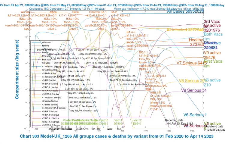
Chart 318, modelled vs. reported active cases and deaths
Chart 318 is also a very busy chart, but it does contain (partly for my own checking purposes) all the relevant data to monitor the match of model outcomes to published data (to the current reporting date), and the forecasts out to 1500 days (12th March 2024), the Model end date.
In view of the ONS cessation of reporting, I suggest that my model now illustrates the divergence of UK reported numbers from reality, if you will accept that, in the shorter term at least, my model’s forecast is likely to mirror the realistic trajectory of (especially) Deaths, and Active Cases in the UK.
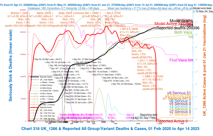
The model has been well calibrated to published data up until very recently, but I suspect there is less Government focus on the accuracy of (and maybe even the requirement for) Covid Case numbers reporting nowadays.
Active case number reporting
Although the active case numbers were and are asserted by the ONS to be surveyed actively each month or so, I have more recently (since about Day 800 of my model) suspected that the published Active Case numbers are somewhat understated; this is about the time that the reported Active Case numbers started to drop quite quickly, although in a wave pattern, the heavy red line in Chart 318 above) while my modelled Active Cases (the thin red line) declined much more slowly. I covered this wave behaviour of the pandemic decline in my 9th February 2023 post on the Kraken variant with the helpful advice of Prof. Graham Medley of the London School of Hygiene and Tropical Medicine (LSHTP).
I see no reason why my model would become divergent at around Day 800 (around mid-April 2022), or any way in which modelled Active Case numbers could be reduced without a concomitant decline in modelled Deaths, other than by significantly adjusting upwards the mortality of the new Covid variants, which isn’t justified by the public data about their characteristics.
The beneficial effect of vaccines (in their many phases) is already taken into account in the model, so this divergence between reported and modelled Active cases has remained, for me, a conundrum, which is why I suggest that maybe public Active Case data might be understated (although it would have to be by a very large factor!)
But I have always regarded it as far more important that the modelling (and reporting) of Covid-19 deaths be stated accurately, and in this area my model has remained close to reported data, up to date at any given time, making me more confident in its forecasts.
Any reporting issues regarding Covid case numbers might be partly because, now that the earlier severe symptoms of the pandemic have eased, thanks to vaccines, people have become more relaxed (a luxury afforded by vaccination) about Covid-19, possible regarding it nowadays as more in the class of common colds and influenza.
As a result of the cessation of ONS Covid reporting, the heavy red line (Reported Active Cases) in this chart has – erm – succumbed to gravity(!), and as a result, for the last week or two, the number of Reported Deaths has remained constant (at 209,396), as you can also see at the Worldometer’s UK website, which takes its feed from the UK Government numbers.
My own model’s forecast is for Covid-19 related deaths to grow, and at the model end date at 12th March 2024 (Day 1500) they stand at 220,424, as you can see at the extreme right of the chart.
Summary
I do think that at least for a few weeks, my projected model outcomes will be realistic, but in the absence of officially updated reported Deaths and Case numbers, there will be divergence from reality as time goes on, as the important periodic calibration to published data will not be possible.
We all would hope that no new variant appears, of course, and that vaccines, which have made a huge difference since the beginning of 2021, will continue to control any new variants of Covid infections that might be out there.
I guess, therefore (I might even hope) that this post might be my last for a while, at least until another variant might appear, since as you see from the chart, and as I mentioned, the UK Government has given up on reporting new Covid Case numbers and Deaths.

One thought on “Official UK Coronavirus reporting ends”