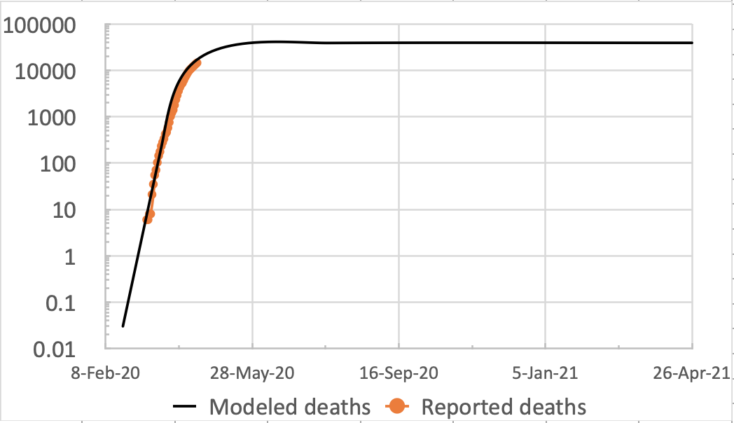
Even having explored Prof. Alex Visscher’s published MatLab code for a week or two now, with UK data, even I am surprised at how well the model is matching up to published UK data so far (on April 18th 2020). I have reported my previous work a couple of times, once relating to the modellingContinue reading “UK Coronavirus Modelling – match to data”
Tag Archives: modelling
Cambridge conversations 17th April 2020 – Coronavirus exit strategy?

As an alumnus, I had the opportunity today (with 2000 other people in over 60 countries) to attend a Cambridge University webinar on the current pandemic crisis. It was moderated by Chris Smith, a consultant medical virologist and lecturer at Cambridge (and a presenter on https://www.thenakedscientists.com/ where more about this event will be found). TheContinue reading “Cambridge conversations 17th April 2020 – Coronavirus exit strategy?”
Making a little progress with a Covid-19 Coronavirus model and real data
In my research on appropriate (available and feasible (for me)) modelling tools for epidemics, I discovered this paper by Prof. Alex de Visscher (to be called Alex hereafter). He has been incredibly helpful. https://arxiv.org/pdf/2003.08824.pdf Thanks to Alex including the MatLab code (a maths package I have used before) in the paper, and also a detailedContinue reading “Making a little progress with a Covid-19 Coronavirus model and real data”
The SIR model and importance of the R0 Reproductive Number – Coronavirus

In the recent daily UK Government presentations, the R0 Reproductive Number has been mentioned a few times, and with good reason. Its value is as a commonly accepted measure of the propensity of an infectious disease outbreak to become an epidemic. It turns out to be a relatively simple number to define, although working backContinue reading “The SIR model and importance of the R0 Reproductive Number – Coronavirus”
Some progress with the Gillespie SIR model – Coronavirus
In the news today (coincident with my current work on this post) we can see how important the measures taken through social distancing, self-isolation and (partial) lockdown are to reducing the rate of infections. So far, the SHTM researchers say “…the R0 could be cut…” and “likely lead to a substantial impact and decline…” –Continue reading “Some progress with the Gillespie SIR model – Coronavirus”
Coronavirus modelling work reported by the BBC
This article by the BBC’s Rachel Schraer explores the modelling for the progression of the Coronavirus Covid-19. In the article we see some graphs showing epidemic growth rates, and in particular this one showing infection rate dependency on how many one individual infects in a given period. https://www.bbc.co.uk/news/health-52056111 This chart led me to look intoContinue reading “Coronavirus modelling work reported by the BBC”
Coronavirus – possible trajectories
I guess the UK line in the Johns Hopkins chart, reported earlier, might well flatten at some point soon, as some other countries’ lines have. But if we continue at 3 days for doubling of cases, according to my spreadsheet experiment, we will see over 1m cases after 40 days. See:https://docs.google.com/spreadsheets/d/1kE_pNRlVaFBeY5DxknPgeK5wmXNeBuyslizpvJmoQDY/edit?usp=sharingand the example outputs attachedContinue reading “Coronavirus – possible trajectories”
Coronavirus – forecasting numbers
A few people might have seen the Johns Hopkins University Medical School chart on Covid-19 infection rates in different countries. They have produced many different outputs, some of them interactive world incidence models – see https://coronavirus.jhu.edu/map.html. This particular chart usefully compares some various national growth rates with straight lines representing different periods over which theContinue reading “Coronavirus – forecasting numbers”
Coronavirus modelling – GLEAMviz15
Here’s the kind of stuff that the Covid-19 modellers will be doing. https://www.nature.com/articles/srep46076.pdf I have downloaded GleamViz, http://www.gleamviz.org/simulator/client/, and it is quite complicated to set up (I used to have a little Windows app called Wildfire that just needed a few numbers to get a pictorial progression of life/recovery/death from the disease, depending on infectivity,Continue reading “Coronavirus modelling – GLEAMviz15”
