
Introduction
Something odd seems to be happening with the relationship between reported UK Covid-19 cases and deaths in the last few weeks, when deaths have been increasing somewhat more quickly than recently, but cases have declined steeply. My model charts seem to expose this oddity.
Model view
Until the start of April 2022, a month or so ago, modelled deaths were in line with reported deaths. But from that time, reported cumulative reported deaths have increased proportionately more quickly, whereas reported cases have been dropping steeply. Here is a typical, current model chart, with parameters set as listed in the caption and in the body of the chart itself.
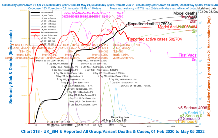
The effect can be seen in all of my charts, whatever model parameters are chosen, within reason.
You can see the steeply declining reported active cases (the heavy red curve), contrasting with the heavy black curve for recently increasing cumulative reported deaths, at a higher rate compared with days prior to Day 800 in the model, April 11th 2022. Here is an expanded view of the key segment of the chart above.

This has been quite a surprise to me: it might well be the case that the model, in which nothing has been changed at that point, exposes a change in the real world conditions, such as changed public behaviour, or a new undetected variant with higher transmission, virulence or mortality, perhaps; or some other environmental condition (the weather?)
It might be that as elderly people (over 75) in the UK are getting their Spring boosters (a second booster, their 4th vaccination) but younger people have not, that waning immunity is showing its effect, but this isn’t, seemingly, affecting infection rates so much as death rates.
It might also be owing to an error in the model, always a possibility with computer codes. But this feature of the output, where modelled cases are ahead of reported cases while modelled deaths are falling behind reported deaths, doesn’t seem to me to be an error in the existing code, which has worked unchanged, and reliably, for a few months.
If it is anything code related, it would seem to me to be something in the environment of the pandemic that I haven’t worked out yet, and so isn’t yet coded into the model.
Worldometer daily view
As always, my model retrieves data from Worldometer for UK Coronavirus cases and deaths, to compare with model data to date, as illustrated above. Worldometer publishes reported data for all countries, both daily data and cumulative data.
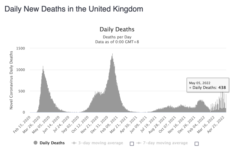
In in their own chart for daily deaths in the UK, we see the recent increase, although the 3-day and 7-day moving averages are decreasing again.
Note that the weekend reporting in the UK is always incomplete, being restored later in the next week, which explains the variations that can be seen clearly (in light and dark grey) towards the right of the chart.
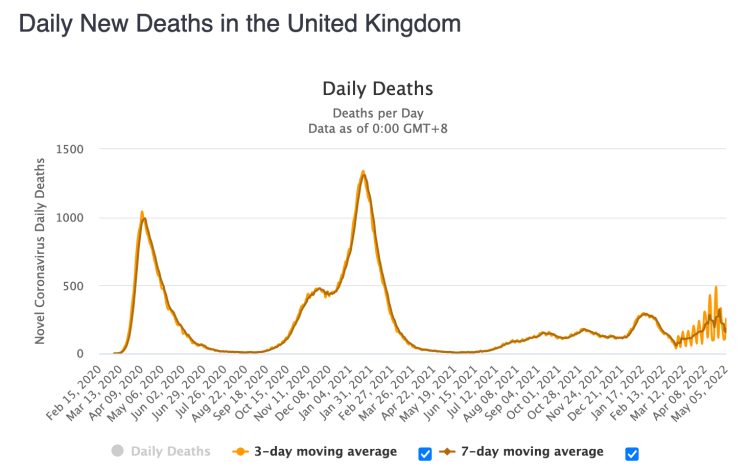
The 3 and 7 day moving averages do show decline from the peak that had been developing in daily deaths, with more variation in the 3-day average than for the 7-day average, as we would expect, and see below.
All the while, however, UK daily cases at Worldometer show the decline which I reproduce in my own chart.

So we can see that my own charts are faithful to the Worldometer reported data, which itself is drawn directly from the UK Government’s Office for National Statistics (ONS) reporting.
Zoe Project view
Prof Tim Spector co-founded the Zoe Project, and around 5 million people (as I do) submit their Covid and general health status on the Zoe app every day, and through this app, the Zoe Project can assess the proportionate penetration of Covid into the UK population, as well as infer the most frequently occurring symptoms of Covid-19. The project is now widening its interest to other health conditions.
Prof Spector remarked on the steep fall in cases in his latest weekly YouTube talk on April 28th, but wondered: “COVID cases in free fall, but for how long?”, as you see below.
New Omicron BA.2.12.1 variant in the USA
A reported new Omicron BA.2.12.1 subvariant in the USA is concerning pandemic analysts, and I have to wonder if there are undetected infections from this, or a similar subvariant, with different virulence and mortality characteristics, here in the UK.
This US News article on May 2nd reported that “Coronavirus cases in the U.S. are ticking up as a new, highly transmissible subvariant of Omicron starts taking hold of the country. See: The Latest News on the Coronavirus Outbreak. The U.S. is averaging more than 56,000 new coronavirus cases each day. That’s up from roughly 25,000 infections reported per day in early April.
“BA.2.12.1 was responsible for 29% of new coronavirus infections as of mid-April, according to data from the Centers for Disease Control and Prevention. That’s up from 19% of cases the week prior and 14% of infections the first week in April.“
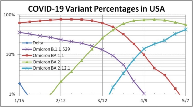
In early May, Omicron BA2.12.1 was responsible for 42.6% of all variant infections, as this chart from Dr Eric Ding’s Twitter post shows.
Recombinant variants
There has been some recent coverage of “recombinant” variants, and the UK Government published an explanation of the variants on 25th March 2022, as part of their regular series of publications on the pandemic in the UK.
They say that a recombinant variant occurs when an individual becomes infected with two or more variants at the same time, resulting in a mixing of their genetic material within the patient’s body. This is not an unusual occurrence and several recombinant SARS-CoV-2 variants have been identified over the course of the pandemic.
Briefing paper 39 is available here, which covers, amongst others, the Omicron XE variant, one of these recombinant variants, which combines characteristics of Omicron BA.1 and BA.2.
They say “a total 637 cases of XE – a recombinant of Omicron BA.1 and BA.2 – have been confirmed in the UK so far. The earliest of these has a specimen date of 19 January 2022. There is currently insufficient evidence to draw conclusions about growth advantage or other properties of this variant. We continue to monitor all recombinants closely, routinely through our world-leading genomic surveillance and sequencing capability.“
Given the reported increasing rate of deaths in the UK, but sharply declining cases, however, this still might not explain the divergence in cases and deaths behaviour.
World Health Organisation (WHO) view
The WHO is reported by CNN as saying that worldwide deaths might be three times higher than reported, which does seem to allow that even deaths (owing to the pandemic) can be severely miscounted, not just cases, which I discuss below, in the context of Prof. Tim Spector’s assessment that cases might be 6 times under-reported.
The BBC also reported this, saying that “The WHO believes many countries under-counted the numbers who died from Covid – only 5.4 million were reported”, but as we see from the following BBC chart, pandemic deaths might, in reality, be up to 15 million worldwide.
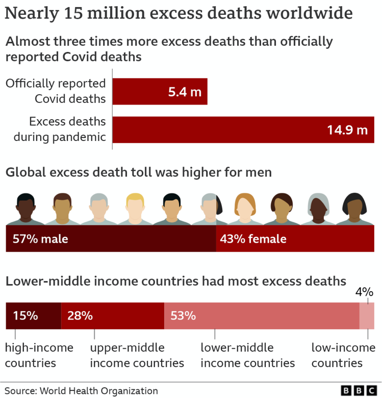
The BBC says that this is 13% more deaths (in the 2020-21 period) than normally expected over two years.
This chart used the term “excess deaths”, and it is worth spending a moment to look at the definition of the term.
Excess mortality
Excess mortality in such analyses is defined as the number of deaths throughout the pandemic that are above the number expected, based on mortality rates in previous years. This is usually between two and five years prior to the pandemic, depending on the organisation doing the analysis. For example, UK agencies, including the Northern Ireland Statistics and Research Agency NISRA use 5 years. Also see this article from Our World in Data.
Agreement was reached in early 2021 by National Records of Scotland (NRS), the Office for National Statistics (ONS) and the Northern Ireland Statistics and Research Agency (NISRA) that the excess deaths calculation for 2021 would make use of the average from the years 2015 – 2019 rather than moving to 2016 – 2020, to exclude the Covid-affected year 2020 from the prior deaths calculation.
The UK’s ONS (Office for National Statistics) provides a useful guide on excess mortality, where they also address the argument around “mortality displacement”, stating that “we are yet to see any evidence that deaths in those aged under 65 or in private homes would have likely occurred over the following weeks or months, as deaths in these age groups and settings continue to be well above normal levels.”
This was to rebut suggestions that the coronavirus pandemic has led to the deaths of many ‘vulnerable’ people who would have otherwise been expected to die in the following days, weeks or months.
Excess mortality is defined by the WHO in their work as the difference in the total number of deaths in a crisis compared to those expected under normal conditions. COVID-19 excess mortality accounts for both the total number of deaths directly attributed to the virus as well as the indirect impact, such as disruption to essential health services or travel disruptions.
Country analysis of excess deaths
The BBC say “in India, there were 4.7 million Covid deaths, it says – 10 times the official figures – and almost a third of Covid deaths globally.“
Not unexpectedly, this is disputed by the Indian Government. In general, however, the figures and discrepancies in many countries for some reported numbers are staggering.

Alongside India, countries with the highest total excess deaths included Russia, Indonesia, USA, Brazil, Mexico and Peru, the WHO figures suggest. The numbers for Russia are three-and-a-half times the country’s recorded deaths.
The WHO report also looks at the rates of excess deaths relative to each country’s population size. The UK’s excess mortality rate – like America, Spain and Germany – was above the global average during 2020 and 2021.

Statistician Prof Jon Wakefield, from Seattle’s University of Washington, who helped the WHO compile this information, told the BBC: “We urgently need better data collection systems. It is a disgrace that people can be born and die – and we have no record of their passing. So we really need to invest in countries’ registration systems so we can get accurate and timely data.”
Discussion
Although the USA news of a the new Omicron BA.2.12.1 subvariant might not reflect the situation here in the UK, and the UK Government reporting doesn’t indicate that recombinant variants have taken off in the UK, it does give me cause to wonder if what I see as the odd behaviour of the reported deaths vs. reported cases in the UK indicates something out there in the UK’s SARS-Cov-2 world we haven’t detected yet.
As Tim Spector wonders, in his April 21st YouTube video below, that I reported in my April 21st blog post, “As Covid falls, why are so many people still in hospital?”
In it, Prof Spector highlighted that on the basis of Zoe app returns, he estimated that the UK Government’s Office for National Statistics (ONS) reported active cases were six times under-reported; this might help to explain the discrepancy in active cases on my charts. See that video here.
Tim Spector also wonders “As Covid cases fall, why are so many people still in hospital”, and so do I. I’d go further and wonder why the cumulative death rate has increased faster even as the active cases plummet, as I illustrated above.
Under-reporting of active cases wouldn’t help so much to explain the discrepancy in the UK’s reported vs. my modelled number of cumulative deaths. I haven’t seen domestic suggestions that deaths in the UK from Covid-19 in the UK are under-reported to anything like that extent.
And any case, there is growth in the rate of increase of officially reported cumulative deaths compared with my model, not a reduction. It’s not just proportionately more growth in deaths: reported active (new) cases are falling fast (the under-reporting?), while the rate of increase in reported cumulative deaths has been rising since early April.
Maybe if under-reporting is rife across all levels of disease severity in the UK, it is just that under-reporting of deaths is proportionately lower than under-reporting of active cases, and that the true growth in the death rate is indeed higher, as the model suggests.
Concluding comments
I am reassured that Tim Spector also finds the current Covid situation in the UK a little puzzling. I have been somewhat mystified for a few weeks.
I am concerned that there is a possibility that a new subvariant, Omicron BA.2.12.1, or, indeed, any of the ones seen in South Africa, such as Omicron BA.4 or BA.5 that I mentioned in my April 21st post, referring Tom Wenseleer’s work on new variants, or a recombinant variant I mentioned above, might have found a foothold in the UK, as yet undetected for some reason.
If so, then recent public optimism and even confidence in the UK that we can live with Covid (in its current BA.2 guise), manifested as public behavioural relaxations, combined with the Government’s total removal of legally enforceable NPIs on February 24th (with parallel changes in the UK home countries at different times), might mean that we aren’t structurally, technically and emotionally ready to cope with such a new variant, especially one that almost certainly would be more transmissive (to displace previous variants), and possibly more virulent and/or lethal.

One thought on “Declining Omicron cases but increasing deaths – Coronavirus”