
Summary
I haven’t needed to make significant updates to my Coronavirus model for a while, because it has been working well in the Omicron context since my most recent post on January 3rd.
The original Omicron variant recently morphed into a new BA.2 variant, and although it seems no more dangerous than its predecessor, it is thought to be between 33%-50% more transmissible. I have assumed the lower value of 33% more transmissive for this post.
I have added Omicron BA.2 as fifth variant v5 to my model, with 8 times the transmissibility of Delta, compared with the original Omicron variant v4 in the model, at 6 times the Delta transmission rate.
I have also run a further scenario with vaccination offered to 5-11-year-old children from April 1st, and in both sets of scenarios there is an interesting wave behaviour, known as the “honeymoon period”, in the decline of infections as vaccination takes effect, subject to the waning of immunity.
Introduction – vaccination
The UK Government has just decided to accept JCVI (Joint Committee on Vaccination and Immunisation) advice to vaccinate 5-11 year-olds, in line with many other European countries, some of whose overall vaccination rates had overtaken that of the UK, although UK adult take-up of vaccination was well ahead of most others.
I have therefore examined the difference that extending the offer of vaccination to all 5-11-year-old children will make to my model outcomes. Forecasted rates of infection and illness do fall, as one might expect, with a concomitant reduction in serious illness rates. Deaths from Covid-19 for children were already, thankfully, very low, and are forecast to be even lower in a 5-11 year-old vaccination context.
But children can pass on infections to others. There had already been concern about infected grandchildren passing on the infection to their more vulnerable grandparents, and the model outcomes do show that there are reductions in illness in other population groups as a result of the postulated vaccination programme for young children.
Wave profile of Omicron active infections
A characteristic of the outcomes for the high Omicron transmissibility in the base Scenario UK_701 for Omicron BA.2 is a much slower decline of infections than for previous variants, but of significant interest is that these reductions happen in waves.
This is a result of Omicron’s high transmissibility combined with immunity waning in the model, with people being infected, recovering, gradually losing immunity and then potentially being re-infected.
This was an unexpected outcome of the model. In consultation with a well-known expert in epidemiology, Professor Graham Medley of the London School of Hygiene and Tropical Medicine, I learned that it isn’t necessarily just an idiosyncrasy or artefact of the model, but can reflect the possibility of a wave profile in real-life infectious disease infections. This wave profile happens with model changes in the model’s Non-Pharmaceutical Interventions (NPIs) / mitigation measures.
In the context of vaccination for young children (starting on April 1st in the UK_711 Scenario model), the resulting increased rate of decline in infections also exhibits the wave behaviour in the decline of Active Cases.
The Omicron BA.2 variant
In common with each new variant that has gained a foothold in the UK, BA.2 has superseded its predecessor, just as the original Omicron superseded Delta by out-competing it in finding susceptible people to infect; and as Delta succeeded Alpha, and as Alpha, in turn, overtook the original “Wuhan” variant in the UK. Each one has been more transmissible than the one before.
The UK context
The context in the UK has changed greatly over the period of the pandemic, as my 50+ blog posts on Coronavirus modelling since March 2020 have reported.
Vaccination, starting at the beginning of 2021, has been the game-changer, allowing NPIs to be reduced as vaccination take-up increases, but it is also apparent that most of the UK population has become more cautious and responsible about infection, reducing their average number of contacts in any given period, achieved by more working from home and less socialising.
An increased focus on personal hygiene also remains – simple things such as more handwashing and less face-touching – having become more habitual, and some Government advisers have been surprised by the lower than expected infection impact of Omicron, possibly owing to these somewhat unexpected behaviours.
This has encouraged the UK Government to forecast the end of nearly all Covid related restrictions, a process that started on July 19th last year, and many countries (such as Australia, and many in Europe) are relaxing their entry requirements for fully vaccinated people. As I write this, The UK Government has announced today, February 21st, that all Covid restrictions in the UK (such as self-isolation) have become advisory rather than legal.
Model simulation results
Without 5-11 year-old vaccination
Firstly I show the outcomes for Omicron, not only with variant v4 in my model as before, but now with Variant v5 added to represent the new Omicron variant BA.2. All model results for Active Cases and Deaths are now compared with reported Active Cases and Deaths up to February 19th. My dataset UK_701 contains all the data for this Scenario.

This is quite a busy chart, but follows the format of my previous charts, and is still showing a very good match for the model cases (lighter red curve) and deaths (lighter black curve) compared with reported data shown in the correspondingly coloured heavier-weight curves, up to February 19th.
The new feature of the modelled outcomes is the relatively flat modelled Active Cases following the present day, but with a wave profile to the curve, showing periodically increasing and declining Active Cases, as vaccination with waning immunity fights with the high transmissibility of Omicron BA.2 for dominance.
I had sought Prof Graham Medley‘s advice on this, and it turns out that this kind of infectious disease behaviour can be seen in real life.
The following is his helpful explanation in a private communication:
“Essentially, the dynamics are driven by the proportion of infectable people. With significant waning, this proportion oscillates around an equilibrium level. When there are more susceptibles than this level, [the Reproduction Number] R goes above 1 and there is an epidemic to remove them (make them immune), and when the proportion is below this level R is less than 1 and the number of infections falls. This in turn allows immunity to wane away and susceptibility to start to rise again, and so on. The period and sustainability of the oscillations are determined by the rate of waning and the R0 – the transmissibility of the virus. They are linked through the equation:
R = R0 * S
where S is the proportion “susceptible” (i.e. that can be infected). S goes down when R>1 and up when R<1. Sometimes there is no oscillation (just goes straight to an equilibrium), sometimes oscillations are damped (they go up and down getting smaller as S settles down to 1/R0) and sometimes they are sustained (keep going forever). Which of these happens is largely determined by the relative values of waning and R0. Generally, the higher R0 the more likely you are to have oscillations.
If there is no waning (and no births) then infections will tend to zero. If waning is very slow, then the period of the oscillations might be very long (decades) so you might not see them in the model. But if waning and R0 are relatively high (which is what you appear to have with Omicron in your model) then the oscillations (successive waves) will be clearer.“
The London School of Hygiene and Tropical Medicine’s Adam Kucharski also highlighted this kind of thing in his Twitter feed on 20th February, which I saw after several runs of my model with these Omicron settings over the last few days, referencing the “honeymoon period” during the management of an infectious outbreak.
The “honeymoon period” metaphor for the wave behaviour
The term “honeymoon period” was used in the 1990s by Prof. Angela McLean to describe a situation where, depending on the fraction of the population that is vaccinated at birth, the disease is either eradicated, or relapses after a so-called honeymoon period. This paper by her in 1998 usefully contains a paragraph describing the appropriateness of the term:
“The non-linear nature of host-parasite interactions can lead to nonintuitive responses to apparently straight-forward interventions. One of these is the ‘honeymoon period‘, the period of very low incidence immediately following the introduction of a mass vaccination programme. This happens because susceptibles accumulate much more slowly in a vaccinated community, so it takes a long time to reach the threshold number required for an epidemic. Such patterns were predicted using mathematical models in the 1980s and have since been observed in communities in Asia, Africa and South America.“
This paper from 2002 by Almut Scherer and Angela McLean further describes the mechanism.
I’ll reproduce the most relevant parts of Adam Kucharski’s very recent Twitter post I mentioned above, where he also references the first use of the term “honeymoon period” in this 1998 paper by R M Anderson and Angela McLean, because his explanation and two of his accompanying charts are so parallel to what my model is showing:
“If COVID immunity can wane, what will happen after large epidemics peak? Some thoughts on post-epidemic ‘honeymoon periods’…
“As immunity accumulates in a population (specifically immunity that protects against becoming infected/infectious), R will decrease. When R drops below 1, the epidemic peaks and starts to decline. But what might happen next?
“When R drops below 1, the epidemic doesn’t magically end – it will continue to cause infections (and hence immunity) as it declines, meaning that the epidemic ‘overshoots’ the level of immunity required to get R below 1, potentially by quite a lot.
“So we can end up in a situation where R drops considerably below 1 as the epidemic continues to decline. End of story, right? Not quite…
“We know protection against infection can wane quickly for Omicron, e.g. below for immunity against symptomatic infection following vaccination (from: https://gov.uk/government/publications/covid-19-vaccine-weekly-surveillance-reports…)
“We also see evidence of some drop-off (although not as sharply) in protection against hospitalisation over time:
“But if R has dropped considerably below 1 during an epidemic, it will take some time for susceptibility to build up to sufficient levels to see a resurgence. Can therefore see a ‘honeymoon period’ where infection remains at lower levels for a while first. Here’s a cartoon:

“We can also see the honeymoon period happen after the introduction of vaccination. The term ‘honeymoon period’ was first coined in the context of measles (https://ncbi.nlm.nih.gov/labs/pmc/articles/PMC2249353/…). In this case, new susceptibility arrives from new births rather than waning of existing responses.
“Below shows hypothetical dynamics after vaccination introduced with 50%, 75%, 80% coverage among infants after 4 years…

“Examples of a post-vaccination honeymoon period were later observed in countries ranging from Burundi, below left (from: https://pubmed.ncbi.nlm.nih.gov/8194915/) to Mongolia, below right (from: https://pubmed.ncbi.nlm.nih.gov/17642531/).
“Several European countries may well have had a COVID post-vaccination honeymoon period against Alpha in early summer 2021, with vaccination + post-infection immunity driving down R. But we never saw [the] subsequent effect of any waning, because Delta came along first.
“So in summary, we shouldn’t assume that post-Omicron level of infection/disease is where things will stay for good. What’s more, above only focuses on waning immunity (& new births in the case of measles), and new variants also likely to shape future susceptibility to COVID.“
From these professional epidemiological observations, I am encouraged that my model’s wave behaviour is not necessarily an artefact of the model. I haven’t seen anything in my model development to indicate a code or logic error (which I might always suspect!) to cause this.
The wave behaviour does seem to be associated with waning immunity in the context of the very high transmissibility of Omicron and even higher transmissibility of Omicron BA.2. Data settings in the model are tabulated in the body of the charts, reflecting the published characteristics of the Omicron versions.
Vaccination of 5-11 year-olds from April 1st
In this case, for dataset UK_711, I have added vaccination for 5-11 year-olds from April 1st 2022, this having been recently announced by the UK Government as starting “in April”. This is the only change from Scenario UK_701 above.
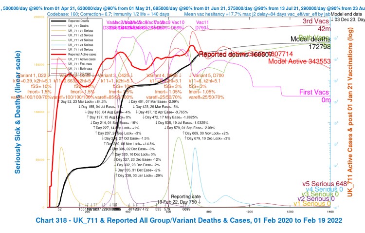
What we see is that the new strategy for vaccination, even though overtly adding vaccination for just under 6m 5-11 year-olds over a period, reduces the overall infection rate considerably in Scenario UK_711, from 1,723,888 down to 343,553 at 3rd December 2023 (day 1400 in the model), a reduction of 80% compared with Scenario UK_701.
Discussion
I have kept the overall maximum vaccination rate in the UK fairly constant, but allocated a share of them from April 1st to these young 5-11-year-old children, as a subset of my Population Group 4, school-age children (0-16 years old).
While the overall downward trend in Active Cases is more pronounced, the wave profile of the decline remains; the transmission rates of Omicron and Omicron BA.2 remain high (33% more for BA.2), and all other infection parameters are the same, although are different for the four population groups in the model: young (socialising) adults (17-39), older (working) adults (40-64), old/vulnerable (65+) and school-age children (0-16).
Serious cases across all populations also reflect these reductions and are reduced from 3,104 to 648 in total by these extra vaccinations.
The indirect benefit to adults of child vaccination (in the model)
Note from the charts that the aggregate number of vaccinations across the whole population by Day 1400 is much higher in Scenario UK_711 (with 5-11-year-old vaccination) than in UK_701 without this additional phase of vaccination.
“3rd Vacs” highlighted in the charts imply that such recipients have already had both their first and second vaccinations (such that every third vaccination implies three vaccinations in total for such recipient individuals), and similarly “both vacs” implies that such recipients have had both their first and second vaccinations.
In Scenario UK_701, therefore, total vaccinations are approximately (3×33 + 2×2) million, or ~103 million (actually 104,623,021 from my other more detailed charts).
In Scenario UK_711, total vaccinations are approximately (3×42 + 2×7) million, or ~140 million (actually 141,357,060 from my more detailed charts).
This difference is because, in the model, only uninfected people at any given time are vaccinated, and because far fewer people are infected in Scenario UK_711, thanks to the vaccination programme for young children, many other people benefit too, being eligible for vaccination when uninfected.
So the new vaccination programme for up to 6 million younger children (involving 12 million vaccinations, assuming first and second vaccinations, but no boosters, for young children over the modelling period) has resulted (in the model Scenario UK_711) in (141,357,060 – 104,623,021) = 36,734,039 more vaccinations by Day 1400 than in Scenario UK_701.
Allowing for these ~12 million vaccinations for 5-11 year-olds, that means nearly 25 million more vaccinations for other parts of the UK population are enabled as a result of fewer infections across the whole population (since the model only vaccinates uninfected people).
My model might better reflect reality by vaccinating uninfected and asymptomatically infected people (as neither they nor the vaccination authorities wouldn’t know those asymptomatic people were infected) but I don’t have compartments in my model that separate asymptomatic from symptomatically infected people, so I haven’t modelled those separately.
Concluding comments
My model simulations again show that vaccination is critical to the management of the SARS-Cov-2 pandemic, and to the protection of all parts of the population from serious illness and death. This powerful influence of vaccination is not unexpected, given my earlier work. Vaccination has mostly supplanted NPIs in this respect.
Such is the powerful influence of vaccination that even the vaccination of young children has beneficial follow-on effects for others; the JCVI have recommended it, taking into account the safety of the vaccines for children and the risk/benefit to them, and models such as mine (but far more professional, no doubt) must be influencing UK Government in this direction.
What was interesting in the model outcomes, for the very high transmission rate of the original Omicron variant, and the even higher transmission rate of Omicron’s BA.2 variant, was the wave profile of the epidemic following the peak in infections at the start of the year.
Even at such high transmission, however, and with this wave behaviour remaining, the infection rate reduces by 80% overall, with the model indicating that the vaccination of young children is key to facilitating this reduction.
All of this presupposes that Omicron BA.2 is the likely current and immediate future dominant variant. As before, let us hope that nothing more virulent comes along soon. Research on vaccines continues, and, hopefully, a vaccine that can defend against a wider range of variants will be developed, to protect us against such an eventuality. Meanwhile, models help us assess and plan our future in the SARS-Cov-2 world.
Thnaks as always are due to Prof. Alex de Visscher of Concordia University for the original model back in March 2020, and for many helpful discussions and collaborations since then, including for the paper we wrote with Dr Tom Sutton on vaccination and NPIs.
On this occasion I extend thanks to Prof Graham Medley of the London School of Hygiene and Tropical Medicine for his help with the interpretation of the “honeymoon period” wave behaviour of the infection profile, and for his interest and support in interpreting the results here.

One thought on “Omicron BA.2, vaccination for 5-11 year-olds, and the honeymoon period – Coronavirus”