
Introduction
I have waited a while since my most recent report on my Coronavirus model on 12th June 2023, so that I can include an assessment of how a further variant (after XBB.1.5) might affect outcomes.
That eventual new variant, BA.2.86 Pirola, has been in the UK since August 16th 2023, and, so far, I have attributed to it only some standard Covid-19 characteristics, until I see more detailed analysis of it.
My June 12th 2023 post was posted not long after the UK Office for National Statistics (ONS) announced that they were ceasing their regular reporting, as you can see at their ONS website announcement on 30th March 2023.
Since then, however, there seems to have been some (apparently weekly) Covid-19 reporting by the ONS on deaths, and also somewhat erratic (as far as I can see) reporting on Covid-19 Active Cases.
Preamble & model structure
In a prior report, “The Kraken Wakes“, on 9th February 2023, I went into some detail about settings for the different variants, embracing Transmission Rates, Non-Pharmaceutical Interventions (NPIs), Vaccination phases, and the four age-groups in the model.
Age groups
| Groups | Name | Age range | Total | weighted % of 67.8m |
| 1 | Active/younger | 17-39 | 23.68m | 33.5% |
| 2 | Caregivers/mid-age | 40-64 | 21.25m | 30% |
| 3 | At risk | 65+ | 12.39m | 17.5% |
| 4 | School age | 0-16 | 13.42m | 19% |
All model calculations are performed within age group, using relevant susceptibilities to infection, and are then grossed up to arrive at population wide forecasts.
Transmission rates k11
In the chart below, transmission rates for each of the 10 variants are given by its k11 parameter, shown in the each list of variant characteristics in red text on the chart for each one.
These range from 0.39 for the first variant (“Wuhan”) to 15 for the most recent variants: this parameter indicates that in a normal social mixing context, the variant has the capability for each infected person to infect a further k11 people per day.
Non-Pharmaceutical Interventions (NPIs)
NPIs are also shown in the chart, in black, with Day number, date and whether the NPI is a % increase – “lock” – or a % reduction – “ease”. The meaning of the percentage is that the effective rate of infectivity of the variant is adjusted (up or down, respectively) by that percentage at that date.
Most of us will remember very well the first NPI, on 23rd March 2020, which comprised the first such UK Government instructions in this area. Recall that measures such as school, college and university closures, staying at home when possible, mask-wearing, and avoiding crowded situations were all part of this.
The model represents those measures not individually, but by reducing the overall effective infectivity of the dominant (first in this case) variant by 84.3%, so that is will only infect 15.7% (100 – 84.3)% as many people as it might otherwise have infected at the outset, when there was no prior NPI at all.
Subsequent percentages increase (lock) or reduce (ease) this percentage by the amount shown at the relevant date. These were judgement calls on my behalf, informed by a great deal of reading of research and other material on the topic.
I should add that the last NPI reduction, of -79.74%, on Day 755, 24th February 2022, removed all NPIs in the model, although UK Government advice remained to be careful; and mask wearing, for example, has been mandated until recently in NHS and other health-related locations.
Vaccination phases
After that first, well-publicised vaccination of Margaret Keenan on December 8th 2020, I added vaccination to the model with effect from January 1st 2021. I will remark, incidentally, that all the pandemic modelling and model testing I have done, with and without vaccination at that stage, and since then, has shown disastrously high levels of infections and deaths without such vaccination.
Vaccination has been offered and delivered in many subsequent phases over the last three or more years, 13 of them in the model, shown in purple text along the bottom of the chart, with people invited in order of vulnerability, so that older age groups (and otherwise vulnerable people) tended to be earlier in the process, starting in early 2020.
Those regarded as less vulnerable were invited later; for example, the NHS started to roll out the COVID-19 jab to school children aged 12 to 15 on 20th September 2021, and for 5 to 11 year-olds on 4th April 2022, and my model reflects this.
The effect of cessation of ONS reporting
In recent weeks, the previous regular wave decline of the pandemic, that we had seen since around March 2022, has become more erratic, as we see in the following chart 318, from my model run on 10th October 2023, which records Reported Deaths and Active Cases until 9th October.

It’s a complicated chart, but it has the virtue of enabling me (and you) to see the relationship of Modelled outputs (in lighter black and red curves) to the Reported data for Deaths, and for Active cases of Covid-19 (in the heavy black and red curves, respectively).
As always for the UK, ONS Reported Covid deaths are deaths that have been recorded with a mention of Covid-19 on the death certificate.
Wave decline of reported Active Cases
A very noticeable feature on the chart is the wave behaviour in the decline of Reported Active Cases, and you can see the explanation for this in this relevant section of my Kraken Wakes blog post here, which had been kindly explained to me by Prof Graham Medley of the London School of Hygiene & Tropical Medicine (LSHTM).
It is immediately clear that since about April 2023, that previously steady wave decline with reducing amplitude in Active cases has become erratic. I have seen many changes to the reported data during that last period, presumably as a result of intended corrections from the ONS; but I am still not happy that the ONS reported data is correct for that period, as I will discuss.
Are my Active Case numbers over-estimated?
During that period, however, the Modelled and Reported Deaths data have remained fairly well in step, although I have yet to refine the variant characteristics for the latest variant, BA.2.86 Pirola, and to a lesser extent for XBB.1.5 prior to that. The more recent the variant, the less certain are its characteristics, until researchers have done their work.
Although the discrepancy in Active Cases has worried me somewhat, I haven’t sought to “correct” the model, because I have remained sceptical that the Reported Active Case numbers are reliable. As I read more and more about the poor accuracy of Reported Data in the UK since the apparent demise of ONS reporting, described above, I feel justified in that view.
Prof Christina Pagel
I am encouraged in that view by a recent article and reference by Prof Christina Pagel of University College, London (UCL), whose work, amongst others such as Prof Neil Ferguson‘s group, and of course Prof Graham Medley, mentioned above, I have followed during the pandemic, while I have been working on my model since March 2020.
In her recent Substack post “Tracking the Covid waves: how to interpret Covid numbers” on 11th October, which is worth reading in its entirety, Prof. Pagel observes: “Once free LFTs [Lateral Flow Tests] were withdrawn in March 2022 (after most free PCR tests stopping in January 2022), appearing as a case became almost increasingly impossible.“
So while ONS might well have been trying to continue to source data from the UK public on Active Cases since then, I would think, as Prof. Pagel implies, that there has been a decline in the completeness and/or accuracy of numbers being collected – and in any case, ONS themselves seem to state that they had given up publishing the numbers on March 30th 2023. It’s a confusing picture – are they or aren’t they, and how well?!
Other UK indicative references
Paul Mainwood
Paul Mainwood is a regular and reliable Covid-19 commentator whom I follow at @PaulMainwood on Twitter/X, and his charts on Twitter of Covid-19 presence in the UK also show the fluctuations in infections, as you can see from the following chart, where one might interpret hospital admissions as the equivalent of my own model’s Serious cases. (NB this chart is for regions in England, not the UK as a whole).

Prof Graham Medley, who has been helpful to me before, particularly by explaining the wave structure of a pandemic decline, commented on this chart on Twitter: “This squiggly-wiggly is quite good. Clearly going through a dynamic shift to a new regime. The big question is whether periodicity reappears and what it looks like. Large annual waves would be challenging but this pseudo-steady indecision at a low (compared to last yr) is better.“
The Zoe app
A picture of the UK’s pandemic related health status is compiled from returns by respondents on their infection status through the Zoe app, founded and run by Prof Tim Spector at King’s College, London, whose work I have quoted before. I am one of nearly 5 million people in the UK who file daily Zoe app returns on their health status. Two mobile phone screenshots below show the simplicity of the user interface.


Mostly I am able to click the button that says “I feel like my usual self”, which takes seconds. I have had one episode of Covid-19, for up to 10 days or so of self isolation, but even then, it was very quick to make the more detailed return using the button “I feel different from my usual self”, and then adding details from a short menu of symptoms that follows. It is worth downloading and using the app for your own information, and for the benefits to Zoe’s research on this important health crisis.
Click on the link on the page at https://health-study.zoe.com/app to download the iPhone App Store or Google Play version of the Zoe app for your mobile device.
The next chart, from the Zoe health project, shows similar pandemic behaviour to Paul Mainwood‘s and my charts above.

I should point out that these studies and charts show a much higher prevalence of Covid-19 in the UK population than is apparent from UK Government’s erstwhile ONS reports; the Zoe chart shows approaching 1.3 million infected at the right of that chart.
Recently, the Zoe Health Study reported 97,904 new infections a day, as you see from the following screenshot of the app on an iPhone.

So taken together, I am satisfied that there is a great deal of information to indicate that Covid-19 infection rates in the UK are well into 7 figures – i.e. well over a million. The Zoe app itself confirms this assessment for Active Cases in the UK.

As a sanity check, from that Zoe 97,904 figure, for example, if we take the recovery period from Covid-19 as 2 weeks – a conservative assumption, especially given the prevalence of “long Covid” diagnoses that seem to be increasing – then in rough terms, a daily new infection rate of c. 100,000 over 14 days would imply nearly 1.5 million concurrent infections, and so Zoe’s aggregate ~1.3 million is consistent with their Daily New Cases number.
Adam Kucharski
Prof. Adam Kucharski, also of the London School of Hygiene & Tropical Medicine (LSHTM), is another expert whose work I have consulted and quoted before in my series of Coronavirus posts since March 2020. His recent chart of Covid-19 prevalence on Twitter

prompts him to ask “Is COVID now a ‘winter virus’? And why are infections seasonal anyway?” He explores this question this in his Substack paper “Is COVID now a ‘winter virus’?”. It is part of his Substack series “Understanding the unseen“.
I would also say that my own model’s outlook of 2.5 million Active Cases to June 2024, shown on my chart, might not be so unreasonable, especially given (in my opinion) the likelihood of under-reporting by the British public on their Covid health status, for a number of possible reasons.
If my model’s outlook is anywhere near reality, it shows how a theoretical model can be an indicator of behaviour that might not be apparent from reported (ONS), sampled or observed “real-life” data, or from experimental numbers.
Sourcing data at Worldometers
Despite what ONS might be doing (or not), reported Covid numbers for the UK (as part of a panoply of data and charts for many countries) do continue to appear at the Worldometers website, where I have sourced my UK reported data conveniently for three years; the Worldometers published data and charts for the UK can be seen here.
I source the reported data for my charts there because the format is presented consistently, predictably and reliably; Worldometers also publish such data for most other countries worldwide. They are good at it, and it saves my having to prise out numbers from several of what can be quite arcane UK Government websites; in this way, Worldometers are doing much of the heavy lifting (of published data) for me.
I used to run a version of my model for the USA too, and Worldometers again offers the ability to deal with the data requirements very conveniently and consistently, potentially for any country one might want to model*.
*[While my model’s code can work equally well for any country or region, however, it became increasingly obvious very quickly from my work on the UK (where I live), and from some early model runs for the USA, that good data on all those aspects mentioned above – Prevalent Variants, Transmission Rates, Non-Pharmaceutical Interventions (NPIs), Vaccination phases, age-group structure and many others – are key to modelling the progress of the pandemic in any country or region. This would be a huge additional task for me to monitor in sufficient detail for another country, as you see from the UK data sources I have mentioned here. Consequently, I haven’t run my USA data model for well over two years.]
Worldometers publish their own charts and forecasts in the same place, as well as collating the data, but I plot my own charts, so that I can combine reported data with my model’s outputs on charts (such as my one above) for comparison purposes. I have been doing this for three years, checking and re-checking (as you do) when frequently enhancing and updating my model and its functionality.
I should emphasise that all the modelling / forecasting in my model is mine; it is just reported data that I pick up from Worldometers. But as I said, they do make their own forecasts too. I would see those as a mathematical exercise; I can’t see how they could reasonably be sensitive to UK local conditions, or for any other large country, other than maybe for the USA where they are located.
I haven’t detected any issues with the Worldometers UK data stream at all, except when caused by an input error out of their control, subsequently announced each time by ONS, from the UK’s own data that Worldometers collect. Here is an example of Worldometers’ own chart presentation.

You can see that the Active cases are indeed very low this year on this Worldometers chart (because that is what the UK must be reporting), especially compared to the peak of around 4.5 million at the beginning of 2022.
Another view of this data for the UK is in my own chart 207, where I plot ONLY Reported data for the UK: All Cases (light blue), Active Cases (dark blue) against the left axis, and Deaths (red) against the right axis.
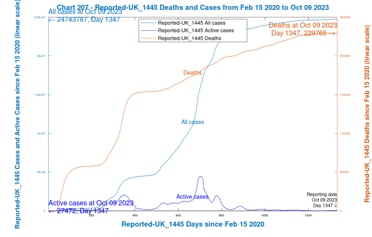
As you see, the Active cases in my chart match the Worldometers chart above, confirming that the Reported data in my model has been transcribed from Worldometers correctly. Having said that, however, I’m not sure that I believe the recently reported flattening in the Deaths curve. Daily reporting has become weekly, if at all, and again it’s a question – are ONS reporting, or are they not?
I do, however, continue to source the Reported Deaths and Cases data from Worldometers. I do regularly update and refine my model and chart presentations (maybe 50 versions at least over more than three years), but it has been working well all this time with the help of those upgrades and updates.
Active Cases in my model
While modelled deaths in my model match well, and I have always regarded that as the most important parameter, the modelled Cases and Active Cases matches to reported data have been a little more variable. I believe, however, that my model is closer to reality than it might seem from published numbers, for the reasons I have stated.
I prioritised this way because a) I thought that errors with UK Deaths reporting would be far less likely, and b) that Deaths are far more important than Cases, ultimately; although the more we hear about “Long Covid“, the more worrying the prospect of widespread and long-lasting Covid infection becomes.
As Prof Christina Pagel also said in her 8th October article “Here yesterday, gone today: Data of Covid Past”, “The best, gold standard, measure of levels of infection in the population are surveys of randomly tested people, such as the ONS infection survey, but this was always lagged by a few weeks and most countries do not have such surveys.“
The UK was doing such random data sourcing from the public over the first two of years of the pandemic, but now that this seems to have fallen away, or has otherwise become less reliable, we should remain concerned. Prof. Pagel also says, in that article on 8th October “Here yesterday, gone today: Data of Covid Past“:
“There has been a slow attrition over the last 18 months in the quality and quantity of data available to understand the current Covid situation – slow enough that perhaps we don’t mourn the loss as much as we should.
“We’ve lost data on where infections are happening and in whom, data on Long Covid, on inequalities, on who is getting tested, on what is happening in schools, or what the population thinks of it all. As other countries have massively scaled back their reporting, we’ve also lost some of our ability to learn from each other.“
Summary
While the Covid situation in the UK seems to be easing, new variants have been appearing regularly, the latest with significant presence in the UK being BA.2.86 Pirola.
I have updated my model accordingly, and it presents an outlook to 20th June 2024, 1600 days from its start date in February 2020.
The intermittent and/or uncertain ONS reporting of UK deaths and cases doesn’t help with confidence about the future. As Prof Christina Pagel indicated in her 8th October article, the lack of reliable data in the UK (and elsewhere) means that we are less informed about the future than we should be.
As I have suggested before, models enable us to explore situations we can’t encounter directly, and at the moment models can offer a view of the future that isn’t necessarily supported by current reported data trends, suspect as they are. I suspect that my model’s outlook to 2.5 million Active cases in June 2024 might not be such an overestimate as I had thought, given the Zoe and other charts I have presented.
Prof Pagel’s paper “Latest Covid situation in the UK: 6th October 2023” contains extensive data and insights regarding the current status of Vaccination rates, Infections, Hospital Admissions, Deaths, current Variants, and the impact of Infections.
I recommend looking at all of Prof Pagel’s recent substack posts at “Diving into Data & Decision making”, as well as Paul Mainwood’s Twitter/X feed on this and other topics.
Please join and report your health status to the Zoe project, and also see Adam Kucharski’s Substack “Understanding the unseen” to inform your own views about where UK’s Covid-19 situation is going.
In return, I promise to read Adam Kucharski’s “Tips for scientific writing” at his Substack collection.

One thought on “My Coronavirus model post-Pirola”