
Introduction
We are just past the fifth anniversary of the announcement of the first COVID-19 lockdown in the UK on 23rd March 2020. This article reviews what I said about the pandemic in the original version of this article, published on May 25th, 2020, when my COVID-19 modelling was at an early stage. It was one of 66 articles I published during the pandemic, which can all be seen at https://brianrsutton.com/?s=Coronavirus.
Early 2020
In early 2020, the UK was coming to terms with a pandemic. This hadn’t happened since the end of the Great War in 1918, when it was caused by a strain of influenza, the so-called “Spanish Flu”.
The effect of the 1918 pandemic was exacerbated by the considerable population movements following the end of the Great War, causing over 50 million deaths worldwide, of which up to 250,000 were in the UK. See https://blogs.lse.ac.uk/politicsandpolicy/public-memory-1918-flu/ and https://www.archives.gov/exhibits/influenza-epidemic/ for more.
A hundred years later, in late 2019, the arrival of a novel virus, SARS-CoV-2, caused the pandemic, leading to many COVID-19 infections. Today, in the UK, we have reached the total number of pandemic deaths from the 1918 era, with a quarter of a million attributable to COVID-19.
Prime Minister Boris Johnson announced the first UK lockdown of the COVID-19 pandemic on 23 March 2020, which came into force three days later. At the time of that first lockdown, UK deaths were in the low hundreds.
The Oxford–AstraZeneca vaccine, developed by Prof. Sarah Gilbert‘s team at Oxford University, was released at the end of 2020. The BBC covered it at https://www.bbc.co.uk/news/uk-55043551.
Early 2025 perspective
Running my full Coronavirus model now, exactly five years after the first UK lockdown, the UK deaths forecast is nearing 250,000, as you will see in the chart in the Addendum. These deaths have been attributed to COVID-19 because it was mentioned on the death certificate, which wasn’t the criterion originally, when the requirement was a positive diagnosis from a COVID-19 test. That more stringent requirement somewhat reduced the rate of reported cases and deaths where COVID-19 might have been involved, since COVID-19 tests were originally in limited supply.
Reports of the current public inquiry into the UK’s early 2020 actions have questioned the need for a lockdown in March 2020, and, if there had been such a need, when it should have occurred, and whether it could or should have been a more discriminating intervention. See https://covid19.public-inquiry.uk/ for a description of the UK Public Inquiry and its schedule.
Some have also asked whether children should have been included in that March 2020 lockdown, given that from today’s 2025 perspective, education for many children can be seen to have been badly affected at that time.
Furthermore, from what we now perceive about differential vulnerabilities to COVID-19 in the UK population, children were (and are) less vulnerable to serious COVID-19 illness than adults, less than was feared at the outset of the pandemic.
Some current views of the impact of lockdown on young children’s education five years ago are consequently very critical of what might be seen as a blunt approach.
I do recall, however, that irrespective of children’s own susceptibility to the symptoms of COVID-19, some felt that if children might act as carriers to bring the disease home from school to their families, including far more susceptible older people such as grandparents, then they should not be excluded from the lockdown. This view seems to have prevailed, at least for a time.
Later, we saw the advent of Long Covid, which has further seriously affected many adults. Could that have been detected earlier, and what might have been done to alleviate it?
Perceived and actual age-based differential vulnerability to COVID-19 led to a phased introduction of vaccines when available, thankfully quickly, in late 2020/early 2021, with Margaret Keenan being the first UK recipient in December 2020.
The elderly and vulnerable were scheduled early for the vaccine, followed by the middle-aged, then younger people, and finally children, in the later vaccine phases. Today, we are four years into the full UK vaccination programme, with the Spring 2025 phase about to begin. Eligible UK citizens can book an appointment at https://www.nhs.uk/vaccinations/covid-19-vaccine/.
The question of the early 2020 lockdown starting date
The question of the lockdown starting date that my May 2020 articles addressed was current at that time, when infection rates were very high. Should the lockdown have started two weeks earlier, and, if it had, what might the consequences have been, given otherwise similar parameters, such as virus infectivity, recovery period and mortality?
This article doesn’t fully address these difficult questions, but it is my first step in tracking these matters in the current debate.
For context, it might help to review what others and I said five years ago about how COVID-19 was spreading in the community, and, of course, the resulting public worry over what the future might hold.
What follows is based on what I wrote then, but with some additional material, links and drafting clarifications, so that references to the 2020 debate can be found more easily.
Introduction to my original 25th May 2020 article
On 14th May 2020, I published a post entitled What if the UK lockdown had been 2 weeks earlier? I explored the possible impact of a postulated 9th March lockdown intervention date, two weeks earlier than the actual 23rd March lockdown date.
That 14th May 2020 article focused more on the impact on the number of deaths in those two scenarios, rather than on the number of COVID-19 cases, when the published data was not as clear or complete, since so few people had then been tested for COVID-19.
That article also made the point that model forecasts weren’t as reliable for that earlier intervention date, 9th March, because the calibration of the model would have been more compromised than for 23rd March, as there was a more limited history of COVID-19 cases and (particularly) deaths data against which to fit a model at that earlier point.
Therefore the comparisons against reported data are not so valid for that earlier date, 9th March, but comparative modelled numbers between the two lockdown dates, the putative one on the 9th March and actual one on the 23rd March 2020, illustrate how a typical infectious disease model such as mine (derived and much extended from Alex de Visscher‘s initial code) responds in a very non-linear way to changes in initial conditions, such as lockdown timing, given the typically exponential pattern of pandemic growth.
Cases
I first present below my two 2020 COVID-19 case numbers charts for the modelled 9th March and 23rd March 2020 lockdown dates. I covered the deaths data in more detail in my previous 14th May post on this topic, and will return to that in the following section.
The following comparative charts for cases present the same reported data, up to the reporting date, 24th May 2020*, in each chart (in orange). Model predictions (in blue) for cases for the postulated lockdown date of 9th March 2020 (left) vs. the actual lockdown date of 23rd March (right) differ greatly.
[*I used public data from 24th May 2020, which is one day earlier than the publication date of my report, 25th May 2020, since the 25th May reported data would not have been fully available to me until the end of that day.]

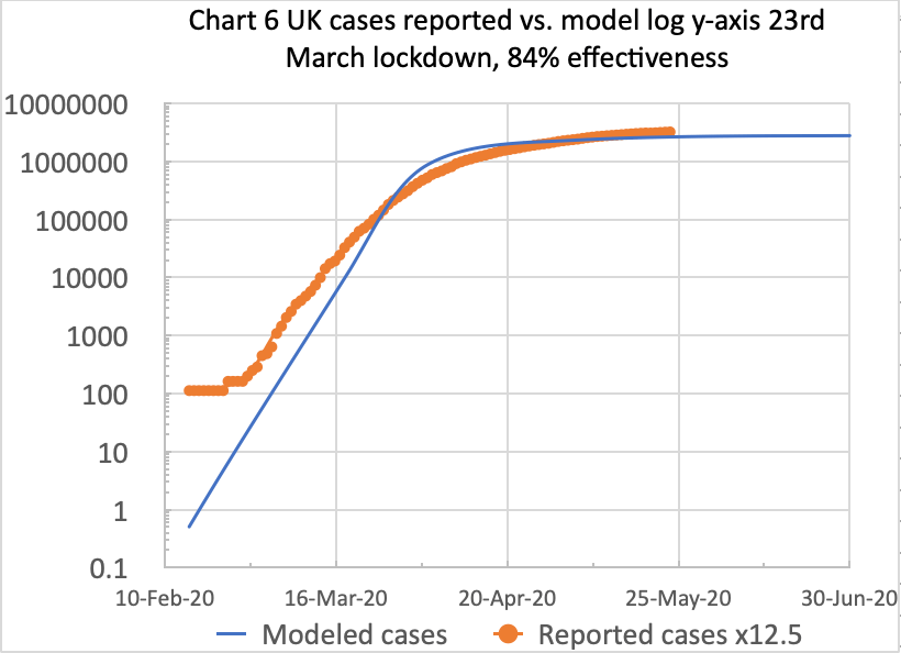
For the postulated 9th March lockdown date, on the left, the modelled number of cases (in blue) by the 23rd March is 14,800, compared with 45,049 cases on the right for the actual 23rd March lockdown, about 3 times as many, because modelled cases for 23rd March show no benefit from prior lockdown.
The number of reported cases (the orange curves above) for 23rd March is 81,325, which is based on multiplying the UK Government’s reported numbers by 12.5**, using Italy’s and other data concerning the proportion of real cases that might ever be tested.
[**At that time, only cases with a positive COVID-19 test were to be included in the published statistics, which was estimated at about only 8% of all cases, as described in my Model Update post on May 8th 2020.]
The reported UK case numbers (in other countries too) underestimated the actual case numbers, owing to the lack of sufficient public Coronavirus testing, with a positive test being the criterion for reporting cases.
As I said in my previous article, a reasonable multiple of the publicly reported numbers for comparison might be 12.5 (the inverse of 8%), which the orange curves reflect for reported cases in both charts above.
Deaths
Here are my comparative charts of the equivalent model data (in blue) for deaths for the postulated 9th March (left) and actual 23rd March (right) lockdown dates. As before, reported deaths are the orange curve in each chart.

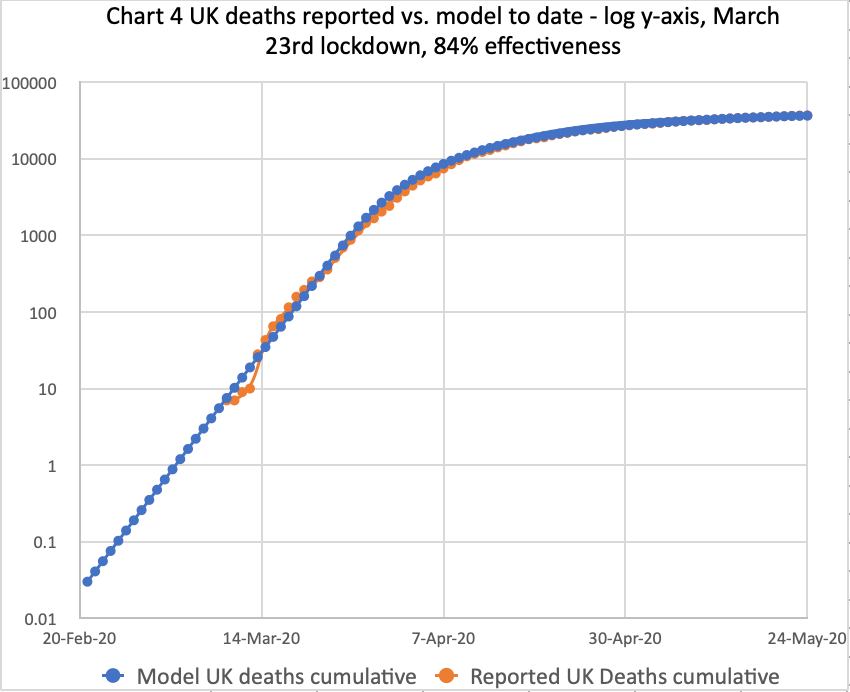
On the right, my well-calibrated live model matches reported deaths data quite accurately, using 84% lockdown intervention effectiveness, for the actual March 23rd lockdown. The model curve and the reported data curve are almost coincident.
On the left, for the postulated 9th March lockdown, the modelled number of deaths is lower from that date, compared with the 23rd March chart. By 23rd March, modelled deaths for the postulated 9th March lockdown stand at 108, far fewer than 402 for 23rd March on the right, the actual lockdown date, when there has been no benefit from any lockdown from 9th March.
Deaths at my 13th May and 25th May report dates
These data can be compared with the deaths a couple of months later, on May 13th 2020, described in my May 13th report. Modelled deaths by then are 540 and 33,216 for the March 9th and March 23rd lockdowns, respectively, at 84% intervention effectiveness.
At the time of writing the original version of this article on 25th May 2020, modelled deaths on the right, for the actual 23rd March lockdown at 84% intervention effectiveness, were 36,660 (against the reported 36,793). For the postulated 9th March lockdown, on the left, it would have been, the model says, 570 deaths, or just 1.5% of the 36,793 deaths that actually occurred (or 36,660, my model prediction).
1.5% seems a tiny fraction, but it can be understood as an internal comparison of model outcomes for those two assumed lockdown dates in an exponential growth scenario. Although there were fewer data to fit the model to the postulated earlier lockdown, it is clear that, by at least an order of magnitude (actually by a far larger factor of 64, 36,660 vs. 570), the model behaviour over those 2 months is crucially dependent on the timing of that initial lockdown intervention.
This shows the startling (but characteristic) impact of exponential pandemic growth on the outcomes from different starting assumptions, the only difference in this case being the lockdown dates.
Cumulative deaths from 23rd March to 13th May compared with 23rd March to 25th May
As one might expect, this kind of outcome applies not only for my 13th May report date, 51 days later than the March 23rd Covid reporting date, but also for my 25th May report date, 63 days after March 23rd.
My 13th May report shows that cumulative COVID-19 deaths would have increased by a factor of 5 in the 51 days from 23rd March to 13th May for a postulated 9th March lockdown, but by a factor of 82 in that same 51-day period for the later, actual 23rd March lockdown.
For the 63 days from March 23rd until my 25th May report publication date, an additional 12 days later, the corresponding factors are 5.2 and 339 for deaths for the postulated 9th March and actual 23rd March lockdown dates, respectively.
My 9th March lockdown modelled numbers are lower than those from Professor Rowland Kao’s research group at Edinburgh, if their Scottish numbers are scaled up proportionally to represent population numbers for the UK as a whole. Indeed, I think my model numbers are too low for the March 9th lockdown case. But remember, this article is about relative model comparisons to demonstrate the impact of delayed lockdown in the model; it’s not an absolute forecast.
In terms of the long-term outlook, under the possibly unrealistic assumption that 84% lockdown effectiveness were to continue, and also the more realistic assumption of the absence of a vaccine at that time, deaths plateau at 42,500 for the actual March 23rd lockdown.
But the model shows that if the lockdown had been March 9th (as covered in my previous post), the deaths plateau would have been far fewer, 625 deaths, just 1/68 of those for the later March 23rd lockdown date.
Discussion
For cases, the modelled long-term plateau for March 9th lockdown, under similar assumptions to those for March 23rd, would have been 41,662 cases; for the actual 23rd March lockdown, the model shows the long-term plateau at 2.8 million cases, a vastly higher number, by a factor of about 67, similar to the ratio of 68 between the respective plateaus on deaths, mentioned above.
This shows the effect of exponential pandemic behaviour, even with only a 2-week difference in the timing of the intervention measures (at 84% effectiveness in both cases). That’s how vital the timing of measures is, in addition to their effectiveness, in an exponential pandemic.
These long-term model outcomes reflect a likely deaths/cases ratio of 1.5%, fairly consistent with the February 2020 reports of COVID-19 mortality in the “captive” community on the cruise ship Diamond Princess ( https://en.wikipedia.org/wiki/COVID-19_pandemic_on_Diamond_Princess).
But as I emphasised earlier, these are comparisons to assess the nature and impact of an earlier lockdown within my model, now adding the cases data analysis to the deaths data analysed before.
It is a like-for-like comparison of modelled outcomes for two assumptions, one for the actual lockdown date, 23rd March, where the model fits reported data quite well (especially for deaths), and one for the earlier, postulated 9th March lockdown date that has been discussed so often, but where the model fit might be more questionable owing to the reduced availability of data at that earlier stage for model calibration and fitting.
Addendum 25th March 2025
The projections from running the model in the early to mid-2020 period should be seen in the context of the particular (and only) strain (that some informally called “Wuhan 1”) of COVID-19 that was around at that time. Since then, we have had many more strains (with non-geographic names), often more infectious and virulent, with different recovery periods, and we have also recognised “Long Covid”. The plateau in deaths and cases forecast in the early 2020 modelling of that first UK variant was far lower than we eventually experienced, having encountered many follow-on COVID-19 variants.
It’s not surprising that subsequent strains of Coronavirus would be more infectious, but not too fatal, causing so many more cases than that first infection, because that is how one virus strain replaces another; it out-infects the previous strain. Not being too fatal allows the infection to multiply more quickly, with more surviving, infectious hosts.
My Coronavirus model post-Pirola
My work on the UK COVID-19 pandemic shows how many variants I modelled since 2020, culminating in the XEC variant, a total of 13 variants.
My latest full report, “My Coronavirus model post-Pirola”, was published on October 12th 2023. Vaccines controlled the pandemic fairly well then, combined with much greater public awareness about how personal behaviour can help infection control. It was based on version 216 of my model and dataset UK_1445, and showed Pirola was the tenth main variant we had encountered in the UK, although there had been many sub-variants.
That post-Pirola report usefully rehearsed many parameters and settings required to model the pandemic. The model comprised four population age-groups with different COVID-19 susceptibilities and vaccine qualifying phases, different variant transmission rates, and many Non-Pharmaceutical Interventions (NPIs) and vaccination phases, resulting in a wave decline of COVID-19 infections.
The wave behaviour in the decline of Reported Active Cases (the heavier red curve in the chart from my October 12th 2023 report below) is a noticeable feature of the pandemic.
Prof Graham Medley of the London School of Hygiene & Tropical Medicine (LHSTM) explained the wave decline to me, and it is presented fully in the relevant section of my Kraken Wakes blog post. He confirmed that it was a common feature of pandemic decline. I found his continued advice and support helpful for many aspects of infectious diseases.
The cessation of ONS reporting
The Office for National Statistics (ONS) website, at https://www.ons.gov.uk/surveys/closedstudies/covid19andrespiratoryinfectionssurveycris, states, “Following the transition to ‘Living with COVID-19’ and after careful consideration, the COVID-19 and Respiratory Infections Survey formally ended on 28 June 2023. The survey, when combined with data from the Coronavirus (COVID-19) Infection Survey (CIS), provided vital information to help understand the impact of self-reported COVID-19 infections, Long COVID and other respiratory infections. Find out about the survey and how the results will be used.”
My own perception at the time, however, was that the cessation of ONS reporting wasn’t on one specific date, and that ONS reported case numbers became erratic before ceasing completely, while reported deaths flatlined at a point during that process. This seemed to start in early April 2023, and continued until a formal announcement was made; the 28th June date mentioned above seems to me to be a post-hoc rationalisation of the ONS position.
The following section contains a chart I used principally to illustrate the wave decline of the UK pandemic in my post-Pirola report published on 12th October 2023. I had originally thought that the wave decline might be a numerical manifestation of the cessation of reporting by the Office for National Statistics (ONS), but as explained to me by Prof Graham Medley, such a wave decline is normal for a pandemic. It was only towards the end of that regular, periodic decline that the ONS reported case numbers became erratic, because (in my view) the ONS seemed to cease reporting in fits and starts, affecting case reporting first, and then finally, deaths reporting, as far as I could tell from their published data.
We can see this in the following extract from my 12th October 2023 post-Pirola report, showing the progress of the pandemic in Chart 318, using version 216 of my model, with dataset UK_1445. The reported deaths (the heavy black curve) had recently flatlined (i.e. no additional deaths reported by the ONS after that point), and the regular wave decline of the ONS reported case numbers (the heavy red curve) had become erratic.
Extracts from my 12th October 2023 post-Pirola report
In recent weeks, the previously regular wave decline of the pandemic, which we had seen since around March 2022, has become more erratic, as we see in the following chart 318, from my model run on 10th October 2023, which records Reported Deaths and Active Cases up to and including 9th October 2023.

It’s a complicated chart, but it enables me (and you) to see the relationship of Modelled deaths and cases (in lighter black and red curves, respectively) to the ONS Reported Deaths and Active cases of COVID-19 (in the heavy black and red curves, respectively).
In 2020, it was decided, some time after the pandemic had started in the UK, that ONS-reported COVID-19 deaths would be defined as deaths recorded with a mention of COVID-19 on the death certificate. At that point, the ONS retroactively edited their previous COVID-19 reporting to be consistent with this definition of a COVID-19 death. Following that decision, I had to re-run my COVID-19 modelling accordingly.
See the UK Health Security Agency (UKHSA) discussion of this from August 2020 at https://ukhsa.blog.gov.uk/2020/08/12/behind-the-headlines-counting-covid-19-deaths/. The UK Office for Statistics Regulation discussed the definition of a COVID-19 death at https://osr.statisticsauthority.gov.uk/blog/the-challenges-of-counting-covid-deaths/.
Much later, in 2023 (formally the 28th June, as stated above), the cessation of the ONS COVID-19 reporting was partly responsible for the pause in my own report writing. I did, however, continue to refine my model and run it frequently, but the forecasts in it had no further ONS-reported data with which to compare to “reality”.
Academic sources and references
In addition to Prof Graham Medley, whose help and advice I have already mentioned, his colleagues Prof. John Edmunds and Prof. Adam Kucharski at the London School of Hygiene & Tropical Medicine (LSHTM), leading practitioners in the field, were also prominent during the pandemic, and I consulted their work and opinions frequently.
London School of Hygiene & Tropical Medicine (LSHTM)
Prof. Adam Kucharski
Prof. Adam Kucharski of the London School of Hygiene & Tropical Medicine (LHSTM) is an expert whose work I have consulted and quoted before in my series of Coronavirus posts since March 2020. His early 2023 chart of COVID-19 prevalence is shown here..

In the very early days, such complete information on codes and methodologies was not available anywhere, which is why I started my COVID-19 modelling in the first place. In compliance with the “stay at home” strictures, at least it kept me off street corners!
Prof. John Edmunds
Prof Edmunds at the London School of Hygiene & Tropical Medicine (LSHTM) has made the point that lockdown delay ‘cost a lot of lives’, although unquantified, as reported by the BBC at https://www.bbc.co.uk/news/uk-politics-52955034
Prof Neil Ferguson at Imperial College
I closely monitored analysis by Prof Neil Ferguson‘s Imperial College group, frequently consulted by the UK Government, and quoted in many TV broadcasts.
This group was one of the most prolific in terms of publications early in the pandemic, including as part of the UK’s SAGE Committee, the Scientific Advisory Group for Emergencies. Neil Ferguson’s findings paralleled my own, saying in June 2020 that deaths could have been reduced by 50% if lockdown had been a week earlier. The BBC reported this at https://www.bbc.co.uk/news/health-52995064.amp.
Usefully, all Imperial College COVID-19 outputs are now published on their website at https://www.imperial.ac.uk/mrc-global-infectious-disease-analysis/disease-areas/covid-19/covid-19-reports/.
Prof Tim Spector of King’s College, London and Prof Christina Pagel of University College, London, are other academics whose work I followed.
Prof Tim Spector at King’s College, London and the Zoe app
I also covered the Zoe app, a project facilitating a picture of the UK’s pandemic-related health status to be compiled from returns by respondents on their COVID-19 infection status.
It was founded and run by Prof Tim Spector at King’s College, London. I was one of nearly 5 million people in the UK who filed daily Zoe app returns on their health status. Here is a Zoe mid-2023 chart of COVID-19 infections in the UK. Tim Spector’s work more generally, and increasingly recently, includes advice on diet-related health, for example, at https://tim-spector.co.uk/the-diet-myth/

Prof. Christina Pagel, University College, London
In 2024, Prof Pagel stated how vital the vaccine had been in saving lives. See https://www.ucl.ac.uk/news/2024/may/analysis-astrazeneca-vaccine-saved-millions-lives-it-should-not-be-demonised. All of her academic publications can be seen here.
At the time of writing this review, Prof. Pagel has just announced on 6th April 2025 on her Substack account, “Diving into Data & Decision-Making”, the setting up of a new website that presents the information considered and developed by SAGE during the early years of the pandemic. This website is at https://sagesearch.info.
She says of the website: “Expect different Covid content from different members – some may focus on data, others on vaccines, variants or Long Covid and others on public health or behavioural science. New posts about every 2 weeks.“
During the pandemic, Prof Pagel was a member of “Independent Sage“, launched in May 2020, publishing advice and commentary on the pandemic, as an alternative to the official UK Government SAGE Committee.
University of Edinburgh Covid research
The BBC reported at https://www.bbc.co.uk/news/uk-scotland-52617895.amp that the University of Edinburgh’s research showed that even in the smaller population (5m) of Scotland, 2000 lives could have been saved with earlier intervention.
Other sources
Paul Mainwood
Paul Mainwood was a regular and reliable COVID-19 commentator whom I followed at @PaulMainwood on Twitter/X. My post-Pirola report shows his charts on Twitter of COVID-19 prevalence in England, measured by hospital admissions in several English regions, which show, as my charts do, the fluctuations in COVID-19 infections. This chart is from late 2023.

My model continues
I have continued to develop my model and to run it frequently. My latest model run, for this report, was on March 20th 2025, with version 222 of the model and dataset UK_1508, which includes the latest three variants up to JN.1 Juno, Flirt and XEC. The corresponding chart follows, showing 13 variants.
Variants began with the original “Wuhan 1” variant, the first to arrive in the UK, and then continued with Alpha, Delta, Omicron BA.1, BA.2, BA.4.5, BQ.1.1, CH.1.1, XBB.1.5 and Pirola, followed by JN.1 Juno, Flirt and XEC. Many were far more infectious than the original variant, although not necessarily with higher mortality. The individual variant parameters are shown (in red) in the chart, as are the vaccination phases (in purple), which started at the end of 2020. Successive Non-Pharmaceutical Interventions (NPIs), and the days into the pandemic when they were implemented, are annotated in black on the chart, shown as “lock” for a % increase in intervention effectiveness, or “ease” for a % reduction.
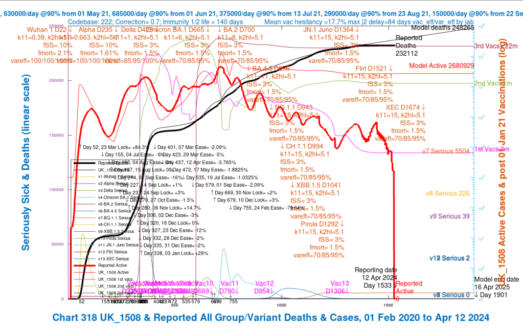
The reported deaths by the time that the UK’s Office for National Statistics (ONS) stopped reporting in phases in mid-2023 were 232,112. My model, which was well-fitted to the reported data up to the April 1st 2023 point (the lighter and heavier black curves respectively), was forecasting deaths to rise from then, until the end of this model run’s forecast period, 16th April 2025, to 248,265 deaths, nearly a quarter of a million UK deaths where COVID-19 was mentioned on the death certificate.
As we see in the chart, ONS-reported deaths (the heavy black curve) flatlined from April 2023, and, not long after that point, ONS-reported cases dropped to zero over a few days (the heavy red curve) after some erratic fluctuations. You can see that these two events were not at the same time, prompting my earlier observation that the ONS cessation of data reporting was not as immediate or absolute as their website asserts.
As I intimated before, although the modelled deaths (the light black curve) fitted the reported deaths very well up to the ONS reporting cessation, my modelled cases (the light red curve) were much higher than reported. I guess that at least part of that is owing to under-reporting of COVID-19 infections by the UK public, for several possibly understandable reasons.
Concluding remarks
This review of some of my UK coronavirus model outputs and the conclusions of my model five years ago was prompted by the current COVID-19 UK Government inquiry.
Issues considered in the inquiry include the extent to which children should have been included in lockdowns and whether lockdowns were necessary or had the right scope and timing. The public inquiry considers many other issues in several modules, the next of which is Module 7 on Test, Trace, and Isolate, which will begin on 12th May 2025. See https://covid19.public-inquiry.uk/ for more details.
As a start, this article sets out my initial modelling in 2020, comparing outcomes of the March 23rd 2020 lockdown date with the possible alternative of starting lockdown two weeks earlier, with otherwise the same parameters, on March 9th 2020.
According to my model, many lives would have been saved with an earlier lockdown.
If lockdown parameters, such as the sub-populations affected, and the particular interventions and their timing were changed, more work would be necessary to differentiate outcomes.
This article simply addresses the option of starting the same scope of lockdown two weeks earlier. All of my 66 articles about the pandemic can be found at https://brianrsutton.com/?s=Coronavirus.
