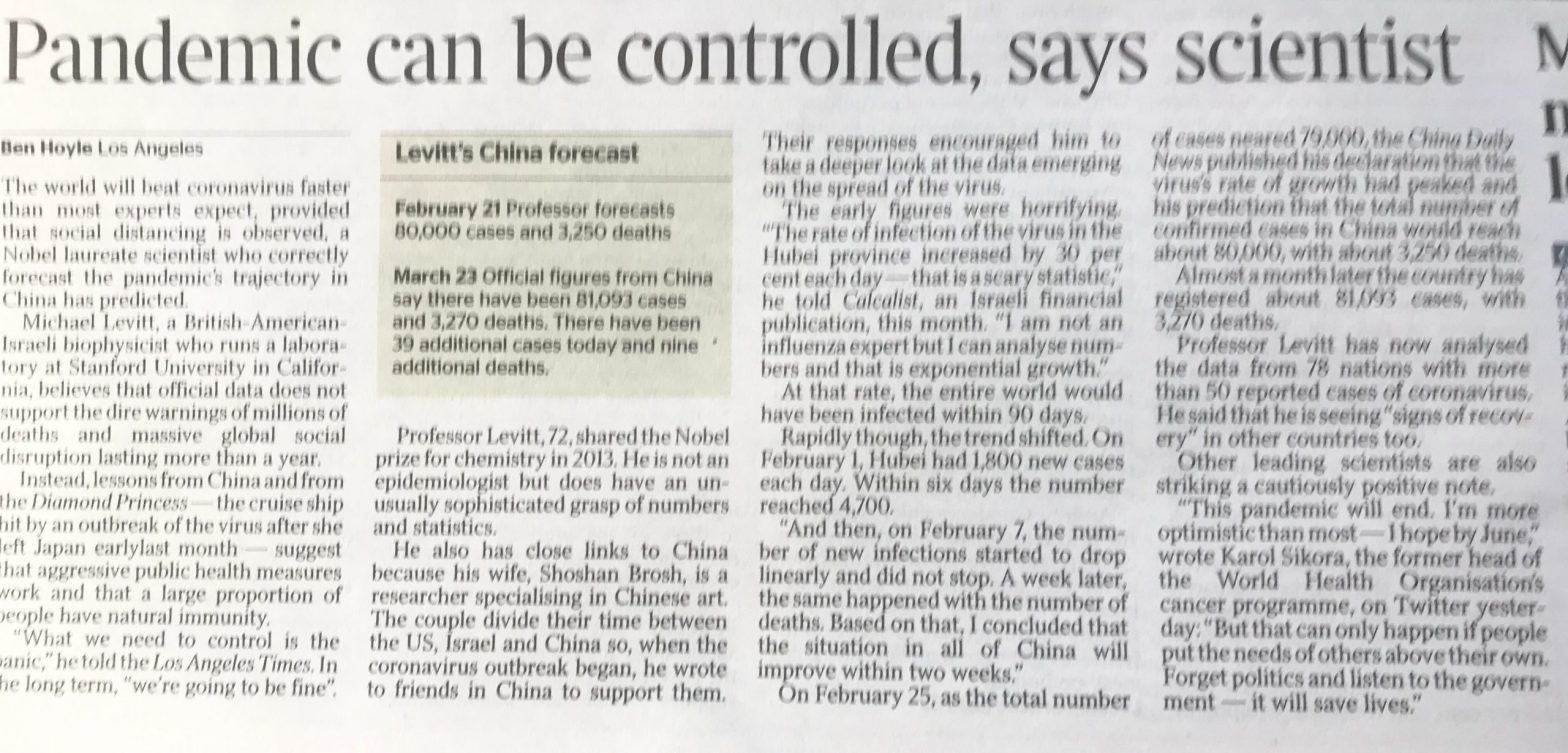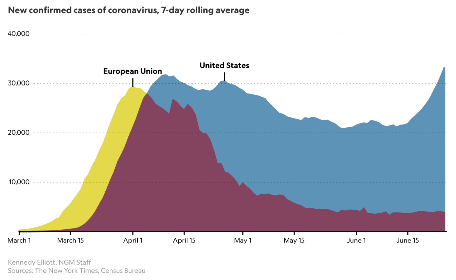
A couple of interesting articles on the Coronavirus pandemic came to my attention this week; a recent on in National Geographic on June 26, highlighting a starting comparison of the USA’s cases history and recent spike in case numbers with European data.
This article referred to an older National Geographic piece, from March, by Cathleen O’Grady, referencing a specific chart from Katy Armstrong of the Imperial College Covid-19 Response team.
I noticed, and was interested in that reference following a recent interaction I had with that team, regarding their influential March 16th paper.
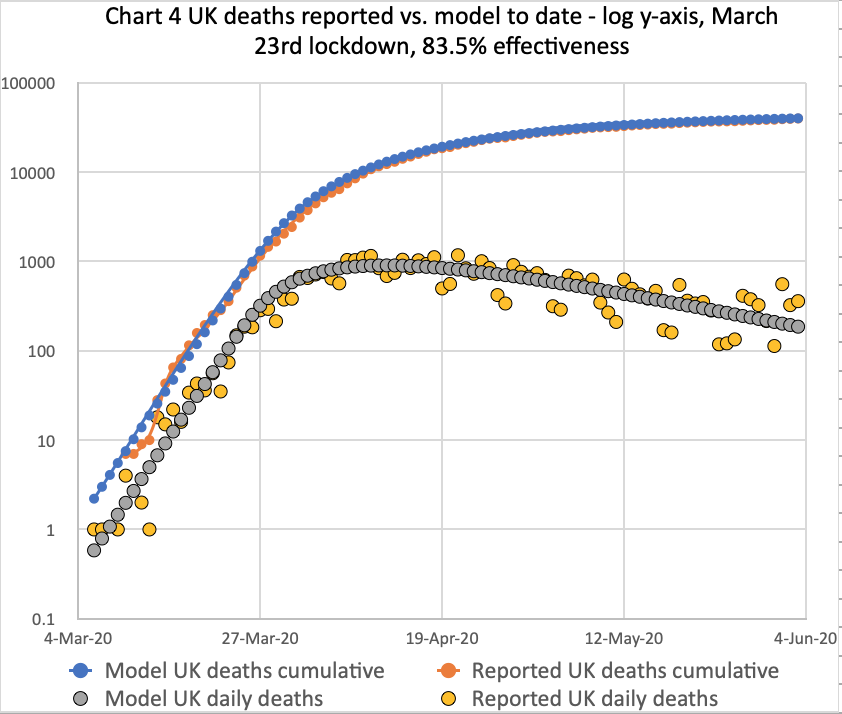
Meanwhile, my own forecasting model is still tracking published data quite well, although over the last couple of weeks I don’t think the published rate of deaths is falling as quickly as before.